Responsive CSS design – Web Design Tips

For designers, the most difficult and interesting aspect of responsive web design has been the flexible nature of it. We’ve constantly in the process of trading in our tenacity for pixel perfection and embracing the web for what it really is; fluid. Today we’ll cover some steps to help you transition towards flexible web design, or as I like to call it, ‘Getting’ Flexy’.

Responsive CSS for a web site will increase a websites visitors by attracting the mobile and tablet visitors also along with the visitors who enjoy their post in desktop version.Now the number of people who are using the tablets and mobiles to browse the web are increasing. Hence a web page layout should be adaptable for all the view port of the device in which the visitor views the webpage.Some of the tips and tricks for the designers to keep in mind when they design a responsive webpages are given below. This will be a prefect resource for responsive web design tutorial in web.
responsive-css-design-tips

First, the basics

Responsive web design, as introduced has three core principles:

  • Flexible grids: percentage-based fluid columns of content.
  • Media queries: a magical tool to change your CSS based on the browser’s current state.
  • Flexible media: content such as images and video should scale with the browser’s dimensions.

You’ll notice that two of those ingredients have the phrase ‘flexible’. This is the key differentiation of responsive web design versus other web design approaches. Let’s look at how to become flexible.

Never use maximum-scale

Occasionally, in an attempt to override an orientation bug in iOS, web developers will add maximum-scale=1 to their meta name=”viewport” tag. Don’t do this. The unfortunate result is that users are unable zoom the page (using a pinch-zoom gesture). This is a bad practice and a huge accessibility concern. If you want your site to be ‘flexy’, it has to be zoom-able.

Do this: you win the internet!

<meta name="viewport" content="width=device-width, initial-scale=1">

This will inform the browser to set the window width to the device’s width without overriding any user needs. Then in your CSS, add this brand new at-rule:

/* You'll need prefixes. @-ms-viewport, @-o-viewport, etc... */
@viewport {
width: device-width;
}

This is an in-progress W3C spec written to move this viewport information over to CSS. IE10 and Opera browsers support this. Go ahead and start rolling this into production sites.

Responsive Images:

Making the height and the width of the images to auto is best for responsive webpages (should be used).

Also make sure always using a compressed image. Because images of 5mb or above are produced when captured from Digital cams. It will take time to load in mobile internet. Hence make sure you compress the image before you use it in the website.

Some of the sites found in the web

http://www.imageoptimizer.net

http://jpeg-optimizer.com/

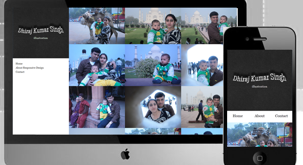
Mobile Navigation Menu:

Navigation menu for mobile should be redesigned when the page is viewed in a smaller width.You could see how the menu is re aligned in this demo, when the width is reduced. Some responsive mobile navigation menus are available in internet.

http://webdesignerwall.com/demo/mobile-nav/

Relative Positioning Of Elements:

Every element in the html is relative to another.Thus it is much flexible when the browser width gets changed. In the this demo header and side menu positions are relative. That gives the flexibility for the menus to get aligned below the header when the width is reduced.

Relative Font Size & Usage Of Percentage:

Instead of using px for the font sizes em is used .Thus the font size reduces relatively when the font size of the header or some other html element reduces. Percentages should be used instead of px.

Example: instead of setting as 1000px , 100% or 90% should be set based on the requirement. Thus the website scales based on the width. The most common example is font-size, if you wanted to set a heading font-size (20px) based on your body font-size (10px) in em units.

Don’t use px units, use em units

The px vs em debate is a long one but em units have proven themselves useful in responsive web design. Using em units should be familiar to most web developers, but worth reviewing. An em unit is a relative unit of measurement based on the parent element.

Keep it relative: typography

Setting your type in em units enables you to use the power of CSS to build a scale-able typographic system that grows with the viewport.

body { font: 100%/1.5 serif; /* 16px */  }
h1 {  font-size: 2em; /* 32px */ }

@media (min-width: 600px) {
body { font: 112.5%; /* 18px */  }
h1 {    /* Do nothing! I'll automatically be 36px */ }
}

Based on personal experience, this will save you hours per project versus going through and updating pixel values. Also, it has an accessibility benefit when a user adjusts their font size.

Keep it relative: white-space

Additionally, using em units for padding and margin helps create a vertical base for your design. At larger screen dimensions you can insert more white-space into your design in a healthy, consistent manner without too much labour.

#hero { margin-bottom: 1em; }

@media (min-width: 600px) {
#hero { margin-bottom: 2em; }
}

Using em units will help you preserve a balanced system of relative proportions. For a more advanced approach on relative sizing,

Min-Width & Max-Width with CSS Media Queries:

Min-width and Max-width should be mentioned in the CSS along with the width.Thus imposing a constraint for the widths are better suited for scale-ability for its width.media queries should be added with the min-width or max-width as condition to display certain elements.

Media queries are so important for a responsive css design.

@media screen and (max-width:320px)
{
    .ad_bar{ display: none }
}

In the above code we are making the ads to disappear when the display device width is below 320px. By this we way we provide a better readability of the content in mobile devices.

max-width min-width
‘Desktop down’ ‘Mobile first’
Start large, dig down Start small, build up
Good for legacy sites Future friendly

Go forth and be flexy!

These are just the basics on the path towards fluid width nirvana. It’s important to remember that we’re all learning and it’s OK to make mistakes. I encourage you, if you haven’t already, to take the plunge and build out your own responsive design. The day when most websites sit on a flexible frame and are universally accessible by any device is hopefully fast approaching. Help the web become a better place.

If you have any more suggestions to be added , feel free to comment below.
view demo


Posted by: Dhiraj kumar

Snow-Fall Effect with JavaScript – Creating Merry Christmas Greetings

On the occasion of Christmas and winter Holidays, I thought to wish this festival by create a nice webpage greetings. So, today I had created this Christmas greeting card using snow-fall effect with help of CSS3 and JavaScript. I hope you all will enjoy this holiday and my web-card too :).

Today we will create a Christmas greeting card using CSS3 and jQuery. There are many things we can do with CSS3 and javascript. We’ll use snowfall.dg.js for creating these snow.

snowfall-effect-javascript-christmas-greetings

Features and Principle

Note: Snowfall Plugin is Less than 12Kb in size. There are many options for customize and use this plugin as per your requirement. Some features are:

  • No need to add any image for snow.
  • No need to add any JavaScript library.
  • You can use any html element in place of snow.
  • Change the Color of Snow by using hexadecimal value.
  • Also support in iPhone, iPad and Mobile devices.
  • Snow-fall movement with mouse/cursor.
  • Stick on bottom.
  • Snow melt effect.
  • Twinkle effect – you can use this also if you want star-fall 🙂
  • More options..

What this script does is adds snow-fall to the body. You can find more options in snowfall.dg.js.

The CSS

No special css required for snow fall effect. But in this greeting card, I have used css for background and my greeting message.

body{
         font-size:18px; 
         background:#badaf3 url(merry_chirstmas-wide.jpg) 100% 0 no-repeat; 
         background-size:cover; 
         font-family: 'IM Fell Double Pica', georgia, serif;
}
#welcome{
         font-size:2em; 
         width:40%; 
         margin:4%; 
         text-align:center; 
         background-color:#fff; 
         -ms-filter: "progid:DXImageTransform.Microsoft.Alpha(Opacity=70)";
         background:rgba(255,255,255,.75); 
         border-radius:10px; 
         box-shadow:4px 4px 10px 0 rgba(20,20,20,.6); 
         text-shadow: 2px 2px 3px #fff; 
         font-style:italic; 
         padding:1em; 
         color:#700; 
         color:rgba(120,0,20,.9)
}

The Html

<div id="welcome">May the miracle of Christmas fill your heart with 
warmth & love. 
Christmas is the time of giving and sharing.
It is the time of loving and forgiving. 
Hope you and your family have
wonderful Holiday... &... Merry Christmas to Everyone! </div>

Snowfall – The javascript

We have to add this snowfall.dg.js in body. I always prefer to use JavaScript files before close of body tag.

<script type="text/javascript" src="snowfall.dg.js"><script>

view demo

Updated!

I have updated this greetings with Jingle bells music and Html5 audio tags. now our Html is

<div id="welcome">May the miracle of Christmas fill your heart with 
warmth & love. 
Christmas is the time of giving and sharing.
It is the time of loving and forgiving. 
Hope you and your family have
wonderful Holiday... &... Merry Christmas to Everyone! </div>
 <audio autoplay="true" loop="true">
   <source src="jingle_bells_merry.ogg" type="audio/ogg">
   <source src="jingle_bells_merry.mp3" type="audio/mpeg">
Your browser does not support the audio element (HTML5). Please update your Browser.
 </audio>

Merry Christmas

I hope you like the result and don’t hesitate to share your thoughts about it. Thanks for reading!

Posted by: Dhiraj kumar

Rotating Words With CSS Animations – CSS3 Keyframes Animation Example

In today’s tutorial we’ll create another typography effect. The idea is to have some kind of sentence and to rotate a part of it. We’ll be “exchanging” certain words of that sentence using CSS animations.
Please note: the result of this tutorial will only work as intended in browsers that support CSS animations.
So let’s start!

In the following, we’ll be going through demo.

rotating-words-css-animations

THE HTML

We’ll have a main wrapper with a h2 heading that contains first-level spans and two divisions for the rotating words:

<section class="rw-wrapper">
	<h2 class="rw-sentence">
		<span>Real poetry is like</span>
		<br />
		<span>creating beautiful butterflies</span>
		<br />
		<span>with a silent touch of</span>
		<div class="rw-words rw-words-1">
			<span>spice</span>
			<span>colors</span>
			<span>happiness</span>
			<span>wonder</span>
			<span>sugar</span>
			<span>happiness</span>
		</div>
	</h2>
</section>

Now, ignoring the garbage placeholder text, we want each span of the rw-word to appear at a time. For that we’ll be using CSS animations. We’ll create one animation for each division and each span will run it, just with different delays.
So, let’s look at the CSS.

THE CSS3

First, we will style the main wrapper and center it on the page:

.rw-wrapper{
	width: 80%;
	position: relative;
	margin: 110px auto 0 auto;
	font-family: 'Bree Serif';
	padding: 10px;
	height: 400px;
	overflow: hidden;
}

We’ll add some text shadow to all the elements in the heading:

.rw-sentence{
	margin: 0;
	text-align: left;
	text-shadow: 1px 1px 1px rgba(255,255,255,0.8);
}

And add some specific text styling to the spans:

.rw-sentence span{
	color: #444;
	white-space: nowrap;
	font-size: 200%;
	font-weight: normal;
}

The divisions will be displayed as inline elements, that will allow us to “insert” them into the sentence without breaking the flow:

.rw-words{
	display: inline;
	text-indent: 10px;
}

Each span inside of a rw-words div will be positioned absolutely and we’ll hide any overflow:

.rw-words span{
	position: absolute;
	opacity: 0;
	overflow: hidden;
	color: #888;
	-webkit-transform-origin: 10% 75%;
	-moz-transform-origin: 10% 75%;
	-ms-transform-origin: 10% 75%;
	-o-transform-origin: 10% 75%;
	transform-origin: 10% 75%;
}

Now, we’ll run two animations. As mentioned previously, we’ll run the same animation for all the spans in one div, just with different delays:

.rw-words-1 span{
	animation: rotateWord 16s linear infinite 0s;
}
.rw-words-2 span{
    animation: rotateWordsSecond 18s linear infinite 0s;
}
.rw-words span:nth-child(2) {
	animation-delay: 3s; 
	color: #6b889d;
}
.rw-words span:nth-child(3) {
	animation-delay: 6s; 
	color: #6b739d;	
}
.rw-words span:nth-child(4) {
	animation-delay: 9s; 
	color: #7a6b9d;
}
.rw-words span:nth-child(5) {
	animation-delay: 12s; 
	color: #8d6b9d;
}
.rw-words span:nth-child(6) {
	animation-delay: 15s; 
	color: #9b6b9d;
}

Our animations will run one cycle, meaning that each span will be shown once for three seconds, hence the delay value. The whole animation will run 6 (number of images) * 3 (appearance time) = 18 seconds.
We will need to set the right percentage for the opacity value (or whatever makes the span appear). Dividing 6 by 18 gives us 0.333… which would be 33% for our keyframe step. Everything that we want to happen to the span needs to happen before that. So, after tweaking and seeing what fits best, we come up with the following animation (Fade in and “fall”) for the first words:

@keyframes rotateWord {
    0% { opacity: 0; }
    5% { opacity: 1; }
    17% { opacity: 1; transform: rotate(0deg); }
	19% { opacity: 1; transform: rotate(98deg); }
	21% { opacity: 1; transform: rotate(86deg); }
	23% { opacity: 1; transform: translateY(85px) rotate(83deg); }
	25% { opacity: 0; transform: translateY(170px) rotate(80deg); }
	80% { opacity: 0; }
    100% { opacity: 0; }
}

We’ll fade in the span and we’ll also animate its height.
The animation for the words in the second div will fade in and animate their width. We added a bit to the keyframe step percentages here, because we want these words to appear just a tiny bit later than the ones of the first word:

@keyframes rotateWordsSecond {
    0% { opacity: 1; animation-timing-function: ease-in; width: 0px; }
    10% { opacity: 0.3; width: 0px; }
    20% { opacity: 1; width: 100%; }
    27% { opacity: 0; width: 100%; }
    100% { opacity: 0; }
}

css3-animations-rotating-words

And that’s it folks! There are many possibilities for the animations, you can check out the demo and see what can be applied!
I hope you enjoyed this tutorial and find it inspiring!
view demo


Posted by: Dhiraj kumar

Top 10 Reasons to Start Using HTML5 Right Now…

So you’re still not using HTML5, huh? I guess you probably have your reasons; it’s not fully adopted yet, it doesn’t work in IE, you don’t like users, you’re out of touch or you are just passionately in love with writing strict XHTML code. HTML5 is the revolution that the web needed and the fact is, it is the future whether you like it or not — suck it up and deal. HTML5 isn’t hard to use or understand and even though it’s not fully adopted yet, there are still plenty of reasons to start using it right now — like right after you get done reading this article.

html5-reasons

There are lots of articles touting the use of HTML5 and praising the benefits of it, yes this is another one of those. With all these articles, with Apple pushing it, with Adobe building new dev products around it, and with so many web sites devoted to it, I still talk to fellow designers and developers who haven’t or won’t adopt it for a variety of reasons. I think the main problem is, it still seems like a mysterious creature to many. To many it feels more like the jet pack or the flying car — an awesome idea that is fun to think about but still not practical in its use. Wrong, the reality is that it is extremely practical right now! It’s not the latest Mercedes concept car being towed around form car show to car show, it’s a reality and it’s not going anywhere.

In order to further demystify HTML5 and help these knuckle dragging designers and developers to jump on the bandwagon I’ve put together a top ten list of reasons why we should all be using HTML5 right now. For those that currently use HTML5 this list may not be anything new or ground breaking, but hopefully it will inspire you to share the benefits of HTML5 with others in the community. We’ll do this Letterman countdown style (minus the celebrity presenter) and start with number ten – accessibility.

10 – ACCESSIBILITY

HTML5 makes creating accessible sites easier for two main reasons: semantics and ARIA. The new (some currently available) HTML headings like <header>, <footer>, <nav>, <section>, <aside>, etc. allow screen readers to easily access content. Before, your screen readers had no way to determine what a given <div> was even if you assigned it an ID or Class. With new semantic tags screen readers can better examine the HTML document and create a better experience for those who use them.

ARIA is a W3C spec that is mainly used to assign specific “roles” to elements in an HTML document – essentially creating important landmarks on the page: header, footer, navigation or article, via role attributes. This has been well overlooked and widely under-used mostly due to the fact that it wasn’t valid, however, HTML5 will validate these attributes. Also, HTML5 will have built in roles that can’t be over-ridden making assigning roles a no brainer. For a more in depth discussion on HTML5 and ARIA please visit the WAI.

9 – VIDEO AND AUDIO SUPPORT

Forget about Flash Player and other third party media players, make your videos and audio truly accessible with the new HTML5 <video> and <audio> tags. Getting your media to play correctly has always been pretty much a nightmare, you had to use the and <object> tags and assign a huge list of parameters just to get the thing visible and working correctly. Your media tags just become these nasty, huge chunks of confusing code segments. HTML5′s video and audio tags basically treat them as images; <video src=”url”/>. But what about all those parameters like height, width and autoplay? No worries my good man, just define those attributes in the tag just like any other HTML element: <video src=”url” width=”640px” height=”380px” autoplay/>.

It’s actually that dead simple, however because old evil browsers out there don’t like our HTML5 friend, you’ll need to add a little bit more code to get them working correctly… but this code isn’t nearly as gnarly and messy as the <object> and tags:

<video poster="myvideo.jpg" controls>
 <source src="myvideo.m4v" type="video/mp4" />
 <source src="myvideo.ogg" type="video/ogg" />
</video>

Some resources worth checking out:

8 – DOCTYPE

doctype html

<!DOCTYPE html>

Yup that’s it, that is the doctype, nothing more, nothing less. Pretty simple right? No more cutting and pasting some long unreadable line of code and no more dirty head tags filled with doctype attributes. You can simply and easily type it out and be happy. The really great thing about it though, beyond the simplicity, is that it works in every browser clear back to the dreaded IE6.

7 – CLEANER CODE

If you are passionate about simple, elegant, easy to read code then HTML5 is the beast for you. HTML5 allows you to write clear and descriptive code, semantic code that allows you to easily separate meaning from style and content. Consider this typical and simple header code with navigation:

<div id="header">
<h1>Header Text</h1>
<div id="nav">
<ul>
<li><a href="#">Link</a></li>
</ul>
</div>
</div>

So this code is pretty clean and simple? But with HTML5 you can clean this up even more and at the same time give your markup more meaning:

<header>
 <h1>Header Text</h1>
 <nav>
  <ul>
   <li><a href="#">Link</a></li>
   <li><a href="#">Link</a></li>
   <li><a href="#">Link</a></li>
  </ul>
 </nav>
</header>

With HTML5 you can finally cure your “divitis” and “classitis” by using semantic and HTML headers to describe your content. Previously you would generally just use div’s for every block of content than drop an id or class on it to describe its content but with the new <section>, <article>, <header>, <footer>, <aside> and <nav> tags, HTML5 allows you to code your markup cleaner as well as keep your CSS better organized and happier.

Some resources worth checking out:

6 – SMARTER STORAGE

One of the coolest things about HTML5 is the new local storage feature. It’s a little bit of a cross between regular old cookies and a client-side database. It’s better than cookies because it allows for storage across multiple windows, it has better security and performance and data will persist even after the browser is closed. Because it’s essentially a client side data base you don’t have to worry about the user deleting cookies and it is been adopted by all the popular browsers.

Local storage is great for many things, but it’s one of HTML5 tools that are making web apps possible without third party plugins. Being able to store data in the user’s browser allows you to easily create those app features like: storing user information, the ability to cache data, and the ability to load the user’s previous application state. If you are interested in getting started with local storage, check out Christian Heilmann’s great 24 Ways article from last year —Wrapping Things Nicely with HTML5 Local Storage.

Some more resources worth checking out:

5 – BETTER INTERACTIONS

Awe, we all want better interactions, we all want a more dynamic website that responds to the user and allows the user to enjoy/interact your content instead of just look at it. Enter <canvas>, the drawing HTML5 tag that allows you to do most (if not more) interactive and animated possibilities than the previous rich internet application platforms like Flash.

Beyond <canvas>, HTML5 also comes with a slew of great APIs that allow you to build a better user experience and a beefier, more dynamic web application — here’s a quick list of native APIs:

  • Drag and Drop (DnD)
  • Offline storage database
  • Browser history management
  • document editing
  • Timed media playback

For way more info on these APIs and more native interactive features of HTML5 visit HTML5Doctor.

Some resources worth checking out:

4 – GAME DEVELOPMENT

Yup, that is correct, you can develop games using HTML5′s <canvas> tag. HTML5 provides a great, mobile friendly way to develop fun, interactive games. If you’ve built Flash games before, you’ll love building HTML5 games.

Script-Tutorials has recently offered a four part series of lessons focused on HTML5 game development, head on over and check out some of the sick stuff they have created:

Some more resources worth checking out:

3 – LEGACY/CROSS BROWSER SUPPORT

modern browsers support

Your modern, popular browsers all support HTML5 (Chrome, Firefox, Safari IE9 and Opera) and the HTML5 doctype was created so that all browsers, even the really old and annoying ones, er, IE6 can use it. But just because old browsers recognize the doctype that doesn’t mean they can use all the new HTML5 tags and goodies. Fortunately, HTML5 is being built to make things easier and more cross browser friendly so in those older IE browsers that don’t like the new tags we can just simply add a Javascript shiv that will allow them to use the new elements:

<!--[if lt IE 9]>
<script src="http://html5shiv.googlecode.com/svn/trunk/html5.js"></script>
<![endif]-->

Some resources worth checking out:

2 – MOBILE, MOBILE, MOBILE

Call it a hunch, but I think mobile technology is becoming more popular these days. I know, that is a pretty crazy assumption and some of your are probably thinking — mobile is just a fad… right. Mobile devices are taking over the world. The adoption of mobile devices continues to grow very rapidly and this means that more and more users will be using their mobile browsers to view your web site or application. HTML5 is the most mobile ready tool for developing mobile sites and apps. With Adobe announcing the death of mobile Flash, you will now count on HTML5 to do your mobile web application development.

Mobile browsers have fully adopted HTML5 so creating mobile ready projects is as easy as designing and constructing for their smaller touch screen displays — hence the popularity of Responsive Design. There are some great meta tags that also allow you to optimize for mobile:

  • Viewport: allows you to define viewport widths and zoom settings
  • Full screen browsing: IOS specific values that allow Apple devices to display in full screen mode
  • Home Screen Icons: like favicons on desktop, these icons are used to add favorites to the home screen of an IOS and Android mobile device

For more info on how to mobilize your site via HTML5, check out “Mobifying” Your HTML5 Site.

Some resources worth checking out:

1 – IT’S THE FUTURE, GET WITH IT!

The number one reason why you should start using HTML5 today is this: it’s the future, start using it now so you don’t get left behind. HTML5 is not going anywhere and as more and more elements get adopted more and more companies will start to develop in HTML5. HTML5 is essentially just HTML, it’s not scary, it’s not anything you really need to figure out or relearn — if you’re developing XHTML strict right now you are already developing in HTML5 so why not take full advantage of it’s current capability?

You really don’t have any excuses not to adopt HTML5 and begin your new love affair with it. Truly, the only real reason I prefer to use HTML5 is just to write cleaner code, all the other benefits and fun features I haven’t even really jumped into yet, but that is the great thing about it, you can just start using it right now and not even change the way you design. So, start using it right now, whether you are just simplifying and making your markup more semantic OR you are gonna build some sick new mobile game that will take over the world — who knows, maybe you can start selling stuffed animal versions of your gaming characters too.

GREAT HTML5 RESOURCES

http://html5doctor.com
http://html5rocks.com
http://html5weekly.com
http://www.remysharp.com
http://www.script-tutorials.com

Posted by: Dhiraj kumar

Cool Animated Fire Effects with CSS3 and jQuery

This effect has been created with some jQuery for setting different CSS3 text-shadow’s in a div. You can check the demo code to see how it’s done. Basically, the Javascript function creates 3 text-shadows (white, yellow and red) with coprime “cycle durations” so the effect looks more random even though it’s totally deterministic.

css3-jquery-animated-fire-effect

Each shadow moves in the Y axis with a linear function and in the X axis with a cosine function. Pretty simple, but effective.

The CSS

#onfire{
      height:auto;
      padding-top:3em;
      font-size: 42px;
      font-weight: bold;
      text-align: center;
      color:brown;
}

The jQuery

<script type="text/javascript">
var step = 1;
function nextShadow(){
	$('#onfire span').each(function(){
	    y = parseFloat($(this).attr("y_pos"));
	    y += step + Math.random()*3;
	    $(this).attr("y_pos", y);
	    shaking = Math.random();
	    shadow1 = "0px 0px "+(y%5)+"px white";
	    shadow2 = shaking*24/y*Math.cos(y/5)*15+"px -"+(shaking*4/y+(y%17))+"px "+(shaking+(y%17))+"px red";
	    shadow3 = shaking*24/y*Math.cos(y/7)*15+"px -"+(shaking*4/y+(y%31))+"px "+(shaking+(y%31))+"px #993";
	    shadow4 = shaking*24/y*Math.cos(y/13)*15+"px -"+(shaking*4/y+(y%41))+"px "+(shaking+(y%41))+"px yellow";
	    $(this).css("text-shadow", shadow2+", "+shadow1+", "+shadow4+", "+shadow3);
	});
}
$(function(){
    $('#onfire span').each(function(){$(this).attr("y_pos","0");});
   setInterval(nextShadow, 50); 
});
</script>

view demo

Update:

I’ve added some randomisation to the algorithm, as well as an individual animation to each of the letters (which, as a drawback, makes the effect run less smooth). I’ve also added a fourth shadow in dark yellow. You can freely use the code by keeping the mention to this site on it.

Thanks for reading and looking forward to read your thoughts!

Posted by: Dhiraj kumar

Clearing floats methods nowadays

At my beginnings as a web designer using Div tags, when I first discovered clear floats I was so happy and it was for sure an “a-ha” moment. Since then, so many things have changed and new clearing methods have appeared. One thing remained the same: the need to clear floats.

In this article, we’ll see some effective solutions for clearing floated elements.

clearing-floats

But first, what is float?

Arranging website page elements was always a struggle for you as a web designer. To achieve your desired website layout, a lot of calculation of box dimensions are needed, and various implementation decisions must be taken as well.

At the beginning, perhaps you used table elements to structure your layout, and even if tables are very intuitive, the table purpose is to list tabular data. You also tried the CSS display values like: tabletable-cell or table-row to build structures, but shortly you gave up as there wasn’t enough support for that.

In the end, you got rid of table markup and skipped to div floats.

So, float is a CSS property which help you aligning and positioning your web page elements.

clearing-floats-simple-example
Simple floats example

Clearing floats

Elements placed after a floated element will wrap around the floated element. To avoid this behavior, you must clear floats. To do that, generally you use the clear property which has four values: leftrightboth and none.

<div style="float:left"></div>
<div style="float:right"></div>
<div style="clear:both"></div>

The above is a common example.

Beside the above example that requires extra HTML markup, below is a list with some clearing methods that I found very useful (and they do not require extra markup):

Clearfix reloaded by Thierry Koblentz

clearfix-reloaded

.clearfix:before,
.clearfix:after{
  content: ".";
  display: block;
  height: 0;
  overflow: hidden;
}
.clearfix:after {clear: both;}
.clearfix {zoom: 1;} /* IE < 8 */

New clearfix hack by Jeff Starr

new-clearfix-hack

.clearfix:after{
  visibility: hidden;
  display: block;
  font-size: 0;
  content: " ";
  clear: both;
  height: 0;
}

* html .clearfix             { zoom: 1; } /* IE6 */
*:first-child+html .clearfix { zoom: 1; } /* IE7 */

Micro clearfix hack by Nicolas Gallagher

micro-clearfix

.cf:before,
.cf:after{
  content:"";
  display:table;
}

.cf:after{
  clear:both;
}

/* For IE 6/7 (trigger hasLayout) */
.cf{
  zoom:1;
}

CSS clearing floats with overflow by Nick La

clear-overflow

That’s it!

You may already know the above techniques and my questions is:  Which one do you use most? Share your opinion with us!

Posted by: Dhiraj kumar

HTML5 canvas awesomeness – games roundup

HTML5 is being developed as the next major revision of HTML, the core markup language of the World Wide Web. Besides new elements like headersectionfooter, etc., the HTML5 brings you the canvas element.

The canvas is a rectangular area within you can use Javascript to draw graphics or other visual images on a web page. Although HTML5 is not a W3C recommendation yet (because of cross browsers issues), people already started to play with it, and when I say play, I mean it.

Today I’ll share with you some awesome HTML5 games demos that show the HTML5 canvas potential.

Agent 008 Ball

8ball

Z-Type

RGB Invaders

Pacman

Spy Chase

Biolab Disaster

Wolfenstein 3D

Fred Jones in Adventureland

Asteroids

Crystal Galaxy

Same Game

Final words

A common misconception is that HTML 5 can provide animation within web pages, which is totallyuntrue. Either JavaScript or CSS3 (or both) is necessary for animating HTML elements.

Posted by: Dhiraj kumar

An Awesome CSS3 Animated Dropdown Menu

It’s a sure thing that CSS3 features like transitions, animations and transforms can add extra spice to your designs.

In this article you will see how you can build an awesome CSS3 animated dropdown menu with some of these cool features.  This is something I wished to do for a while and I finally made it. I just added support for smartphones / mobile devices and fixed the navigation for iPad and iPhone also.

css3-animated-dropdown-menu-preview

Here’s a quick preview for the CSS3 animated dropdown menu that we’re going to create today:

css3-menu-animation

The HTML

The HTML structure hasn’t changed at all, simple and minimal. Here’s an excerpt:

<ul id="menu">
        <li><a href="#">Home</a></li>
        <li>
                <a href="#">Categories</a>
                <ul>
                        <li><a href="#">CSS</a></li>
                        <li><a href="#">Graphic design</a></li>
                        <li><a href="#">Development tools</a></li>
                        <li><a href="#">Web design</a></li>
                </ul>
        </li>
        <li><a href="#">Work</a></li>
        <li><a href="#">About</a></li>
        <li><a href="#">Contact</a></li>
</ul>

The CSS

I revised and improved the styles in order to create this unique CSS3 animated dropdown menu. So, below you can find the commented pieces of styles:

Mini reset

Reset the default ul styles.

#menu, #menu ul {
        margin: 0;
        padding: 0;
        list-style: none;
}

Main level

The #menu is basically the main ul for this menu. CSS3 things like gradientsshadows and rounded corners help us to create the below:

css3-menu-wrapper

#menu {
        width: 960px;
        margin: 60px auto;
        border: 1px solid #222;
        background-color: #111;
        background-image: linear-gradient(#444, #111);
        border-radius: 6px;
        box-shadow: 0 1px 1px #777;
}

Clear floats

Here is Nicolas Gallagher‘s clearing method I’ve been using lately:

#menu:before,
#menu:after {
        content: "";

        display: table;
}

#menu:after {
        clear: both;
}

#menu {
        zoom:1;
}

List elements

css3-menu-elements

Please notice the #menu li:hover > a  selector. This is perhaps the most important CSS trick for this CSS3 dropdown menu.

So, this is how this works: Select an “a” element that is child of a “li” ; the “li” element must be a descendant of the “#menu”. Read more here.

#menu li {
        float: left;
        border-right: 1px solid #222;
        box-shadow: 1px 0 0 #444;
        position: relative;
}

#menu a {
        float: left;
        padding: 12px 30px;
        color: #999;
        text-transform: uppercase;
        font: bold 12px Arial, Helvetica;
        text-decoration: none;
        text-shadow: 0 1px 0 #000;
}

#menu li:hover > a {
        color: #fafafa;
}

*html #menu li a:hover { /* IE6 only */
        color: #fafafa;
}

Submenus

With CSS3 transitons we can animate changes to CSS properties like margin or opacity. This is very cool and I’ve used this for animating the CSS3 sub-menus. The result is great if you ask me:

css3-menu-animation

#menu ul {
        margin: 20px 0 0 0;
        _margin: 0; /*IE6 only*/
        opacity: 0;
        visibility: hidden;
        position: absolute;
        top: 38px;
        left: 0;
        z-index: 1;
        background: #444;
        background: linear-gradient(#444, #111);
        box-shadow: 0 -1px 0 rgba(255,255,255,.3);
        border-radius: 3px;
        transition: all .2s ease-in-out;
}

#menu li:hover > ul {
        opacity: 1;
        visibility: visible;
        margin: 0;
}

#menu ul ul {
        top: 0;
        left: 150px;
        margin: 0 0 0 20px;
        _margin: 0; /*IE6 only*/
        box-shadow: -1px 0 0 rgba(255,255,255,.3);
}

#menu ul li {
        float: none;
        display: block;
        border: 0;
        _line-height: 0; /*IE6 only*/
        box-shadow: 0 1px 0 #111, 0 2px 0 #666;
}

#menu ul li:last-child {
        box-shadow: none;
}

#menu ul a {
        padding: 10px;
        width: 130px;
        _height: 10px; /*IE6 only*/
        display: block;
        white-space: nowrap;
        float: none;
        text-transform: none;
}

#menu ul a:hover {
        background-color: #0186ba;
        background-image: linear-gradient(#04acec, #0186ba);
}

First and last list elements styles

css3-dropdown-first-last-items

#menu ul li:first-child > a {
        border-radius: 3px 3px 0 0;
}

#menu ul li:first-child > a:after {
        content: '';
        position: absolute;
        left: 40px;
        top: -6px;
        border-left: 6px solid transparent;
        border-right: 6px solid transparent;
        border-bottom: 6px solid #444;
}

#menu ul ul li:first-child a:after {
        left: -6px;
        top: 50%;
        margin-top: -6px;
        border-left: 0;
        border-bottom: 6px solid transparent;
        border-top: 6px solid transparent;
        border-right: 6px solid #3b3b3b;
}

#menu ul li:first-child a:hover:after {
        border-bottom-color: #04acec;
}

#menu ul ul li:first-child a:hover:after {
        border-right-color: #0299d3;
        border-bottom-color: transparent;
}

#menu ul li:last-child > a {
        border-radius: 0 0 3px 3px;
}

The jQuery

As you already get used to, IE6 gets some extra attention:

$(function() {
  if ($.browser.msie && $.browser.version.substr(0,1)<7)
  {
        $('li').has('ul').mouseover(function(){
                $(this).children('ul').css('visibility','visible');
                }).mouseout(function(){
                $(this).children('ul').css('visibility','hidden');
                })
  }
});

While the :hover pseudo-class does not work for other elements than anchor, we just need to add this small jQuery snippet to fix it. It’s pretty self-explanatory.

Update: Mobile navigation support

css3-mobile-dropdown

This is something I wished to do for a while and I finally made it. I just added support for mobile devices and fixed the navigation for iPad.

You know how much I love CSS only solutions, but this time we’ll be using some jQuery to enhance this menu. To view the result, you can narrow your browser window or browse it with your smartphone.

The viewport meta tag

To maintain everything at the correct scale, the first thing added is the viewport meta tag:

<meta name="viewport" content="width=device-width, initial-scale=1.0">

Small HTML update

You need to wrap the above HTML structure using something like: <nav id="menu-wrap">. This will be our relative holder for the mobile navigation.

The jQuery add

After page loads, we’ll add the #menu-trigger element which does exactly what you think: will trigger the mobile menu when it will be clicked. Further, in the CSS, you’ll see that this element is displayed using CSS3 media queries.

Another thing here is the iPad device detection. As you can see below, we’ll remove the fancy transition effect and stick to toggling display: none/block. This way, the functionality will be maintained also on the iPad.

/* Mobile */
$('#menu-wrap').prepend('<div id="menu-trigger">Menu</div>');
$("#menu-trigger").on("click", function(){
        $("#menu").slideToggle();
});

// iPad
var isiPad = navigator.userAgent.match(/iPad/i) != null;
if (isiPad) $('#menu ul').addClass('no-transition');

The mobile CSS

Here, the CSS3 media queries do the trick. We’ll add CSS rules to override the initial styles:

#menu-trigger { /* Hide it initially */
        display: none;
}

@media screen and (max-width: 600px) {

        #menu-wrap {
                position: relative;
        }

        #menu-wrap * {
                box-sizing: border-box;
        }

        #menu-trigger {
                display: block; /* Show it now */
                height: 40px;
                line-height: 40px;
                cursor: pointer;
                padding: 0 0 0 35px;
                border: 1px solid #222;
                color: #fafafa;
                font-weight: bold;
                background-color: #111;
                /* Multiple backgrounds here, the first is base64 encoded */
                background: url(data:image/png;base64,iVBOR...) no-repeat 10px center, linear-gradient(#444, #111);
                border-radius: 6px;
                box-shadow: 0 1px 1px #777, 0 1px 0 #666 inset;
        }

        #menu {
                margin: 0; padding: 10px;
                position: absolute;
                top: 40px;
                width: 100%;
                z-index: 1;
                display: none;
                box-shadow: none;
        }

        #menu:after {
                content: '';
                position: absolute;
                left: 25px;
                top: -8px;
                border-left: 8px solid transparent;
                border-right: 8px solid transparent;
                border-bottom: 8px solid #444;
        }       

        #menu ul {
                position: static;
                visibility: visible;
                opacity: 1;
                margin: 0;
                background: none;
                box-shadow: none;
        }

        #menu ul ul {
                margin: 0 0 0 20px !important;
                box-shadow: none;
        }

        #menu li {
                position: static;
                display: block;
                float: none;
                border: 0;
                margin: 5px;
                box-shadow: none;
        }

        #menu ul li{
                margin-left: 20px;
                box-shadow: none;
        }

        #menu a{
                display: block;
                float: none;
                padding: 0;
                color: #999;
        }

        #menu a:hover{
                color: #fafafa;
        }       

        #menu ul a{
                padding: 0;
                width: auto;
        }

        #menu ul a:hover{
                background: none;
        }

        #menu ul li:first-child a:after,
        #menu ul ul li:first-child a:after {
                border: 0;
        }               

}

@media screen and (min-width: 600px) {
        #menu {
                display: block !important;
        }
}       

/* iPad */
.no-transition {
        transition: none;
        opacity: 1;
        visibility: visible;
        display: none;
}

#menu li:hover > .no-transition {
        display: block;
}

view demo

Your turn

I hope you enjoyed this article and the techniques I used. Please share your comments and questions below!

Posted by: Dhiraj kumar

7 tips to organize your CSS

Working often with CSS for my own website or for my job makes me trying always to be organized and that made me thinking about a thing. What is the best way to organize my CSS file(s)? With this article I will try to present you a short guide about CSS organizing.

tips-to-organize-your-css

1. Group your CSS files into a folder

Beside your main CSS file you may want to use also a print CSS file or why not a CSS file for the IE6/7 browser. Placing them together in a folder named css for example will help you improve your website back-end structure.

group-css-files

2. Use efficient selectors

A very important thing for you to know is how browsers understand and read your CSS selectors? The answer is that they read them from right to left. That means that for the selector ul li a span the first thing thing interpreted is span.

efficient-selectors

The id is the selector with the greater specificity so always, instead div#header you should use just #header. This way your file will be less redundant and smaller. Also note that the use of efficient CSS selectors is a nowadays requirement.

3. Comment and separate your CSS rules

Generally, a CSS file contains reset styles, header, content and footer styles and in order to easier browse your CSS rules you should choose a way to separate them.

comment-css

You can choose an simple and easy to notice separator as in the following example:

  /* Header styles */
  /* ---------------------------------- */
  /* Content styles */
  /* ---------------------------------- */
  /* Footer styles */

4. Create a simple color scheme to use for your styles

When you are dealing for example with a CSS file for an web application you will use a lot common styles and colors.  So placing something as following inside a CSS comment could be very helpful for you:

  /* Colors: Light Gray #eaeaea, Dark Gray #828282, Red #c60000 */

5. Use a meaning naming convention for your selectors.

Let’s suppose you need to name your logo, menu and a tagline that are placed inside a header id wrapper. A good approach in this way would be to use namings as:

  • header-logo or h-logo
  • header-menu or h-menu
  • header-tag or h-tag

css-naming-convention

6. Create your own small CSS framework

By doing that you will be able to use these common CSS classes at any time for any elements from your markup.

.full-width{
  width: 100% !important;
}

.min-width{
  width: 1% !important;
  white-space: nowrap !important;
}

.centered-inline{
  text-align: center !important;
}

.centered-block{
  margin-left: auto !important;
  margin-right: auto !important;
}

7. Simple is better

Don’t try to complicate things because simplicity will save you time, effort and why not your remaining hair 🙂

Posted by: Dhiraj kumar

Reference: Useful HTML tags and their attributes

html
This tutorial is intented to introduce the HTML code basics to users that have never written a web site manually. Writing HTML code is pretty much writing tags, attributes and content. That’s why we’ll focus on how a tag and it’s attributes and contents are defined. Please Note that  In older versions of HTML, some tags did not require ending tags. With the emergence of XML and XHTML, you should be sure to include both beginning and ending tags.

Elements and tags

HTML is composed by a set of elements that are the basis of its structure. Elements are designed to give special information that will be used to compute their final representation. This means that where a tag is defined in the HTML code, something will happen in the representation of that document, that may be visual or not.

Body tag and attributes

<body>...</body> Contains the viewed portion of the document
<body bgcolor="color"> Sets the color of the background in hexadecimal code
<body background="filename.xxx"> Sets an image as a page’s background (wallpaper)
<body text="color"> Specifies the color of normal text in hexadecimal code
<body link="color"> Specifies the default color of unvisited links in hexadecimal code
<body alink="color"> Specifies the color of links on click in hexadecimal code
<body vlink="color"> Specifies the color of followed links in hexadecimal code

Font tag and attributes

<font>...</font> Changes font attributes for text within the tags
<font size="value">...</font> Sets the font to a size from 1 to 7, with 1 the smallest and 7 the largest
<font face="name">...</font> Sets the font face
<font color="color">...</font> Sets the font color using hexadecimal code

Image tag and attributes

<img> Embeds an image in the document at the location of the tag
<img src="url" alt="text"> Adds an image with a text description
<img src="url" alt="text" align="direction"> Aligns an image to the left, right, center, bottom, or top
<img src="url" alt="text" border="number"> Sets the size of the border around an image
<img src="url" alt="text" height="pixels"> Sets the height of an image
<img src="url" alt="text" width="pixels"> Sets the width of an image
<img src="url" alt="text" hspace="pixels"> Sets a horizontal margin to be placed around an image
<img src="url" alt="text" vspace="pixels"> Sets a vertical margin to be placed around an image
<img src="url" alt="text" usemap="map-name"> Designates an image as a client-side image map

Anchor tag and attributes

<a>...</a> Designates the origin and destination of a hyperlink
<a href="url">...</a> Creates a hyperlink
<a href="#name">...</a> Links to a target location in the current page
<a href="URL#name">...</a> Links to a target location in a page outside your site
<a name="name">...</a> Sets a target location within a document
<a href="mailto:email">...</a> Creates a mailto link
Optional attributes:
<a href="?" target="?">...</a> Specifies where the linked-to document is to be placed
<a href="?" rel="?">...</a> Sets up a relationship between the linked-to document and the current page
<a href="?" rev="?">...</a> Sets up a reverse relationship between the current page and the linked-to document

Table tags and attributes

<table>...</table> Generates a table
<table border="pixels"> Sets the size of cell borders
<table cellspacing="pixels"> Sets the amount of space between cells
<table cellpadding="pixels"> Sets the amount of space between a border and cell content
<table height="pixels" or "%"> Sets the height of a table
<table width="pixels" or "%"> Sets the width of a table
<td>...</td> Defines a table data cell
<td colspan="columns"> Sets a cell to span columns
<td rowspan="rows"> Sets a cell to span rows
<td nowrap> Prevents the lines within a cell from wrapping
<th>...</th> Defines a table header with bold, centered table data
<tr>...</tr> Defines a table row
<tr align="?"> or <td align="?"> Aligns the contents of a row or cell to the left, right, or center
<tr valign="?"> or <td valign="?"> Sets the vertical alignment of a row or cell to the top, middle, or bottom

Frame tags and attributes

<frameset>...</framesET> Specifies the layout of subsections in the main browser window
<frameset rows="value,value"> Defines the rows within a frameset
<frameset cols="value,value"> Defines the columns within a frameset
<noframes>...</noframes> Provides alternate content for browsers that do not support frames
<frame src="?"> Defines the appearance and content of a single frame
<frame name="name"> Labels the frame for targeting by other frames
<frame marginwidth="#"> Sets the margin width of a frame
<frame marginheight="#"> Sets the margin height of a frame
<frame scrolling="value"> Creates a frame scrollbar
<frame noresize> Prevents the resizing of a frame

Form tags and attributes

<form>...</form> Generates a container for all form elements
<form action="url"> Designates the path of the script to process input from the form
<form method="get|post"> Instructs the browser how to interact with the form URL
<form accept="media type"> Defines which MIME types are supported by the server processing the form
<form accept-charset="text"> Defines which character sets are supported by the server processing the form
<form enctype="media type"> Defines the format of the submitted data
<option> Defines each menu item
<select name="name">...</select> Generates a pull-down menu
<input type="checkbox"> Generates a check box
<input type="hidden"> Conceals a field from view
<input type="image"> Generates an image that acts like a Submit button
<input type="password"> Generates a one-line password box
<input type="radio"> Generates a radio button
<input type="text"> Generates a one-line text box
<input type="submit"> Generates a Submit button (send form)
<input type="reset"> Generates a Reset button (clear form)

Posted by: Dhiraj kumar