Rotating Words With CSS Animations – CSS3 Keyframes Animation Example

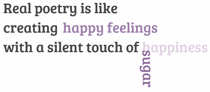
In today’s tutorial we’ll create another typography effect. The idea is to have some kind of sentence and to rotate a part of it. We’ll be “exchanging” certain words of that sentence using CSS animations.
Please note: the result of this tutorial will only work as intended in browsers that support CSS animations.
So let’s start!

In the following, we’ll be going through demo.

rotating-words-css-animations

THE HTML

We’ll have a main wrapper with a h2 heading that contains first-level spans and two divisions for the rotating words:

<section class="rw-wrapper">
	<h2 class="rw-sentence">
		<span>Real poetry is like</span>
		<br />
		<span>creating beautiful butterflies</span>
		<br />
		<span>with a silent touch of</span>
		<div class="rw-words rw-words-1">
			<span>spice</span>
			<span>colors</span>
			<span>happiness</span>
			<span>wonder</span>
			<span>sugar</span>
			<span>happiness</span>
		</div>
	</h2>
</section>

Now, ignoring the garbage placeholder text, we want each span of the rw-word to appear at a time. For that we’ll be using CSS animations. We’ll create one animation for each division and each span will run it, just with different delays.
So, let’s look at the CSS.

THE CSS3

First, we will style the main wrapper and center it on the page:

.rw-wrapper{
	width: 80%;
	position: relative;
	margin: 110px auto 0 auto;
	font-family: 'Bree Serif';
	padding: 10px;
	height: 400px;
	overflow: hidden;
}

We’ll add some text shadow to all the elements in the heading:

.rw-sentence{
	margin: 0;
	text-align: left;
	text-shadow: 1px 1px 1px rgba(255,255,255,0.8);
}

And add some specific text styling to the spans:

.rw-sentence span{
	color: #444;
	white-space: nowrap;
	font-size: 200%;
	font-weight: normal;
}

The divisions will be displayed as inline elements, that will allow us to “insert” them into the sentence without breaking the flow:

.rw-words{
	display: inline;
	text-indent: 10px;
}

Each span inside of a rw-words div will be positioned absolutely and we’ll hide any overflow:

.rw-words span{
	position: absolute;
	opacity: 0;
	overflow: hidden;
	color: #888;
	-webkit-transform-origin: 10% 75%;
	-moz-transform-origin: 10% 75%;
	-ms-transform-origin: 10% 75%;
	-o-transform-origin: 10% 75%;
	transform-origin: 10% 75%;
}

Now, we’ll run two animations. As mentioned previously, we’ll run the same animation for all the spans in one div, just with different delays:

.rw-words-1 span{
	animation: rotateWord 16s linear infinite 0s;
}
.rw-words-2 span{
    animation: rotateWordsSecond 18s linear infinite 0s;
}
.rw-words span:nth-child(2) {
	animation-delay: 3s; 
	color: #6b889d;
}
.rw-words span:nth-child(3) {
	animation-delay: 6s; 
	color: #6b739d;	
}
.rw-words span:nth-child(4) {
	animation-delay: 9s; 
	color: #7a6b9d;
}
.rw-words span:nth-child(5) {
	animation-delay: 12s; 
	color: #8d6b9d;
}
.rw-words span:nth-child(6) {
	animation-delay: 15s; 
	color: #9b6b9d;
}

Our animations will run one cycle, meaning that each span will be shown once for three seconds, hence the delay value. The whole animation will run 6 (number of images) * 3 (appearance time) = 18 seconds.
We will need to set the right percentage for the opacity value (or whatever makes the span appear). Dividing 6 by 18 gives us 0.333… which would be 33% for our keyframe step. Everything that we want to happen to the span needs to happen before that. So, after tweaking and seeing what fits best, we come up with the following animation (Fade in and “fall”) for the first words:

@keyframes rotateWord {
    0% { opacity: 0; }
    5% { opacity: 1; }
    17% { opacity: 1; transform: rotate(0deg); }
	19% { opacity: 1; transform: rotate(98deg); }
	21% { opacity: 1; transform: rotate(86deg); }
	23% { opacity: 1; transform: translateY(85px) rotate(83deg); }
	25% { opacity: 0; transform: translateY(170px) rotate(80deg); }
	80% { opacity: 0; }
    100% { opacity: 0; }
}

We’ll fade in the span and we’ll also animate its height.
The animation for the words in the second div will fade in and animate their width. We added a bit to the keyframe step percentages here, because we want these words to appear just a tiny bit later than the ones of the first word:

@keyframes rotateWordsSecond {
    0% { opacity: 1; animation-timing-function: ease-in; width: 0px; }
    10% { opacity: 0.3; width: 0px; }
    20% { opacity: 1; width: 100%; }
    27% { opacity: 0; width: 100%; }
    100% { opacity: 0; }
}

css3-animations-rotating-words

And that’s it folks! There are many possibilities for the animations, you can check out the demo and see what can be applied!
I hope you enjoyed this tutorial and find it inspiring!
view demo


Posted by: Dhiraj kumar

Top 10 Reasons to Start Using HTML5 Right Now…

So you’re still not using HTML5, huh? I guess you probably have your reasons; it’s not fully adopted yet, it doesn’t work in IE, you don’t like users, you’re out of touch or you are just passionately in love with writing strict XHTML code. HTML5 is the revolution that the web needed and the fact is, it is the future whether you like it or not — suck it up and deal. HTML5 isn’t hard to use or understand and even though it’s not fully adopted yet, there are still plenty of reasons to start using it right now — like right after you get done reading this article.

html5-reasons

There are lots of articles touting the use of HTML5 and praising the benefits of it, yes this is another one of those. With all these articles, with Apple pushing it, with Adobe building new dev products around it, and with so many web sites devoted to it, I still talk to fellow designers and developers who haven’t or won’t adopt it for a variety of reasons. I think the main problem is, it still seems like a mysterious creature to many. To many it feels more like the jet pack or the flying car — an awesome idea that is fun to think about but still not practical in its use. Wrong, the reality is that it is extremely practical right now! It’s not the latest Mercedes concept car being towed around form car show to car show, it’s a reality and it’s not going anywhere.

In order to further demystify HTML5 and help these knuckle dragging designers and developers to jump on the bandwagon I’ve put together a top ten list of reasons why we should all be using HTML5 right now. For those that currently use HTML5 this list may not be anything new or ground breaking, but hopefully it will inspire you to share the benefits of HTML5 with others in the community. We’ll do this Letterman countdown style (minus the celebrity presenter) and start with number ten – accessibility.

10 – ACCESSIBILITY

HTML5 makes creating accessible sites easier for two main reasons: semantics and ARIA. The new (some currently available) HTML headings like <header>, <footer>, <nav>, <section>, <aside>, etc. allow screen readers to easily access content. Before, your screen readers had no way to determine what a given <div> was even if you assigned it an ID or Class. With new semantic tags screen readers can better examine the HTML document and create a better experience for those who use them.

ARIA is a W3C spec that is mainly used to assign specific “roles” to elements in an HTML document – essentially creating important landmarks on the page: header, footer, navigation or article, via role attributes. This has been well overlooked and widely under-used mostly due to the fact that it wasn’t valid, however, HTML5 will validate these attributes. Also, HTML5 will have built in roles that can’t be over-ridden making assigning roles a no brainer. For a more in depth discussion on HTML5 and ARIA please visit the WAI.

9 – VIDEO AND AUDIO SUPPORT

Forget about Flash Player and other third party media players, make your videos and audio truly accessible with the new HTML5 <video> and <audio> tags. Getting your media to play correctly has always been pretty much a nightmare, you had to use the and <object> tags and assign a huge list of parameters just to get the thing visible and working correctly. Your media tags just become these nasty, huge chunks of confusing code segments. HTML5′s video and audio tags basically treat them as images; <video src=”url”/>. But what about all those parameters like height, width and autoplay? No worries my good man, just define those attributes in the tag just like any other HTML element: <video src=”url” width=”640px” height=”380px” autoplay/>.

It’s actually that dead simple, however because old evil browsers out there don’t like our HTML5 friend, you’ll need to add a little bit more code to get them working correctly… but this code isn’t nearly as gnarly and messy as the <object> and tags:

<video poster="myvideo.jpg" controls>
 <source src="myvideo.m4v" type="video/mp4" />
 <source src="myvideo.ogg" type="video/ogg" />
</video>

Some resources worth checking out:

8 – DOCTYPE

doctype html

<!DOCTYPE html>

Yup that’s it, that is the doctype, nothing more, nothing less. Pretty simple right? No more cutting and pasting some long unreadable line of code and no more dirty head tags filled with doctype attributes. You can simply and easily type it out and be happy. The really great thing about it though, beyond the simplicity, is that it works in every browser clear back to the dreaded IE6.

7 – CLEANER CODE

If you are passionate about simple, elegant, easy to read code then HTML5 is the beast for you. HTML5 allows you to write clear and descriptive code, semantic code that allows you to easily separate meaning from style and content. Consider this typical and simple header code with navigation:

<div id="header">
<h1>Header Text</h1>
<div id="nav">
<ul>
<li><a href="#">Link</a></li>
</ul>
</div>
</div>

So this code is pretty clean and simple? But with HTML5 you can clean this up even more and at the same time give your markup more meaning:

<header>
 <h1>Header Text</h1>
 <nav>
  <ul>
   <li><a href="#">Link</a></li>
   <li><a href="#">Link</a></li>
   <li><a href="#">Link</a></li>
  </ul>
 </nav>
</header>

With HTML5 you can finally cure your “divitis” and “classitis” by using semantic and HTML headers to describe your content. Previously you would generally just use div’s for every block of content than drop an id or class on it to describe its content but with the new <section>, <article>, <header>, <footer>, <aside> and <nav> tags, HTML5 allows you to code your markup cleaner as well as keep your CSS better organized and happier.

Some resources worth checking out:

6 – SMARTER STORAGE

One of the coolest things about HTML5 is the new local storage feature. It’s a little bit of a cross between regular old cookies and a client-side database. It’s better than cookies because it allows for storage across multiple windows, it has better security and performance and data will persist even after the browser is closed. Because it’s essentially a client side data base you don’t have to worry about the user deleting cookies and it is been adopted by all the popular browsers.

Local storage is great for many things, but it’s one of HTML5 tools that are making web apps possible without third party plugins. Being able to store data in the user’s browser allows you to easily create those app features like: storing user information, the ability to cache data, and the ability to load the user’s previous application state. If you are interested in getting started with local storage, check out Christian Heilmann’s great 24 Ways article from last year —Wrapping Things Nicely with HTML5 Local Storage.

Some more resources worth checking out:

5 – BETTER INTERACTIONS

Awe, we all want better interactions, we all want a more dynamic website that responds to the user and allows the user to enjoy/interact your content instead of just look at it. Enter <canvas>, the drawing HTML5 tag that allows you to do most (if not more) interactive and animated possibilities than the previous rich internet application platforms like Flash.

Beyond <canvas>, HTML5 also comes with a slew of great APIs that allow you to build a better user experience and a beefier, more dynamic web application — here’s a quick list of native APIs:

  • Drag and Drop (DnD)
  • Offline storage database
  • Browser history management
  • document editing
  • Timed media playback

For way more info on these APIs and more native interactive features of HTML5 visit HTML5Doctor.

Some resources worth checking out:

4 – GAME DEVELOPMENT

Yup, that is correct, you can develop games using HTML5′s <canvas> tag. HTML5 provides a great, mobile friendly way to develop fun, interactive games. If you’ve built Flash games before, you’ll love building HTML5 games.

Script-Tutorials has recently offered a four part series of lessons focused on HTML5 game development, head on over and check out some of the sick stuff they have created:

Some more resources worth checking out:

3 – LEGACY/CROSS BROWSER SUPPORT

modern browsers support

Your modern, popular browsers all support HTML5 (Chrome, Firefox, Safari IE9 and Opera) and the HTML5 doctype was created so that all browsers, even the really old and annoying ones, er, IE6 can use it. But just because old browsers recognize the doctype that doesn’t mean they can use all the new HTML5 tags and goodies. Fortunately, HTML5 is being built to make things easier and more cross browser friendly so in those older IE browsers that don’t like the new tags we can just simply add a Javascript shiv that will allow them to use the new elements:

<!--[if lt IE 9]>
<script src="http://html5shiv.googlecode.com/svn/trunk/html5.js"></script>
<![endif]-->

Some resources worth checking out:

2 – MOBILE, MOBILE, MOBILE

Call it a hunch, but I think mobile technology is becoming more popular these days. I know, that is a pretty crazy assumption and some of your are probably thinking — mobile is just a fad… right. Mobile devices are taking over the world. The adoption of mobile devices continues to grow very rapidly and this means that more and more users will be using their mobile browsers to view your web site or application. HTML5 is the most mobile ready tool for developing mobile sites and apps. With Adobe announcing the death of mobile Flash, you will now count on HTML5 to do your mobile web application development.

Mobile browsers have fully adopted HTML5 so creating mobile ready projects is as easy as designing and constructing for their smaller touch screen displays — hence the popularity of Responsive Design. There are some great meta tags that also allow you to optimize for mobile:

  • Viewport: allows you to define viewport widths and zoom settings
  • Full screen browsing: IOS specific values that allow Apple devices to display in full screen mode
  • Home Screen Icons: like favicons on desktop, these icons are used to add favorites to the home screen of an IOS and Android mobile device

For more info on how to mobilize your site via HTML5, check out “Mobifying” Your HTML5 Site.

Some resources worth checking out:

1 – IT’S THE FUTURE, GET WITH IT!

The number one reason why you should start using HTML5 today is this: it’s the future, start using it now so you don’t get left behind. HTML5 is not going anywhere and as more and more elements get adopted more and more companies will start to develop in HTML5. HTML5 is essentially just HTML, it’s not scary, it’s not anything you really need to figure out or relearn — if you’re developing XHTML strict right now you are already developing in HTML5 so why not take full advantage of it’s current capability?

You really don’t have any excuses not to adopt HTML5 and begin your new love affair with it. Truly, the only real reason I prefer to use HTML5 is just to write cleaner code, all the other benefits and fun features I haven’t even really jumped into yet, but that is the great thing about it, you can just start using it right now and not even change the way you design. So, start using it right now, whether you are just simplifying and making your markup more semantic OR you are gonna build some sick new mobile game that will take over the world — who knows, maybe you can start selling stuffed animal versions of your gaming characters too.

GREAT HTML5 RESOURCES

http://html5doctor.com
http://html5rocks.com
http://html5weekly.com
http://www.remysharp.com
http://www.script-tutorials.com

Posted by: Dhiraj kumar

Animated 3D Bouncing Ball with CSS3, Html5

Hi guys! Today we are going to see another great example of how to use the power of CSS3. We will start by creating a very cool and realistic 3D ball with pure CSS3 properties, and add a little CSS3 animations for giving the ball a “bouncing” effect.

Please note: the result of this tutorial will only work as intended in browsers that support the respective CSS properties (gradient, shadow, border-radius, keyframe animation).css-3d-bouncing-ball

THE HTML

Let’s start with some very basic HTML:

<div id="ballWrapper">
     <div id="ball"></div>
     <div id="ballShadow"></div>
</div>

What we have here are 3 simple DIV elements. “#ballWrapper” is the main DIV which wraps the ball. This DIV will determine the ball’s position and height on the screen. Next, we have the “#ball” element which is the ball markup, and finally there is the “#ballShadow” which holds the ball’s shadow separately from the ball itself.

THE CSS

First, we’ll want to set a basic width and height to our ‘#ballWrapper’ DIV. It will help us position it to the center of the screen:

#ballWrapper {
    width: 140px;
    height: 300px;
    position: fixed;
    left: 50%;
    top: 50%;
    margin: -150px 0 0 -70px;
}

Note that I gave the DIV both top and left position properties of  ‘50%’, and a negative top and left margin which is calculated to be exactly half of the original height and width of the DIV. That way we can center the ball on the screen.

Next in line, let’s give our ball some styles (grow up, it’s not that funny… :])

#ball {
    width: 140px;
    height: 140px;
    border-radius: 70px;
    background: linear-gradient(top,  rgba(187,187,187,1) 0%,rgba(119,119,119,1) 99%);
    box-shadow: inset 0 -5px 15px rgba(255,255,255,0.4), 
                inset -2px -1px 40px rgba(0,0,0,0.4), 
                0 0 1px #000;   
}

We are giving the ball equal width and height and a ‘border-radius‘ property with a value of  ’70px’ (which is half of the original width and height we’ve set) so it will be a ball and not an oval shape.

Another thing you’ll notice is the background. I gave the ball’s element a linear background and 3 different box shadow levels so it would get the 3D effect. The first box shadow level is for the dark shadowing at the bottom of the ball (see image). Then, we have the second level that is responsible for the blurry glow – again, at the bottom of the ball. Finally the third level is a hardly noticeable blurry shadow behind the contours of the ball.

If you take a look at the ball you’ll notice that there is another small oval shape on top of the ball that gives it a reflection effect. Here is how I created it:

#ball::after {
    content: "";
    width: 80px; 
    height: 40px; 
    position: absolute;
    left: 30px;
    top: 10px;  
    background: linear-gradient(top,  rgba(232,232,232,1) 0%,rgba(232,232,232,1) 1%,rgba(255,255,255,0) 100%);
    border-radius: 40px / 20px; 
}

I used the CSS pseudo element ::after and gave it a linear gradient with an opacity. In addition, I’ve set the border radius to  ’40px / 20px’ so it has an oval shape.
Next, let’s handle the ball’s shadow:

#ballShadow {
    width: 60px;
    height: 75px;
    position: absolute;
    z-index: 0;
    bottom: 0;
    left: 50%;
    margin-left: -30px;
    background: rgba(20, 20, 20, .1);
    box-shadow: 0px 0 20px 35px rgba(20,20,20,.1);
    border-radius: 30px / 40px; 
}

view demo

Again, I used the same properties for centering the shadow, but this time I pinned it to the bottom of ‘#ballWrapper’. I also added a semi-transparent background to it, a fitting box shadow and a border radius.

THE BOUNCING ANIMATION

Now let’s take a look at the fun stuff…

I’ll start by adding the animation property to our ball:

#ball {
    animation: jump 1s infinite;
}

All I did was to define the animation’s name (jump), the animation’s duration (1 second) and how many times the animation will happen – in our case we use ‘infinite’ which means that it will run forever.
The animation itself:

@keyframes jump {
    0% {
        top: 0;
    }
    50% {
        top: 140px;
        height: 140px;
    }
    55% {
        top: 160px; 
        height: 120px; 
        border-radius: 70px / 60px;
    }
    65% {
        top: 120px; 
        height: 140px; 
        border-radius: 70px;
    }
    95% {
        top: 0;
    }
    100% {
        top: 0;
    }
}

So, basically what I’m doing here is to play with the ‘top’ position property of the ball.  Starting from 0, through 160 and back to 0. You’ll notice that in the middle of the animation I’m also playing with the ‘border-radius’ property – that way I handle the “impact” of the ball on the ground.

And now the ball’s shadow; first let’s add the shadow’s relevant animation property:

#ballShadow {
    animation: shrink 1s infinite;
}

I used the same values that I used with the ball, only with a different keyframes animation called shrink which looks as follows:

@-keyframes shrink {
    0% {
        bottom: 0;
        margin-left: -30px;
        width: 60px;
        height: 75px;
        background: rgba(20, 20, 20, .1);
        box-shadow: 0px 0 20px 35px rgba(20,20,20,.1);
        border-radius: 30px / 40px;
    }
    50% {
        bottom: 30px;
        margin-left: -10px;
        width: 20px;
        height: 5px;
        background: rgba(20, 20, 20, .3);
        box-shadow: 0px 0 20px 35px rgba(20,20,20,.3);
        border-radius: 20px / 20px;
    }
    100% {
        bottom: 0;
        margin-left: -30px;
        width: 60px;
        height: 75px;
        background: rgba(20, 20, 20, .1);
        box-shadow: 0px 0 20px 35px rgba(20,20,20,.1);
        border-radius: 30px / 40px;
    }
}

In the shadow’s animation I played with different properties then in the ball’s animation. In order to give it all a realistic effect when it comes to the ball’s distance from the floor, I needed to animate the shadow width, height and opacity. While the ball is close to the floor, the shadow needs to be darker and smaller. When the ball jumps up, the shadow should be lighter and bigger.

Last, but not least, let’s add the “click effect” to the ball which makes it appear as if it moves away from us when we click and hold. To achieve this effect, all we have to use is the ‘:active’ pseudo-class, add a transition and play with the CSS3 transform ‘scale’ property like this:

#ballWrapper {
    transform: scale(1);
    transition: all 5s linear 0s;
}

#ballWrapper:active {
    transform: scale(0);
}

The transition from a transform value of scale(1) to scale(0) will make it look as if the element is moving away from you.

view demo

That’s it!

I hope you enjoyed this article and if you have questions, comments, or suggestions, let me know! Thanks for reading.

Posted by: Dhiraj kumar