Animated bubbles upwards continuously with pure CSS

Here is a pure CSS experimental work to create floating bubbles without using JavaScript. These animated bubbles are also with popping effect. All these animation is created by Pure CSS.

For our little demo, we use a simple image for the conical flask and then create the bubbles entirely with markup and CSS. read more @ http://www.css-jquery-design.com/…

Animated bubbles upwards continuously with pure CSS

The HTML

<div id="beaker">
  <span class="bubble">
    <span class="glow"> </span>
  </span>
</div>

With our bubbles all made, now we need them to act like bubbles. We could use JavaScript but that’s no fun. Just use CSS! read more @ http://www.css-jquery-design.com/…read-more-button

CSS3 Modal Window Popups – sliding forms with fancybox effect

Today, I will describe you how to create cool CSS3 modal popup windows (or boxes). Literally, not so long ago, in order to achieve such effects, we used jQuery. But, as it turned out, CSS3 has all the necessary tools for making modal windows too. In our demonstration I have prepared single page with two popup elements: join form and login form. Welcome to test results (domo) and understand how it was made. read more @ http://www.css-jquery-design.com/…

css3-modal-window-popup

HTML

First, lets create the main HTML markup. As you can see – the structure is quite easy. Here are one panel with buttons and two popups. Each of them contains own overlay DIV element and popup DIV element with some content inside and ‘close’ button.  read more @ http://www.css-jquery-design.com/…

read-more-button

Animated Color wheel spinning with CSS3 Keyframes animation, Transform and Transition

I have done some experimental work to create CSS3 Animation without using JavaScript. I end up creating some animations using CSS3 Keyframes and Transform and like to share. I have done this animation using border-color tricks and CSS Transform: i.e. CSS scale and CSS3 rotation.

Note: Before going I like to make something clear, Internet Explorer 10, Firefox, and Opera supports the @keyframes rule and animation property. Chrome and Safari requires the prefix -webkit- in css.

Important: Internet Explorer 9, and earlier versions, does not support the @keyframe rule or animation property.

css3-keyframes-color-wheel-animation

The HTML

<div id="colorWheel">
    <span class="color01"></span>
    <span class="color02"></span>
    <span class="color03"></span>
    <span class="color04"></span>
    <span class="color05"></span>
    <span class="color06"></span>
    <span class="color07"></span>
    <span class="color08"></span>
    <span class="color09"></span>
    <span class="color10"></span>
</div>

The CSS

Now, We will use some CSS Technique using border-color tricks and CSS3 rotation. I have created this color cycle without using any image.  I have done a cool rotating wheel animation  using @keyframes animation.

#colorWheel {
    height: 100px;
    width: 100px;
    margin: 40px auto ;
    position: absolute; left:10%;
    -webkit-transform-origin: 50px 150px;
    -moz-transform-origin: 50px 150px;
    -ms-transform-origin: 50px 150px;
    -o-transform-origin: 50px 150px;
    transform-origin: 50px 150px;
    -webkit-transition: all 0.5s linear;
    -moz-transition: all 0.5s linear;
    -ms-transition: all 0.5s linear;
    -o-transition: all 0.5s linear;
    transition: all 0.5s linear;
    animation: wheel 10s ease-in-out infinite alternate;
    -moz-animation: wheel 10s ease-in-out infinite alternate;
    -webkit-animation: wheel 10s ease-in-out infinite alternate;
    -ms-animation: wheel 10s ease-in-out infinite alternate;
}

@keyframes wheel{
    0%{
    opacity:1;
    left:-10%;
    transform:scale(.6) rotate(0deg);
}
50%{
    opacity:.7}
100%{
    left: 90%;
    opacity:1;
    transform:scale(1) rotate(2160deg);
}
}
@-webkit-keyframes wheel{
    0%{
    opacity:1;
    left:-10%;
    -webkit-transform:scale(.6) rotate(0deg);
}
50%{
    opacity:.7;}
100%{
    left: 90%;
    opacity:1;
    -webkit-transform:scale(1) rotate(2160deg);
}
}
@-moz-keyframes wheel{
0%{
    opacity:1;
    left:-10%;
    -moz-transform:scale(.6) rotate(0deg);
}
50%{
    opacity:.7;}
100%{
    left: 90%;
    opacity:1;
    -moz-transform:scale(1) rotate(2160deg);
}
}
@-ms-keyframes wheel{
0%{
    opacity:1;
    left:-10%;
    -ms-transform:scale(.6) rotate(0deg);
}
50%{
    opacity:.7;}
100%{
    left: 90%;
    opacity:1;
    -ms-transform:scale(1) rotate(2160deg);
}
}

#colorWheel:hover {}
#colorWheel span {
    position: absolute;
    -webkit-transform-origin: 50% 50%;
    border-style: solid;
    border-width: 150px 50px;
    box-sizing: border-box;
}
#colorWheel span.color01 {
    -webkit-transform: rotate(0deg);
    -moz-transform: rotate(0deg);
    -ms-transform: rotate(0deg);
    -o-transform: rotate(0deg);
    transform: rotate(0deg);
    border-color: #43a1cd transparent transparent transparent;
}
#colorWheel span.color02 {
    -webkit-transform: rotate(36deg);
    -moz-transform: rotate(36deg);
    -ms-transform: rotate(36deg);
    -o-transform: rotate(36deg);
    transform: rotate(36deg);
    border-color: #639b47 transparent transparent transparent;
}
#colorWheel span.color03 {
    -webkit-transform: rotate(72deg);
    -moz-transform: rotate(72deg);
    -ms-transform: rotate(72deg);
    -o-transform: rotate(72deg);
    transform: rotate(72deg);
    border-color: #9ac147 transparent transparent transparent;
}
#colorWheel span.color04 {
    -webkit-transform: rotate(108deg);
    -moz-transform: rotate(108deg);
    -ms-transform: rotate(108deg);
    -o-transform: rotate(108deg);
    transform: rotate(108deg);
    border-color: #e1e23b transparent transparent transparent;
}
#colorWheel span.color05 {
    -webkit-transform: rotate(144deg);
    -moz-transform: rotate(144deg);
    -ms-transform: rotate(144deg);
    -o-transform: rotate(144deg);
    transform: rotate(144deg);
    border-color: #f7941e transparent transparent transparent;
}
#colorWheel span.color06 {
    -webkit-transform: rotate(180deg);
    -moz-transform: rotate(180deg);
    -ms-transform: rotate(180deg);
    -o-transform: rotate(180deg);
    transform: rotate(180deg);
    border-color: #ba3e2e transparent transparent transparent;
}
#colorWheel span.color07 {
    -webkit-transform: rotate(216deg);
    -moz-transform: rotate(216deg);
    -ms-transform: rotate(216deg);
    -o-transform: rotate(216deg);
    transform: rotate(216deg);
    border-color: #9a1d34 transparent transparent transparent;
}
#colorWheel span.color08 {
    -webkit-transform: rotate(252deg);
    -moz-transform: rotate(252deg);
    -ms-transform: rotate(252deg);
    -o-transform: rotate(252deg);
    transform: rotate(252deg);
    border-color: #662a6c transparent transparent transparent;
}
#colorWheel span.color09 {
    -webkit-transform: rotate(288deg);
    -moz-transform: rotate(288deg);
    -ms-transform: rotate(288deg);
    -o-transform: rotate(288deg);
    transform: rotate(288deg);
    border-color: #272b66 transparent transparent transparent;
}
#colorWheel span.color10 {
    -webkit-transform: rotate(324deg);
    -moz-transform: rotate(324deg);
    -ms-transform: rotate(324deg);
    -o-transform: rotate(324deg);
    transform: rotate(324deg);
    border-color: #2d559f transparent transparent transparent;
}
#colorWheel:before {
    content: "";
    width: 300px;
    height: 300px;
    overflow: hidden;
    position: absolute;
    top: -30px;
    left: -130px;
    border-radius: 100%;
    border: 30px solid #ffffff;
    z-index: 100;
    box-shadow:0px 0px 2px 12px rgba(180,180,180,.5)
}
#colorWheel:after {
    content: "";
    width: 100px;
    height: 100px;
    overflow: hidden;
    position: absolute;
    top: 100px;
    left: 0px;
    border-radius: 100%;
    box-shadow:0px 0px 2px 12px rgba(250,250,250,.5);
    background: #444 url(Dhiraj.png); background-size:contain
}

view demo

Your turn

I had already posted some articles of css3 @keyframes animation examples.  Please check some of these beautiful animation with demo below:

I hope you enjoyed this article and the techniques I used. Please share your comments and questions below!

Posted by: Dhiraj kumar

Pure CSS3 Animated Polaroid Gallery

Normally, Polaroid Gallery is a CSS3 & jQuery Image Gallery plugin for Media Library. It is used to overlay images as Polaroid pictures on the current page or post.

It’s a sure thing that CSS3 features like transitions, animations and transforms can add extra spice to your designs. In this article you will see how you can build an awesome CSS3 animated  Polaroid pictures gallery with some of these cool features.  This is something I wished to do for a while and I finally made it.css3-animated-polaroid-gallery

The HTML

The HTML structure hasn’t changed at all, simple and minimal. Here’s an excerpt:

<div class="photo-album">
<h2>Dhiraj, Geetu & Atharv at Taj ↦ Agra
  <a class="large polaroid img1" href="#"> 
    <img alt="" src="https://lh3.googleusercontent.com/-73u0oSgSX0w/UQ6PZ0Z1wOI/AAAAAAAADPE/57bc9C0BEG0/s512/Agra-trip%252520112.JPG" /> 
    Camel wants to kiss Atharv. </a> 
  <a class="polaroid img2" href="#"> 
    <img alt="" src="https://lh4.googleusercontent.com/-cPFum21LNBA/UQ6PXyb2ISI/AAAAAAAADPM/kJLhIyvx_2k/s512/Agra-trip%252520147.JPG" /> 
    My dearest one.. Atharv with Geetu. — at Taj Mahal</a> 
  <a class="small polaroid img3" href="#"> 
    <img alt="" src="https://lh6.googleusercontent.com/-Bz8NR-oKxGw/UQ6PguAxrsI/AAAAAAAADNY/B7i8X02vnbg/s512/Agra-trip%252520153.JPG" /> 
    Ferntastic</a> 
  <a class="medium polaroid img4" href="#"> 
    <img alt="" src="https://lh4.googleusercontent.com/-gB3RNt_3aos/UQ6Pmx5egoI/AAAAAAAADKM/lensH9ojFd0/s512/Agra-trip%252520154.JPG" /> 
    My dearest one.. Atharv with Geetu. — at Taj Mahal</a> 
  <a class="polaroid img5" href="#"> 
    <img alt="" src="https://lh5.googleusercontent.com/-YbVIBYilZ-M/UQ6P0w2PC8I/AAAAAAAADNc/kKzFy9k51D8/s512/Agra-trip%252520170.JPG" /> 
    Atharv & Geetu with Dhiraj.. Taj in background</a> 
  <a class="polaroid img6" href="#"> 
    <img alt="" src="https://lh6.googleusercontent.com/-IedPhDIDTcg/UQ6P5NG_hSI/AAAAAAAADKw/frG26WPd_OY/s512/Agra-trip%252520175.JPG" /> 
    Atharv in a cute pose.. Taj mahal in background</a> 
  <a class="polaroid img7" href="#"> 
    <img alt="" src="https://lh6.googleusercontent.com/-fhOKmDe-6S4/UQ6QBnHRDhI/AAAAAAAADPw/StGk4el6PVI/s512/Agra-trip%252520192.JPG" /> 
    Atharv with his papa Dhiraj</a> 
  <a class="small polaroid img8" href="#"> 
    <img alt="" src="https://lh4.googleusercontent.com/-lUXHF4hGxak/UQ6QF_7iZnI/AAAAAAAADOs/-agtNNnnYbU/s512/Agra-trip%252520193.JPG" /> 
    awesome</a> 
  <a class="medium polaroid img9" href="#"> 
    <img alt="" src="https://lh3.googleusercontent.com/-a-kezOzwNR8/UQ6QNJpEa4I/AAAAAAAADNk/FAN4Z3LDy2Y/s512/Agra-trip%252520206.JPG" /> 
    Geetu with Dhiraj</a> 
  <a class="polaroid img10" href="#"> 
    <img alt="" src="https://lh6.googleusercontent.com/-J3Gcspy0HKg/UQ6QXk3ZV9I/AAAAAAAADQE/0PyQD_VvC8o/s512/Agra-trip%252520221.JPG" /> 
    Nice one..</a> 
  <a class="small polaroid img11" href="#"> 
    <img alt="" src="https://lh5.googleusercontent.com/-OLpIvUAwZ6E/UQ6QY9gnPwI/AAAAAAAADNo/00eTz4E3_GI/s512/Agra-trip%252520223.JPG" /> 
    Sulphurous</a> 
  <a class="small polaroid img12" href="#"> 
    <img alt="" src="https://lh6.googleusercontent.com/-V-NJ8w3N5hs/UQ6QYqtZVOI/AAAAAAAADOw/FcjS2sgQXxA/s512/Agra-trip%252520229.JPG" /> 
    Atharv with his papa..</a> <a class="small polaroid img13" href="#"> 
    <img alt="" src="https://lh4.googleusercontent.com/-W1T4Z6_xwlQ/UQ6QAdQwuzI/AAAAAAAADNg/vSiGaoo7_TU/s512/Agra-trip%252520188.JPG" /> 
    Atharv with his papa Dhiraj</a> 
  <a class="small polaroid img14" href="#"> 
    <img alt="" src="https://lh6.googleusercontent.com/-Bz8NR-oKxGw/UQ6PguAxrsI/AAAAAAAADNY/B7i8X02vnbg/s512/Agra-trip%252520153.JPG" /> 
    Nice one..</a> 
  <a class="polaroid img15" href="#"> 
    <img alt="" src="https://lh4.googleusercontent.com/-W1T4Z6_xwlQ/UQ6QAdQwuzI/AAAAAAAADNg/vSiGaoo7_TU/s512/Agra-trip%252520188.JPG" /> 
    Atharv with his papa Dhiraj</a> 
</div>

CSS

a.polaroid {
		display: block;
		text-decoration: none;
		color: #333;
		padding: 10px 10px 20px 10px;
		width: 150px;
		border: 1px solid #d7d7d7;
		background-color: white; background:rgba(255,255,255,.9);
		z-index: 2;
		font-size: 0.7em;
		-webkit-box-shadow: 2px 2px 4px rgba(0,0, 0, 0.3),inset 0 0 0.7em rgba(0,0, 0, 0.4);;
		-moz-box-shadow: 2px 2px 4px rgba(0,0, 0, 0.3),inset 0 0 0.7em rgba(0,0, 0, 0.4);;
		box-shadow: 2px 2px 4px rgba(0,0, 0, 0.3),inset 0 0 0.7em rgba(0,0, 0, 0.4);-webkit-filter: blur(1px); border-radius:5px;
		-webkit-transition: all 0.5s ease-in; text-align:center
	}
	a.polaroid:hover, a.polaroid:focus, a.polaroid:active {
		z-index: 999;
		border-color: #999;
		-webkit-box-shadow: 15px 15px 20px rgba(0,0, 0, 0.4),inset 0 0 0.7em rgba(0,0, 0, 0.4);
		-moz-box-shadow: 15px 15px 20px rgba(0,0, 0, 0.4),inset 0 0 0.7em rgba(0,0, 0, 0.4);
		box-shadow: 15px 15px 20px rgba(0,0, 0, 0.4),inset 0 0 0.7em rgba(0,0, 0, 0.4);
		-webkit-transform: rotate(0deg) scale(1.05);
		-moz-transform: rotate(0deg) scale(1.05);
		transform: rotate(0deg) scale(1.05);-webkit-filter: blur(0px);
	}
	.polaroid img {
		margin: 0 0 15px;
		width: 150px;
		height: 120px;
	}

	a img {
		border: none;
		display: block;
	}

	.photo-album {
		position: relative; width: 80%; margin: 0 auto; max-width: 70em; height: 450px; margin-top:2.5em; min-width: 800px; max-width: 900px;
	}
	.photo-album .polaroid {
		position: absolute;
	}
	.photo-album h2 {
		position: absolute; z-index: 5; top: 150px; text-align: center; width: 100%; line-height: 2; 
	}
	.photo-album h2 span {
		background-color: white; background:rgba(255,255,255,.8);
		font-family: 'Satisfy', cursive;
		padding: 0.4em 0.8em 0.3em 0.8em;
		-webkit-box-shadow: 2px 2px 4px rgba(0,0, 0, 0.3);
		-moz-box-shadow: 2px 2px 4px rgba(0,0, 0, 0.3);
		box-shadow: 2px 2px 4px rgba(0,0, 0, 0.3);
		border-radius: 5px; border:1px solid #CCC
	}
	.photo-album .small {
		width: 75px; padding: 6px 6px 12px 6px; font-size: 0.6em;
	}
	.photo-album .small img {
		width: 75px; height: 60px;
	}
	.photo-album .medium {
		width: 200px; padding: 13px 13px 26px 13px; font-size: 0.8em;
	}
	.photo-album .medium img {
		width: 200px; height: 165px;
	}
	.photo-album .large {
		width: 300px; padding: 20px 20px 30px 20px; font-size: 1em;
	}
	.photo-album .large img {
		width: 300px; height: 250px
	}
	.photo-album .img1 {
		bottom: 10px; right: 365px; 
		-webkit-transform: rotate(10deg);
		-moz-transform: rotate(10deg);
		transform: rotate(10deg);
	}
	.photo-album .img2 {
		top: 50px; right: 20px;
		-webkit-transform: rotate(-4deg);
		-moz-transform: rotate(-4deg);
		transform: rotate(-4deg);
	}
	.photo-album .img3 {
		left: 400px; top: 0;
		-webkit-transform: rotate(-5deg);
		-moz-transform: rotate(-5deg);
		transform: rotate(-5deg);
	}
	.photo-album .img4 {
		top: 10px; left: 495px;
		-webkit-transform: rotate(-20deg);
		-moz-transform: rotate(-20deg);
		transform: rotate(-20deg);
	}
	.photo-album .img5 {
		bottom: 0; right: 0;
		-webkit-transform: rotate(1deg);
		-moz-transform: rotate(1deg);
		transform: rotate(1deg);
	}
	.photo-album .img6 {
		bottom: 10px; right: 156px;
		-webkit-transform: rotate(6deg);
		-moz-transform: rotate(6deg);
		transform: rotate(6deg);
	}
	.photo-album .img7 {
		bottom:0; left:400px;
		-webkit-transform: rotate(-10deg);
		-moz-transform: rotate(-10deg);
		transform: rotate(-10deg);
	}
	.photo-album .img8 {
		bottom: -20px; left: 700px;
		-webkit-transform: rotate(-8deg);
		-moz-transform: rotate(-8deg);
		transform: rotate(-8deg);
	}
	.photo-album .img9 {
		bottom: 0; left: 0;
		-webkit-transform: rotate(-8deg);
		-moz-transform: rotate(-8deg);
		transform: rotate(-8deg);
	}
	.photo-album .img10 {
		top: 0; left: 20px;
		-webkit-transform: rotate(8deg);
		-moz-transform: rotate(8deg);
		transform: rotate(8deg);
	}
	.photo-album .img11 {
		top: 0; right: 0;
		-webkit-transform: rotate(-8deg);
		-moz-transform: rotate(-8deg);
		transform: rotate(-8deg);
	}
	.photo-album .img12 {
		top: 0; left: 680px;
		-webkit-transform: rotate(18deg);
		-moz-transform: rotate(18deg);
		transform: rotate(18deg);
	}
	.photo-album .img13 {
		bottom: -20px; right: 630px;
		-webkit-transform: rotate(4deg);
		-moz-transform: rotate(4deg);
		transform: rotate(4deg);
	}
	.photo-album .img14 {
		top: 90px; left: 430px;
		-webkit-transform: rotate(15deg);
		-moz-transform: rotate(15deg);
		transform: rotate(15deg);
	}
	.photo-album .img15 {
		left:176px; top:20px;
		-webkit-transform: rotate(-8deg);
		-moz-transform: rotate(-8deg);
		transform: rotate(-8deg);
	}	
	a:hover, a:focus {
		z-index: 5;
	}

view demo

Your turn

I hope you enjoyed this article and the techniques I used. Please share your comments and questions below!

Posted by: Dhiraj kumar

Cool Typography Effects With CSS3 and jQuery

Today we will create a set of nice typography effects for big headlines using CSS3 and jQuery. There are many things we can do with CSS3 animations and transitions and we’ll explore some of the possibilities.

Today we will create a set of nice typography effects for big headlines using CSS3 and jQuery. There are many things we can do with CSS3 animations and transitions and we’ll explore some of the possibilites.

We’ll be using jquery.DG_lettering.js in order to style single letters of the words we’ll be having in our big headlines.

typography-effects-with-css-jquery

THE HTML

The structure will simply be an h2 element with an anchor inside. We’ll wrap the headline in a container:

<div id="letter-container" class="letter-container">
    <h2><a href="#">Sun</a></h2>
</div>

Then we’ll call the jquery.DG_lettering.js plugin, so that every letter gets wrapped in a span.

This example looks crazy: we’ll create a text shadow that “elevates” the letters. We’ll also create a pseudo element which has a superhero as background.

THE CSS

.letter-container h2 a:before{
    content: '';
    position: absolute;
    z-index: 0;
    width: 525px;
    height: 616px;
    background: transparent url(superhero.png) no-repeat center center;
    background-size: 40%;
    top: 0px;
    left: 50%;
    margin-left: -277px;
    transition: all 0.3s ease-in-out;
}

On hover, we will animate the background size to make the superhero larger:

.letter-container h2 a:hover:before{
    background-size: 100%;
}

The span will have the text-shadow that “elevates” the letters and on hover, we will move the letter down by adding a padding and changing the shadow:

.letter-container h2 a span{
    color: #ff3de6;
    float:left;
    position: relative;
    z-index: 100;
    transition: all 0.3s ease-in-out;
    text-shadow:  
      0px -1px 3px #cb4aba, 
      0 4px 3px #934589, 
      2px 15px 5px rgba(0, 0, 0, 0.2), 
      1px 20px 10px rgba(0, 0, 0, 0.3);
}
.letter-container h2 a span:hover{
    color: #e929d0;
    padding-top: 10px;
    text-shadow:  
      0px -1px 3px #cb4aba, 
      0 4px 3px #934589, 
      1px 1px 10px rgba(0, 0, 0, 0.2);
}

And that’s it! I hope you enjoyed creating some crazy typography effects with CSS3 and jQuery!

view demo

That’s it!

I hope you enjoyed this article and if you have questions, comments, or suggestions, let me know! Thanks for reading.

Posted by: Dhiraj kumar

Animated 3D Bouncing Ball with CSS3, Html5

Hi guys! Today we are going to see another great example of how to use the power of CSS3. We will start by creating a very cool and realistic 3D ball with pure CSS3 properties, and add a little CSS3 animations for giving the ball a “bouncing” effect.

Please note: the result of this tutorial will only work as intended in browsers that support the respective CSS properties (gradient, shadow, border-radius, keyframe animation).css-3d-bouncing-ball

THE HTML

Let’s start with some very basic HTML:

<div id="ballWrapper">
     <div id="ball"></div>
     <div id="ballShadow"></div>
</div>

What we have here are 3 simple DIV elements. “#ballWrapper” is the main DIV which wraps the ball. This DIV will determine the ball’s position and height on the screen. Next, we have the “#ball” element which is the ball markup, and finally there is the “#ballShadow” which holds the ball’s shadow separately from the ball itself.

THE CSS

First, we’ll want to set a basic width and height to our ‘#ballWrapper’ DIV. It will help us position it to the center of the screen:

#ballWrapper {
    width: 140px;
    height: 300px;
    position: fixed;
    left: 50%;
    top: 50%;
    margin: -150px 0 0 -70px;
}

Note that I gave the DIV both top and left position properties of  ‘50%’, and a negative top and left margin which is calculated to be exactly half of the original height and width of the DIV. That way we can center the ball on the screen.

Next in line, let’s give our ball some styles (grow up, it’s not that funny… :])

#ball {
    width: 140px;
    height: 140px;
    border-radius: 70px;
    background: linear-gradient(top,  rgba(187,187,187,1) 0%,rgba(119,119,119,1) 99%);
    box-shadow: inset 0 -5px 15px rgba(255,255,255,0.4), 
                inset -2px -1px 40px rgba(0,0,0,0.4), 
                0 0 1px #000;   
}

We are giving the ball equal width and height and a ‘border-radius‘ property with a value of  ’70px’ (which is half of the original width and height we’ve set) so it will be a ball and not an oval shape.

Another thing you’ll notice is the background. I gave the ball’s element a linear background and 3 different box shadow levels so it would get the 3D effect. The first box shadow level is for the dark shadowing at the bottom of the ball (see image). Then, we have the second level that is responsible for the blurry glow – again, at the bottom of the ball. Finally the third level is a hardly noticeable blurry shadow behind the contours of the ball.

If you take a look at the ball you’ll notice that there is another small oval shape on top of the ball that gives it a reflection effect. Here is how I created it:

#ball::after {
    content: "";
    width: 80px; 
    height: 40px; 
    position: absolute;
    left: 30px;
    top: 10px;  
    background: linear-gradient(top,  rgba(232,232,232,1) 0%,rgba(232,232,232,1) 1%,rgba(255,255,255,0) 100%);
    border-radius: 40px / 20px; 
}

I used the CSS pseudo element ::after and gave it a linear gradient with an opacity. In addition, I’ve set the border radius to  ’40px / 20px’ so it has an oval shape.
Next, let’s handle the ball’s shadow:

#ballShadow {
    width: 60px;
    height: 75px;
    position: absolute;
    z-index: 0;
    bottom: 0;
    left: 50%;
    margin-left: -30px;
    background: rgba(20, 20, 20, .1);
    box-shadow: 0px 0 20px 35px rgba(20,20,20,.1);
    border-radius: 30px / 40px; 
}

view demo

Again, I used the same properties for centering the shadow, but this time I pinned it to the bottom of ‘#ballWrapper’. I also added a semi-transparent background to it, a fitting box shadow and a border radius.

THE BOUNCING ANIMATION

Now let’s take a look at the fun stuff…

I’ll start by adding the animation property to our ball:

#ball {
    animation: jump 1s infinite;
}

All I did was to define the animation’s name (jump), the animation’s duration (1 second) and how many times the animation will happen – in our case we use ‘infinite’ which means that it will run forever.
The animation itself:

@keyframes jump {
    0% {
        top: 0;
    }
    50% {
        top: 140px;
        height: 140px;
    }
    55% {
        top: 160px; 
        height: 120px; 
        border-radius: 70px / 60px;
    }
    65% {
        top: 120px; 
        height: 140px; 
        border-radius: 70px;
    }
    95% {
        top: 0;
    }
    100% {
        top: 0;
    }
}

So, basically what I’m doing here is to play with the ‘top’ position property of the ball.  Starting from 0, through 160 and back to 0. You’ll notice that in the middle of the animation I’m also playing with the ‘border-radius’ property – that way I handle the “impact” of the ball on the ground.

And now the ball’s shadow; first let’s add the shadow’s relevant animation property:

#ballShadow {
    animation: shrink 1s infinite;
}

I used the same values that I used with the ball, only with a different keyframes animation called shrink which looks as follows:

@-keyframes shrink {
    0% {
        bottom: 0;
        margin-left: -30px;
        width: 60px;
        height: 75px;
        background: rgba(20, 20, 20, .1);
        box-shadow: 0px 0 20px 35px rgba(20,20,20,.1);
        border-radius: 30px / 40px;
    }
    50% {
        bottom: 30px;
        margin-left: -10px;
        width: 20px;
        height: 5px;
        background: rgba(20, 20, 20, .3);
        box-shadow: 0px 0 20px 35px rgba(20,20,20,.3);
        border-radius: 20px / 20px;
    }
    100% {
        bottom: 0;
        margin-left: -30px;
        width: 60px;
        height: 75px;
        background: rgba(20, 20, 20, .1);
        box-shadow: 0px 0 20px 35px rgba(20,20,20,.1);
        border-radius: 30px / 40px;
    }
}

In the shadow’s animation I played with different properties then in the ball’s animation. In order to give it all a realistic effect when it comes to the ball’s distance from the floor, I needed to animate the shadow width, height and opacity. While the ball is close to the floor, the shadow needs to be darker and smaller. When the ball jumps up, the shadow should be lighter and bigger.

Last, but not least, let’s add the “click effect” to the ball which makes it appear as if it moves away from us when we click and hold. To achieve this effect, all we have to use is the ‘:active’ pseudo-class, add a transition and play with the CSS3 transform ‘scale’ property like this:

#ballWrapper {
    transform: scale(1);
    transition: all 5s linear 0s;
}

#ballWrapper:active {
    transform: scale(0);
}

The transition from a transform value of scale(1) to scale(0) will make it look as if the element is moving away from you.

view demo

That’s it!

I hope you enjoyed this article and if you have questions, comments, or suggestions, let me know! Thanks for reading.

Posted by: Dhiraj kumar

Random 3D Explosions, 3D clouds – Effects with CSS 3D and jQuery

Introduction

This tutorial will try to guide you through the steps to create a 3D-like, explosions in sky or billboard-based clouds. There are a few advanced topics, mainly how 3D transformations via CSS properties work. If you want to find more information, this is a nice place to begin.

If you’re in a hurry, just check the final result.

css-3d-explosive-clouds

The tutorial is divided into sections, each with a different step to understand and follow the process, with HTML, CSS and Javascript blocks. Each step is based on the previous one, and has a link to test the code. The code in the tutorial is a simplified version of the demos, but the main differences are documented on every section.

HTML

First, we need two div elements: viewport and world. All the rest of the elements will be dynamically created.

Viewport covers the whole screen and acts as the camera plane. Since in CSS 3D Transforms there is no camera per se, think of it as a static sheet of glass through which you see a world that changes orientation relative to you. We’ll position all our world objects (or scene) inside it, and that’s what will be transformed around.

World is a div that we are going to use to anchor all our 3D elements. Transforming (rotating, translating or scaling) world will transform all our elements. For brevity and from here on, I’m using non-prefixed CSS properties. Use the vendor prefix (-webkit, -moz, -o, -ms, etc.) where appropriate.

This is all the markup we’ll need:

<div id="viewport">
    <div id="world"></div>
</div>

CSS

These next are our two CSS definitions. It’s very important to center the div that contains our scene (world in our case) in the viewport, or the scene will be rendered with an offset! Remember that you are still rotating an element that is positioned inside the document, exactly like any other 2D element.

#viewport {
	-webkit-perspective: 1000; -moz-perspective: 1000; -o-perspective: 1000; 
	position: absolute; 
	left: 0; 
	top: 0; 
	right: 0; 
	bottom: 0; 
	overflow: hidden;
	background-image: linear-gradient(bottom, rgb(69,132,180) 28%, rgb(31,71,120) 64%);
	background-image: -o-linear-gradient(bottom, rgb(69,132,180) 28%, rgb(31,71,120) 64%);
	background-image: -moz-linear-gradient(bottom, rgb(69,132,180) 28%, rgb(31,71,120) 64%);
	background-image: -webkit-linear-gradient(bottom, rgb(69,132,180) 28%, rgb(31,71,120) 64%);
	background-image: -ms-linear-gradient(bottom, rgb(69,132,180) 28%, rgb(31,71,120) 64%);
	background-image: -webkit-gradient(
			linear,
			left bottom,
			left top,
			color-stop(0.28, rgb(69,132,180)),
			color-stop(0.64, rgb(31,71,120))
	);
}

#world {
	position: absolute; 
	left: 50%; 
	top: 50%; 
	margin-left: -256px; 
	margin-top: -256px; 
	height: 512px; 
	width: 512px; 
	-webkit-transform-style: preserve-3d; 
	-moz-transform-style: preserve-3d; 
	-o-transform-style: preserve-3d; 
	pointer-events: none;
}

CSS For Adding Clouds Base

Now we start adding real 3D content. We add some new div which are positioned in the space, relatively to world. It’s esentially adding several absolute-positioned div as children of world, but using translate in 3 dimensions instead of left and top. They are centered in the middle of world by default. The width and height don’t really matter, since these new elements are containers for the actual cloud layers. For commodity, it’s better to center them (by setting margin-left and margin-top to negative half of width and height).

.cloudBase {
		position: absolute; 
		left: 256px; 
		top: 256px; 
		width: 20px; 
		height: 20px; 
		margin-left: -10px; 
		margin-top: -10px
	}

CSS for Clouds Layer

Now things start getting interesting. We add several absolute-positioned .cloudLayer div elements to each .cloudBase. These will hold our cloud textures.

.cloudLayer {
		position: absolute; 
		left: 50%; 
		top: 50%; 
		width: 256px; 
		height: 256px; 
		margin-left: -128px; 
		margin-top: -128px; 
		-webkit-transition: opacity .5s ease-out; 
		-moz-transition: opacity .5s ease-out; 
		-o-transition: opacity .5s ease-out;
	}

jQuery (JavaScript)

We add generate() and createCloud() functions to populate world. Note that random_{var} are not real variables but placeholder names for the real code, which should return a random number between the specified range.

var layers = [],
	objects = [],
	textures = [],

	world = document.getElementById( 'world' ),
	viewport = document.getElementById( 'viewport' ),

	d = 0,
	p = 400,
	worldXAngle = 0,
	worldYAngle = 0,
	computedWeights = [];

	viewport.style.webkitPerspective = p;
	viewport.style.MozPerspective = p;
	viewport.style.oPerspective = p;
	textures = [
		{ name: 'white cloud', 	file: 'cloud.png'	, opacity: 1, weight: 0 },
		{ name: 'dark cloud', 	file: 'darkCloud.png'	, opacity: 1, weight: 0 },
		{ name: 'smoke cloud', 	file: 'smoke.png'	, opacity: 1, weight: 0 },
		{ name: 'explosion', 	file: 'explosion.png'	, opacity: 1, weight: 0 },
		{ name: 'explosion 2', 	file: 'explosion2.png'	, opacity: 1, weight: 0 },
		{ name: 'box', 		file: 'box.png'		, opacity: 1, weight: 0 }
	];

	function setTextureUsage( id, mode ) {
		var modes = [ 'None', 'Few', 'Normal', 'Lot' ];
		var weights = { 'None': 0, 'Few': .3, 'Normal': .7, 'Lot': 1 };
		for( var j = 0; j < modes.length; j++ ) {
			var el = document.getElementById( 'btn' + modes[ j ] + id );
			el.className = el.className.replace( ' active', '' );
			if( modes[ j ] == mode ) {
				el.className += ' active';
				textures[ id ].weight = weights[ mode ];
			}
		}
	}
	setTextureUsage( 0, 'Few' );
	setTextureUsage( 1, 'Few' );
	setTextureUsage( 2, 'Normal' );
	setTextureUsage( 3, 'Lot' );
	setTextureUsage( 4, 'Lot' );

	generate();

	function createCloud() {

		var div = document.createElement( 'div'  );
		div.className = 'cloudBase';
		var x = 256 - ( Math.random() * 512 );
		var y = 256 - ( Math.random() * 512 );
		var z = 256 - ( Math.random() * 512 );
		var t = 'translateX( ' + x + 'px ) translateY( ' + y + 'px ) translateZ( ' + z + 'px )';
		div.style.webkitTransform = t;
		div.style.MozTransform = t;
		div.style.oTransform = t;
		world.appendChild( div );

		for( var j = 0; j < 5 + Math.round( Math.random() * 10 ); j++ ) {
			var cloud = document.createElement( 'img' );
			cloud.style.opacity = 0;
			var r = Math.random();
			var src = 'troll.png';
			for( var k = 0; k < computedWeights.length; k++ ) { 
				if( r >= computedWeights[ k ].min && r <= computedWeights[ k ].max ) { 					
( function( img ) { img.addEventListener( 'load', function() {
 						img.style.opacity = .8;
					} ) } )( cloud );
 					src = computedWeights[ k ].src; 
}} 
cloud.setAttribute( 'src', src ); 
cloud.className = 'cloudLayer'; 		 			
var x = 256 - ( Math.random() * 512 ); 
var y = 256 - ( Math.random() * 512 ); 
var z = 100 - ( Math.random() * 200 ); 
var a = Math.random() * 360; 
var s = .25 + Math.random(); 
x *= .2; y *= .2; 
cloud.data = {x: x, y: y, z: z, a: a, s: s, speed: .1 * Math.random()}; 
var t = 'translateX( ' + x + 'px ) translateY( ' + y + 'px ) translateZ( ' + z + 'px ) rotateZ( ' + a + 'deg ) scale( ' + s + ' )'; 
cloud.style.webkitTransform = t; 
cloud.style.MozTransform = t; 			
cloud.style.oTransform = t; 			
div.appendChild( cloud ); 			
layers.push( cloud ); 		} 		 		
return div; 	 	
function generate() { 		
objects = []; 		
if ( world.hasChildNodes() ) { 			
while ( world.childNodes.length >= 1 ) {
				world.removeChild( world.firstChild );       
			} 
		}
		computedWeights = [];
		var total = 0;
		for( var j = 0; j < textures.length; j++ ) { 			
if( textures[ j ].weight > 0 ) {
				total += textures[ j ].weight;
			}
		}
		var accum = 0;
		for( var j = 0; j < textures.length; j++ ) { 			
if( textures[ j ].weight > 0 ) {
				var w = textures[ j ].weight / total;
				computedWeights.push( {
					src: textures[ j ].file,
					min: accum,
					max: accum + w
				} );
				accum += w;
			}
		}
		for( var j = 0; j < 5; j++ ) {
			objects.push( createCloud() );
		}
	}

Result

For the final effect, we fill cloudLayer div for an img with a cloud texture. The textures should be PNG with alpha channel to get the effect right.

css-3d-explosive-clouds

Conclusion

Of course, you can use any texture or set of textures you want: smoke puffs, plasma clouds, green leaves, flying toasters… Just change the background-image that a specific kind of cloud layer uses. Mixing different textures in different proportions gives interesting results.

Adding elements in random order is fine, but you can also create ordered structures, like trees, duck-shaped clouds or complex explosions. Try following a 3D curve and create solid trails of clouds. Create a multiplayer game to guess the shape of a 3D cloud. The possibilities are endless!

I hope it’s been an interesting tutorial and not too hard to follow.

view demo

I hope you like the result and don’t hesitate to share your thoughts about it. Thanks for reading!

Posted by: Dhiraj kumar

Creating CSS Starbursts Design with CSS3 Transform

Working with the new CSS3 rotation property I got that I could create image free starbursts. All I needed was a series of nested block-level elements each rotated by a slightly different amount. The rotation would distribute the box corners around the circumference of the star.

About these CSS3 Starbursts:

A good thing is if you create your starbursts with CSS3 you can do so much more than with images. You can experiment with different numbers of points/corners, rounded borders, resize, text-shadows and animations also.

To see the animations you will need to use latest browsers like IE 9+, Firefox 4.0+, Safari 4.1+ and Chrome 3.0+.

css-starburst-design

No CSS Hacks

There are no CSS hacks required for these CSS3 starbursts. CSS is designed to be backwards compatible so any browser that cannot understand CSS3 will simply ignore these new rules without any error.

iPhone, iPod Touch, & iPad Compatible

The Safari browser is one of the most advanced when it comes to CSS3 because it uses the powerful Webkit rendering engine. This means all these animated starbursts will work fine on the iPhone, iPod Touch and the iPad.

SEO Friendly

Because the text in each starburst is actually real text it will be crawled and indexed by Google like everything else. It also means that people who are vision impaired can more easily read and understand your web page if they are using a screen reader.

No Images Required

All of the shapes, colours and shadows in the starbursts above are created using CSS3 rules. No images are used at all.

No JavaScript Required

The animations in these demos are made possible with the CSS3 transition rules. No JavaScript is used to create any effects.

Resizable Text Compatible

All the dimensions of the starbursts are set in em measurements. This means that you can increase the text size in your browser and the starburst will grow in size along with all other text. This is great news for web accessibility.

view demo

The HTML

<div class="price-container">
  <div class="price">
    <span class="label">Buy</span>
    <span class="number">$99.95</span>
    <span class="label">Now</span>
  </div>
</div>

I have <div> that, you guessed it, contains the price starburst. I’ll use this for the background of the starburst. The <div> is the container for the text inside (the price info.) That’s it for the markup. From here, I’ll be styling pseudo classes to create the multiple points. Also, I mentioned earlier that there were a few less points in the CSS version of this starburst. This markup doesn’t really have anything unnecessary in it.

The CSS

Now on to the fun part. Let me overview what I’m going to do, then I’ll show you the styles needed to achieve it. I’m going to style .price-container.price, and the :before and:after pseudo elements for each. Essentially, I’ve got six elements to work with. I created this background image to apply to each of the elements and I will rotate 15 degrees each:

image used for starburst

The CSS is a little bit longer. I’ve used the rotation rules in the CSS, one is for Firefox (prefixed with -moz-), one is for webkit i.e. Safari and Chrome (prefixed with -webkit-), one is for Internet Explorer (prefixed with -ms-), one is for Opera (prefixed with -o-), and the other is the standard rotation rule as it will be used once this rotation property becomes standard:

.price-container,
.price-container:before,
.price-container:after,
.price-container .price,
.price-container .price:before,
.price-container .price:after {
	height: 8.5em;
	width: 8.5em;
	background: #760B1F url(price-bg.png) top left no-repeat;
	background-size: 8.5em;
}

.price-container:before,
.price-container:after,
.price-container .price:before,
.price-container .price:after {
	content: "";
	position: absolute;
}

.price-container {
	margin: 100px auto; /* Centering for demo */
	position: relative; /* Context */
	top: 2.5em;
	left: 2.5em;
	-webkit-transform: rotate(-45deg);
	  -moz-transform: rotate(-45deg);
	   -ms-transform: rotate(-45deg);
	    -o-transform: rotate(-45deg);
	       transform: rotate(-45deg);
}

.price-container:before {
	top: 0;
	left: 0;
	-webkit-transform: rotate(-30deg);
	  -moz-transform: rotate(-30deg);
	   -ms-transform: rotate(-30deg);
	    -o-transform: rotate(-30deg);
	       transform: rotate(-30deg);
}

.price-container:after {
	top: 0;
	left: 0;
	-webkit-transform: rotate(-15deg);
	  -moz-transform: rotate(-15deg);
	   -ms-transform: rotate(-15deg);
	    -o-transform: rotate(-15deg);
	       transform: rotate(-15deg);
}

.price-container .price {
	padding: .5em 0em;
	height: 7.5em; /* height minus padding */
	position: absolute;
	bottom: 0;
	right: 0;
	-webkit-transform: rotate(45deg);
	  -moz-transform: rotate(45deg);
	   -ms-transform: rotate(45deg);
	    -o-transform: rotate(45deg);
	       transform: rotate(45deg);
	z-index: 1; /* important so the text shows up */
}

.price-container .price:before {
	top: 0;
	left: 0;
	-webkit-transform: rotate(60deg);
	  -moz-transform: rotate(60deg);
	   -ms-transform: rotate(60deg);
	    -o-transform: rotate(60deg);
	       transform: rotate(60deg);
}

.price-container .price:after {
	top: 0;
	left: 0;
	-webkit-transform: rotate(75deg);
	  -moz-transform: rotate(75deg);
	   -ms-transform: rotate(75deg);
	    -o-transform: rotate(75deg);
	       transform: rotate(75deg);
}

A few things I’ll point out about the styles:

  • Notice the order of the rotation angles: This order is important because there is going to be text inside the inner-most element. Therefore, the last element (the one the text going in, in this case .price) has to be straight. Notice that .price-container is rotated -45 degrees and .price is rotated 45 degrees – back to 0.
  • The height and width: The height and width has to be set since we are dealing with background images here. I’ve set it in ems to adjust appropriately when the text size increases.
  • There’s a padding top and bottom on .price-container .price. That’s why the height is a little different than all the others.
  • Everything is positioned absolutely inside the first container. .price-container hasleft: 2.5em and top: 2.5em just to move the whole thing a little. When everything is rotated, the corners go of the page and out of the container a little.
  • z-index: There’s a z-index defined for .price-container .price. This is so the price information inside this div is visible.

Now all that’s left is styling the text.

.price-container .price span {
        position: relative;
	z-index: 100;
	display: block;
	text-align: center;
	color: #FE0;
	font: 1.8em/1.4em 'georgia',Sans-Serif;
	text-transform: uppercase;
}

.price-container .price span.number {
  font-weight: bold;
  font-size: 2.5em;
  line-height: .9em;
  color: #fff;
}

Some more CSS used in hover effect:

.price-container.one:hover {
	-webkit-transform: rotate(-20deg);
	-moz-transform: rotate(-20deg);
	-ms-transform: rotate(-20deg);
	-o-transform: rotate(-20deg);
	transform: rotate(-20deg);
}

Doing It Image-Free

Now, I have some extra stuff in here because the design called for this very subtle inner border. If you don’t like or need the inner border, just remove the bit about background image and background size and design will hold up fine.

Browser Support

This works as-is in IE 9+, Firefox 4.0+, Safari 4.1+ and Chrome 3.0+. IE 8 and below do not support background-size, and Chrome 1.0, Firefox 3.6 and Safari 3.0 will require some vendor prefixes. IE8 does support pseudo elements, however doesn’t support transform.

The fallback would be a colored square. Very likely not a huge problem.

auto-adjustable-dynamic-starburst-design-css3-html5

There You Have It

It’s a price star thing. Flexible enough to grow when you increase your font size. Made with some CSS. You can use this for highlighting prices, discounts etc.

That’s it!

I hope you enjoyed this article and if you have questions, comments, or suggestions, let me know! Thanks for reading.

Posted by: Dhiraj kumar

CSS tricks and hacks – Latest top ten useful tips

CSS can be complex, and as each new browser version is released, you may well find yourself struggling to keep up with the latest tips and hacks. But those tips and hacks will save your sanity! Here, I’ve put together the ten tips that I find most helpful, to save you the hassle of scrounging around the Web for solutions when time is tight.

1. BLOCK VS. INLINE LEVEL ELEMENTS

Nearly all HTML elements are either block or inline elements. The characteristics of block elements include:

  • Always begin on a new line
  • Height, line-height and top and bottom margins can be manipulated
  • Width defaults to 100% of their containing element, unless a width is specified

Examples of block elements include <div><p><h1><form><ul> and <li>. The characteristics of inline elements, on the other hand, are the opposite of block elements:

  • Begin on the same line
  • Height, line-height and top and bottom margins can’t be changed
  • Width is as long as the text/image and can’t be manipulated

Examples of inline elements include <span><a><label><input><img><strong> and <em>.

To change an element’s status, you can use display: inline or display: block. But what’s the point of changing an element from being block to inline, or vice-versa? Well, at first it may seem like you might hardly ever use this trick, but in actual fact, this is a very powerful technique, which you can use whenever you want to:

  • Have an inline element start on a new line
  • Have a block element start on the same line
  • Control the width of an inline element (particularly useful for navigation links)
  • Manipulate the height of an inline element
  • Set a background colour as wide as the text for block elements, without having to specify a width
2. ANOTHER BOX MODEL HACK ALTERNATIVE

The box model hack  is used to fix a rendering problem in pre-IE 6 browsers on PC, whereby the border and padding are included in, rather than added onto, the width of an element. A number of CSS-based solutions have been put forward to remedy this; here’s another one that I really like:

padding: 2em;
border: 1em solid green;
width: 20em;
width/**/:/**/ 14em;

The first width command is read by all browsers; the second by all browsers except IE5.x on PC. Because the second command comes second, it takes precedence over the first: any command that comes second will always override a preceding command. So, how does all this work?

By placing empty comment tags (/**/) before the colons, we instruct IE5.0 to ignore the command. Likewise, if we place empty comment tags after the colon, IE5.5 will ignore the command. Using these two rules in conjunction with each other, we can hide the command from all of IE5.x browsers.

3. MINIMUM WIDTH FOR A PAGE

A very handy CSS command that exists is the min-width command, whereby you can specify a minimum width for any element. This can be particularly useful for specifying a minimum width for a page.

Unfortunately, IE doesn’t understand this command, so we’ll need to come up with a new way of making this functionality work in this browser. First, we’ll insert a <div> under the <body> tag, as we can’t assign a minimum width to the <body>:

<body>
<div class="container">

Next, we create our CSS commands, to create a minimum width of 600px:

#container   {
min-width: 600px;
width:expression(document.body.clientWidth < 600? "600px": "auto" );
}

The first command is the regular minimum width command; the second is a short JavaScript command that only IE understands. Do note, though, that this command will cause your CSS document to become invalid; you may prefer to insert it into the head of each HTML document to get around this.

You might also want to combine this minimum width with a maximum width:

#container {
min-width: 600px;
max-width: 1200px;
width:expression(document.body.clientWidth < 600? "600px" : document.body.clientWidth > 1200? "1200px" : "auto");
}
4. IE AND WIDTH AND HEIGHT ISSUES

IE has a rather strange way of doing things. It doesn’t understand the min-width and min-height commands, but instead interprets width and height as min-width and min-height — go figure!

This can cause problems, because we may need boxes to be resizable should we need to fit more text into them, or should the user resize the text. If we use only the width and height commands on a box, non-IE browsers won’t allow the box to resize. If we only use the min-width and min-height commands, though, we can’t control the width or height in IE!

This can be especially problematic when using background images. If you’re using a background image that’s 80px wide and 35px high, you’ll want to make sure that the default size for a box using this image is exactly 80 x 35px. However, if users resize the text, the box size will need to expand gracefully.

To resolve this problem, you can use the following code for a box with class="box":

.box {
width: 80px;
height: 35px;
}

html>body .box {
width: auto;
height: auto;
min-width: 80px;
min-height: 35px;
}

All browsers will read through the first CSS rule, but IE will ignore the second rule because it makes use of the child selector command . Non-IE browsers will read through the second one, which will override the values from the first rule, because this CSS rule is more specific, and CSS rules that are more specific always override those that are less specific.

5. TEXT-TRANSFORM COMMAND

One of the lesser known, but really useful CSS commands is the text-transform command. Three of the more common values for this rule are:  text-transform: uppercasetext-transform: lowercase and text-transform: capitalize.  The first rule turns all characters into capital letters, the second turns them all into small letters, and the third makes the first letter of each word a capital letter.

This command is incredibly useful to help ensure consistency in style across an entire Website,  particularly if it has a number of content editors. Say for example your style guide dictates that words in headings must always begin with capital letters.  To ensure that this is always the case, use text-transform: capitalize. Even if site editors forget about the capitalisation, their mistake won’t show up on the Website.

It’s also preferable to use text-transform:  uppercase to capitalise words, as screen readers may pronounce shorter words in capital letters as acronyms. A great example of this is ‘CONTACT US’, which is pronounced as ‘contact U S’ by some screen readers.

6. DISAPPEARING TEXT OR IMAGES IN IE?

IE exhibits a very strange bug whereby text or background images sometimes disappear from sight. These items are still actually present and, if you highlight everything on screen or hit refresh, they’ll often re-appear. Kind of strange, huh?

This problem mostly occurs on background images and on text positioned next to a floated element. To remedy the problem,  simply insert position: relative into the CSS command for the disappearing element, and for some bizarre reason, that’ll usually fix the problem. If this doesn’t work (and sometimes, it doesn’t), assign a width to the offending element in the CSS — that should fix the problem.

7. INVISIBLE TEXT

Sometimes, you may actually want to make text invisible. Invisible text can be especially useful for screen reader users, perhaps to assign a label to a form item, or insert a heading ahead of a section. Don’t want to change the visual appearance by inserting these elements? Make them invisible, and no one using a visual browser will know they’re there.

You may also want to make text invisible if using a print or handheld CSS file, as some information may not need to be displayed on either of these mediums (see below for more on this).

To make text invisible, you can use display: none — easy! This works fine for hiding text from handhelds (if  CSS is supported) and printed Web pages, but isn’t so great for many screen readers.  Screen readers are now becoming too clever for their own good, and some will actually ignore any text that has the rule display: none assigned to it.

Therefore, for screen readers users, a new approach is needed: position: absolute; left: -9000px.  This basically takes the text and positions it 9000px to the left of the left edge of the screen, essentially making it invisible.

8. CSS DOCUMENT FOR HANDHELDS

A separate CSS document can be created for PDAs and mobile phones, and activated only when one of these devices is being used to access your site. More and more Websites are creating separate CSS documents for printing , so Web pages automatically become print-friendly when users choose to print them. You can do the same for handheld devices.

The following command is used to call up the CSS document for handheld:

<link type="text/css" rel="stylesheet" href="handheldstyle.css" media="handheld" />

CSS commands in the handheld CSS file override any equivalent commands in the main CSS document.  So, what commands should you place in this file?
Ideally, you want users of handheld devices to avoid having to scroll horizontally.

To test this, open up your Website in a regular browser window and resize it to 150px in width. Then, open up your main CSS file and insert some new commands at the very bottom of the document. The commands you place here should adjust the layout of the Website so that it doesn’t require horizontal scrolling at a width of 150px. Then, open up a new document, cut and paste these new commands over, and save it as handheldstyle.css (or whatever name you want to give it).

Your Websites offering to users of handheld devices should be quite different to its offering to traditional Web browsers, as the user experience is quite different on a handheld device. For further information, a book such as Handheld Usability , by S.W. Weiss, is a great read.

9. 3-D PUSH BUTTON EFFECT

Back in the early days of the Web, 3-d buttons that appeared to become pushed in when moused over were all the rage. At that time, this could only be achieved through images and JavaScript, but now, with the advent of CSS, we can go retro and re-create this 3-d effect.

The main CSS commands you’ll need are:

a {
display: block;
border: 1px solid;
border-color: #aaa #000 #000 #aaa;
width: 8em;
background: #fc0;
}

a:hover {
position: relative;
top: 1px;
left: 1px;
border-color: #000 #aaa #aaa #000;
}

Aside from these commands, you can insert other commands to achieve the desired presentation effect — the only limit is your imagination!

10. SAME NAVIGATION CODE ON EVERY PAGE

Most Websites highlight the navigation item relating to each user’s location within the Website, to help users orientate themselves. This is a fundamental requirement for basic usability, but it can be a pain: we need to tweak the HTML code behind the navigation for each and every page. Can we have the best of both worlds? Is it possible to have the navigation highlighted on every page, without having to tweak the HTML code on every page? Of course it is!

First of all, you’ll need to assign a class to each navigation item:

<ul>
<li><a href="#" class="home">Home</a></li>
<li><a href="#" class="about">About us</a></li>
<li><a href="#" class="contact">Contact us</a></li>
</ul>

You’ll then need to insert an id into the <body> tag. The id should be representative of where users are located in the site, and should change when users move to a different site section. When on the ‘Home’ page, it should read <body id="home">, in ‘About Us’, it should read <body id="about">, and in ‘Contact Us’, <body id="contact">.

Next, you create a new CSS rule:

#home .home, #about .about, #about .about, #contact .contact {
commands for highlighted navigation go here
}

This basically creates a rule that only takes effect when class="home" is contained within id="home", and when class="about" is in id="about" and class="contact" is in id="contact". These situations will only occur when the user is in the appropriate section of the site,  seamlessly creating our highlighted navigation item.

Posted by: Dhiraj kumar

Clearing floats methods nowadays

At my beginnings as a web designer using Div tags, when I first discovered clear floats I was so happy and it was for sure an “a-ha” moment. Since then, so many things have changed and new clearing methods have appeared. One thing remained the same: the need to clear floats.

In this article, we’ll see some effective solutions for clearing floated elements.

clearing-floats

But first, what is float?

Arranging website page elements was always a struggle for you as a web designer. To achieve your desired website layout, a lot of calculation of box dimensions are needed, and various implementation decisions must be taken as well.

At the beginning, perhaps you used table elements to structure your layout, and even if tables are very intuitive, the table purpose is to list tabular data. You also tried the CSS display values like: tabletable-cell or table-row to build structures, but shortly you gave up as there wasn’t enough support for that.

In the end, you got rid of table markup and skipped to div floats.

So, float is a CSS property which help you aligning and positioning your web page elements.

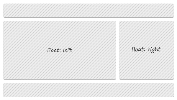
clearing-floats-simple-example
Simple floats example

Clearing floats

Elements placed after a floated element will wrap around the floated element. To avoid this behavior, you must clear floats. To do that, generally you use the clear property which has four values: leftrightboth and none.

<div style="float:left"></div>
<div style="float:right"></div>
<div style="clear:both"></div>

The above is a common example.

Beside the above example that requires extra HTML markup, below is a list with some clearing methods that I found very useful (and they do not require extra markup):

Clearfix reloaded by Thierry Koblentz

clearfix-reloaded

.clearfix:before,
.clearfix:after{
  content: ".";
  display: block;
  height: 0;
  overflow: hidden;
}
.clearfix:after {clear: both;}
.clearfix {zoom: 1;} /* IE < 8 */

New clearfix hack by Jeff Starr

new-clearfix-hack

.clearfix:after{
  visibility: hidden;
  display: block;
  font-size: 0;
  content: " ";
  clear: both;
  height: 0;
}

* html .clearfix             { zoom: 1; } /* IE6 */
*:first-child+html .clearfix { zoom: 1; } /* IE7 */

Micro clearfix hack by Nicolas Gallagher

micro-clearfix

.cf:before,
.cf:after{
  content:"";
  display:table;
}

.cf:after{
  clear:both;
}

/* For IE 6/7 (trigger hasLayout) */
.cf{
  zoom:1;
}

CSS clearing floats with overflow by Nick La

clear-overflow

That’s it!

You may already know the above techniques and my questions is:  Which one do you use most? Share your opinion with us!

Posted by: Dhiraj kumar