Animated aquarium with pure CSS

Here is a pure CSS experimental work to create a aquarium. Image / javascript hasn’t been used for aquarium or it’s animation. I have used jQuery only for random air-bubbles. All these animation is created by Pure CSS. Some times ago, I had written a article about “Animated bubbles upwards continuously with pure CSS“. You can also use this trick for air-bubbles.
read more @ http://www.css-jquery-design.com/…

Animated aquarium with pure CSS

For Creating Aquarium’s water, sand, rocks and plants few lines of HTML required.

The HTML

<div class="bubbles"></div>

<div class="ground"></div>
<div class="rock_1"></div>
<div class="rock_2"></div>
<div class="rock_3"></div>
<div class="rock_4"></div>
<div class="rock_5"></div>
<div class="rock_6"></div>
<div class="rock_7"></div>

<div class="plant_1_wrap">
    <div class="plant_1"></div>
    <div class="plant_2"></div>
    <div class="plant_3"></div>
</div>
<div class="plant_2_wrap">
    <div class="plant_4"></div>
    <div class="plant_5"></div>
</div>

Now, its CSS turn. I had written about 1040 lines only in CSS for creating these elements.
read more @ http://www.css-jquery-design.com/…read-more-button

Animated bubbles upwards continuously with pure CSS

Here is a pure CSS experimental work to create floating bubbles without using JavaScript. These animated bubbles are also with popping effect. All these animation is created by Pure CSS.

For our little demo, we use a simple image for the conical flask and then create the bubbles entirely with markup and CSS. read more @ http://www.css-jquery-design.com/…

Animated bubbles upwards continuously with pure CSS

The HTML

<div id="beaker">
  <span class="bubble">
    <span class="glow"> </span>
  </span>
</div>

With our bubbles all made, now we need them to act like bubbles. We could use JavaScript but that’s no fun. Just use CSS! read more @ http://www.css-jquery-design.com/…read-more-button

CSS Vendor Prefixes or CSS3 browser prefixes

CSS vendor prefixes or CSS browser prefixes are a way for browser makers to add support for new CSS features in a sort of testing and experimentation period. Browser prefixes are used to add new features that may not be part of a formal specification and to implement features in a specification that hasn’t been finalized. read more @ http://www.css-jquery-design.com/…

CSS-Vendor-Prefixes-or-CSS3-browser-prefixes

The CSS browser prefixes are:

  • Android: -webkit-
  • Chrome: -webkit-
  • Firefox: -moz-
  • Internet Explorer: -ms-
  • iOS: -webkit-
  • Opera: -o-
  • Safari: -webkit-

In most cases, to use a more advanced CSS style property, you take the standard CSS property and add the prefix above for each browser. read more @ http://www.css-jquery-design.com/…
read-more-button

CSS3 Inheritance Tips and Tricks – inherit, initial & unset

It’s easy to overlook the cascading features of style-sheets. Most designers/developers are aware of the inherit keyword but there are a few new inheritance features in CSS3 you may not be aware of…  read more @ http://www.css-jquery-design.com/…

css3-inheritance-tips-and-tricks-inherit-initial-unset

property: inherit;

The inherit keyword means “use whatever value is assigned to my parent”. If no value was explicitly defined on the parent element, the browser works up the DOM tree until the property is found. Ultimately, it ends at the browser  read more @ http://www.css-jquery-design.com/…
read-more-button

Javascript or jQuery Fullscreen browser window – Html5 technology

The new html5 technology – fullscreen API gives us an easy way to present a web page content in full-screen mode. We are about to give you detailed information about the fullscreen mode. Just try to imagine about all possible advantages which you can get using this technology – full-screen photo albums, videos, and even games. But before we describe this new technology, I have to note that this technology is experimental, and not all the browsers support it.
read more @ http://www.css-jquery-design.com/…

javascript-jquery-fullscreen-browser-window-html5-technology

Starting the full-screen mode

Due to the fact that this mode is supported by different browsers differently, we have to foresee all the cases: read more @ http://www.css-jquery-design.com/…

read-more-button

CSS3 Modal Window Popups – sliding forms with fancybox effect

Today, I will describe you how to create cool CSS3 modal popup windows (or boxes). Literally, not so long ago, in order to achieve such effects, we used jQuery. But, as it turned out, CSS3 has all the necessary tools for making modal windows too. In our demonstration I have prepared single page with two popup elements: join form and login form. Welcome to test results (domo) and understand how it was made. read more @ http://www.css-jquery-design.com/…

css3-modal-window-popup

HTML

First, lets create the main HTML markup. As you can see – the structure is quite easy. Here are one panel with buttons and two popups. Each of them contains own overlay DIV element and popup DIV element with some content inside and ‘close’ button.  read more @ http://www.css-jquery-design.com/…

read-more-button

Animated Color wheel spinning with CSS3 Keyframes animation, Transform and Transition

I have done some experimental work to create CSS3 Animation without using JavaScript. I end up creating some animations using CSS3 Keyframes and Transform and like to share. I have done this animation using border-color tricks and CSS Transform: i.e. CSS scale and CSS3 rotation.

Note: Before going I like to make something clear, Internet Explorer 10, Firefox, and Opera supports the @keyframes rule and animation property. Chrome and Safari requires the prefix -webkit- in css.

Important: Internet Explorer 9, and earlier versions, does not support the @keyframe rule or animation property.

css3-keyframes-color-wheel-animation

The HTML

<div id="colorWheel">
    <span class="color01"></span>
    <span class="color02"></span>
    <span class="color03"></span>
    <span class="color04"></span>
    <span class="color05"></span>
    <span class="color06"></span>
    <span class="color07"></span>
    <span class="color08"></span>
    <span class="color09"></span>
    <span class="color10"></span>
</div>

The CSS

Now, We will use some CSS Technique using border-color tricks and CSS3 rotation. I have created this color cycle without using any image.  I have done a cool rotating wheel animation  using @keyframes animation.

#colorWheel {
    height: 100px;
    width: 100px;
    margin: 40px auto ;
    position: absolute; left:10%;
    -webkit-transform-origin: 50px 150px;
    -moz-transform-origin: 50px 150px;
    -ms-transform-origin: 50px 150px;
    -o-transform-origin: 50px 150px;
    transform-origin: 50px 150px;
    -webkit-transition: all 0.5s linear;
    -moz-transition: all 0.5s linear;
    -ms-transition: all 0.5s linear;
    -o-transition: all 0.5s linear;
    transition: all 0.5s linear;
    animation: wheel 10s ease-in-out infinite alternate;
    -moz-animation: wheel 10s ease-in-out infinite alternate;
    -webkit-animation: wheel 10s ease-in-out infinite alternate;
    -ms-animation: wheel 10s ease-in-out infinite alternate;
}

@keyframes wheel{
    0%{
    opacity:1;
    left:-10%;
    transform:scale(.6) rotate(0deg);
}
50%{
    opacity:.7}
100%{
    left: 90%;
    opacity:1;
    transform:scale(1) rotate(2160deg);
}
}
@-webkit-keyframes wheel{
    0%{
    opacity:1;
    left:-10%;
    -webkit-transform:scale(.6) rotate(0deg);
}
50%{
    opacity:.7;}
100%{
    left: 90%;
    opacity:1;
    -webkit-transform:scale(1) rotate(2160deg);
}
}
@-moz-keyframes wheel{
0%{
    opacity:1;
    left:-10%;
    -moz-transform:scale(.6) rotate(0deg);
}
50%{
    opacity:.7;}
100%{
    left: 90%;
    opacity:1;
    -moz-transform:scale(1) rotate(2160deg);
}
}
@-ms-keyframes wheel{
0%{
    opacity:1;
    left:-10%;
    -ms-transform:scale(.6) rotate(0deg);
}
50%{
    opacity:.7;}
100%{
    left: 90%;
    opacity:1;
    -ms-transform:scale(1) rotate(2160deg);
}
}

#colorWheel:hover {}
#colorWheel span {
    position: absolute;
    -webkit-transform-origin: 50% 50%;
    border-style: solid;
    border-width: 150px 50px;
    box-sizing: border-box;
}
#colorWheel span.color01 {
    -webkit-transform: rotate(0deg);
    -moz-transform: rotate(0deg);
    -ms-transform: rotate(0deg);
    -o-transform: rotate(0deg);
    transform: rotate(0deg);
    border-color: #43a1cd transparent transparent transparent;
}
#colorWheel span.color02 {
    -webkit-transform: rotate(36deg);
    -moz-transform: rotate(36deg);
    -ms-transform: rotate(36deg);
    -o-transform: rotate(36deg);
    transform: rotate(36deg);
    border-color: #639b47 transparent transparent transparent;
}
#colorWheel span.color03 {
    -webkit-transform: rotate(72deg);
    -moz-transform: rotate(72deg);
    -ms-transform: rotate(72deg);
    -o-transform: rotate(72deg);
    transform: rotate(72deg);
    border-color: #9ac147 transparent transparent transparent;
}
#colorWheel span.color04 {
    -webkit-transform: rotate(108deg);
    -moz-transform: rotate(108deg);
    -ms-transform: rotate(108deg);
    -o-transform: rotate(108deg);
    transform: rotate(108deg);
    border-color: #e1e23b transparent transparent transparent;
}
#colorWheel span.color05 {
    -webkit-transform: rotate(144deg);
    -moz-transform: rotate(144deg);
    -ms-transform: rotate(144deg);
    -o-transform: rotate(144deg);
    transform: rotate(144deg);
    border-color: #f7941e transparent transparent transparent;
}
#colorWheel span.color06 {
    -webkit-transform: rotate(180deg);
    -moz-transform: rotate(180deg);
    -ms-transform: rotate(180deg);
    -o-transform: rotate(180deg);
    transform: rotate(180deg);
    border-color: #ba3e2e transparent transparent transparent;
}
#colorWheel span.color07 {
    -webkit-transform: rotate(216deg);
    -moz-transform: rotate(216deg);
    -ms-transform: rotate(216deg);
    -o-transform: rotate(216deg);
    transform: rotate(216deg);
    border-color: #9a1d34 transparent transparent transparent;
}
#colorWheel span.color08 {
    -webkit-transform: rotate(252deg);
    -moz-transform: rotate(252deg);
    -ms-transform: rotate(252deg);
    -o-transform: rotate(252deg);
    transform: rotate(252deg);
    border-color: #662a6c transparent transparent transparent;
}
#colorWheel span.color09 {
    -webkit-transform: rotate(288deg);
    -moz-transform: rotate(288deg);
    -ms-transform: rotate(288deg);
    -o-transform: rotate(288deg);
    transform: rotate(288deg);
    border-color: #272b66 transparent transparent transparent;
}
#colorWheel span.color10 {
    -webkit-transform: rotate(324deg);
    -moz-transform: rotate(324deg);
    -ms-transform: rotate(324deg);
    -o-transform: rotate(324deg);
    transform: rotate(324deg);
    border-color: #2d559f transparent transparent transparent;
}
#colorWheel:before {
    content: "";
    width: 300px;
    height: 300px;
    overflow: hidden;
    position: absolute;
    top: -30px;
    left: -130px;
    border-radius: 100%;
    border: 30px solid #ffffff;
    z-index: 100;
    box-shadow:0px 0px 2px 12px rgba(180,180,180,.5)
}
#colorWheel:after {
    content: "";
    width: 100px;
    height: 100px;
    overflow: hidden;
    position: absolute;
    top: 100px;
    left: 0px;
    border-radius: 100%;
    box-shadow:0px 0px 2px 12px rgba(250,250,250,.5);
    background: #444 url(Dhiraj.png); background-size:contain
}

view demo

Your turn

I had already posted some articles of css3 @keyframes animation examples.  Please check some of these beautiful animation with demo below:

I hope you enjoyed this article and the techniques I used. Please share your comments and questions below!

Posted by: Dhiraj kumar

Pure CSS3 Animated Polaroid Gallery

Normally, Polaroid Gallery is a CSS3 & jQuery Image Gallery plugin for Media Library. It is used to overlay images as Polaroid pictures on the current page or post.

It’s a sure thing that CSS3 features like transitions, animations and transforms can add extra spice to your designs. In this article you will see how you can build an awesome CSS3 animated  Polaroid pictures gallery with some of these cool features.  This is something I wished to do for a while and I finally made it.css3-animated-polaroid-gallery

The HTML

The HTML structure hasn’t changed at all, simple and minimal. Here’s an excerpt:

<div class="photo-album">
<h2>Dhiraj, Geetu & Atharv at Taj ↦ Agra
  <a class="large polaroid img1" href="#"> 
    <img alt="" src="https://lh3.googleusercontent.com/-73u0oSgSX0w/UQ6PZ0Z1wOI/AAAAAAAADPE/57bc9C0BEG0/s512/Agra-trip%252520112.JPG" /> 
    Camel wants to kiss Atharv. </a> 
  <a class="polaroid img2" href="#"> 
    <img alt="" src="https://lh4.googleusercontent.com/-cPFum21LNBA/UQ6PXyb2ISI/AAAAAAAADPM/kJLhIyvx_2k/s512/Agra-trip%252520147.JPG" /> 
    My dearest one.. Atharv with Geetu. — at Taj Mahal</a> 
  <a class="small polaroid img3" href="#"> 
    <img alt="" src="https://lh6.googleusercontent.com/-Bz8NR-oKxGw/UQ6PguAxrsI/AAAAAAAADNY/B7i8X02vnbg/s512/Agra-trip%252520153.JPG" /> 
    Ferntastic</a> 
  <a class="medium polaroid img4" href="#"> 
    <img alt="" src="https://lh4.googleusercontent.com/-gB3RNt_3aos/UQ6Pmx5egoI/AAAAAAAADKM/lensH9ojFd0/s512/Agra-trip%252520154.JPG" /> 
    My dearest one.. Atharv with Geetu. — at Taj Mahal</a> 
  <a class="polaroid img5" href="#"> 
    <img alt="" src="https://lh5.googleusercontent.com/-YbVIBYilZ-M/UQ6P0w2PC8I/AAAAAAAADNc/kKzFy9k51D8/s512/Agra-trip%252520170.JPG" /> 
    Atharv & Geetu with Dhiraj.. Taj in background</a> 
  <a class="polaroid img6" href="#"> 
    <img alt="" src="https://lh6.googleusercontent.com/-IedPhDIDTcg/UQ6P5NG_hSI/AAAAAAAADKw/frG26WPd_OY/s512/Agra-trip%252520175.JPG" /> 
    Atharv in a cute pose.. Taj mahal in background</a> 
  <a class="polaroid img7" href="#"> 
    <img alt="" src="https://lh6.googleusercontent.com/-fhOKmDe-6S4/UQ6QBnHRDhI/AAAAAAAADPw/StGk4el6PVI/s512/Agra-trip%252520192.JPG" /> 
    Atharv with his papa Dhiraj</a> 
  <a class="small polaroid img8" href="#"> 
    <img alt="" src="https://lh4.googleusercontent.com/-lUXHF4hGxak/UQ6QF_7iZnI/AAAAAAAADOs/-agtNNnnYbU/s512/Agra-trip%252520193.JPG" /> 
    awesome</a> 
  <a class="medium polaroid img9" href="#"> 
    <img alt="" src="https://lh3.googleusercontent.com/-a-kezOzwNR8/UQ6QNJpEa4I/AAAAAAAADNk/FAN4Z3LDy2Y/s512/Agra-trip%252520206.JPG" /> 
    Geetu with Dhiraj</a> 
  <a class="polaroid img10" href="#"> 
    <img alt="" src="https://lh6.googleusercontent.com/-J3Gcspy0HKg/UQ6QXk3ZV9I/AAAAAAAADQE/0PyQD_VvC8o/s512/Agra-trip%252520221.JPG" /> 
    Nice one..</a> 
  <a class="small polaroid img11" href="#"> 
    <img alt="" src="https://lh5.googleusercontent.com/-OLpIvUAwZ6E/UQ6QY9gnPwI/AAAAAAAADNo/00eTz4E3_GI/s512/Agra-trip%252520223.JPG" /> 
    Sulphurous</a> 
  <a class="small polaroid img12" href="#"> 
    <img alt="" src="https://lh6.googleusercontent.com/-V-NJ8w3N5hs/UQ6QYqtZVOI/AAAAAAAADOw/FcjS2sgQXxA/s512/Agra-trip%252520229.JPG" /> 
    Atharv with his papa..</a> <a class="small polaroid img13" href="#"> 
    <img alt="" src="https://lh4.googleusercontent.com/-W1T4Z6_xwlQ/UQ6QAdQwuzI/AAAAAAAADNg/vSiGaoo7_TU/s512/Agra-trip%252520188.JPG" /> 
    Atharv with his papa Dhiraj</a> 
  <a class="small polaroid img14" href="#"> 
    <img alt="" src="https://lh6.googleusercontent.com/-Bz8NR-oKxGw/UQ6PguAxrsI/AAAAAAAADNY/B7i8X02vnbg/s512/Agra-trip%252520153.JPG" /> 
    Nice one..</a> 
  <a class="polaroid img15" href="#"> 
    <img alt="" src="https://lh4.googleusercontent.com/-W1T4Z6_xwlQ/UQ6QAdQwuzI/AAAAAAAADNg/vSiGaoo7_TU/s512/Agra-trip%252520188.JPG" /> 
    Atharv with his papa Dhiraj</a> 
</div>

CSS

a.polaroid {
		display: block;
		text-decoration: none;
		color: #333;
		padding: 10px 10px 20px 10px;
		width: 150px;
		border: 1px solid #d7d7d7;
		background-color: white; background:rgba(255,255,255,.9);
		z-index: 2;
		font-size: 0.7em;
		-webkit-box-shadow: 2px 2px 4px rgba(0,0, 0, 0.3),inset 0 0 0.7em rgba(0,0, 0, 0.4);;
		-moz-box-shadow: 2px 2px 4px rgba(0,0, 0, 0.3),inset 0 0 0.7em rgba(0,0, 0, 0.4);;
		box-shadow: 2px 2px 4px rgba(0,0, 0, 0.3),inset 0 0 0.7em rgba(0,0, 0, 0.4);-webkit-filter: blur(1px); border-radius:5px;
		-webkit-transition: all 0.5s ease-in; text-align:center
	}
	a.polaroid:hover, a.polaroid:focus, a.polaroid:active {
		z-index: 999;
		border-color: #999;
		-webkit-box-shadow: 15px 15px 20px rgba(0,0, 0, 0.4),inset 0 0 0.7em rgba(0,0, 0, 0.4);
		-moz-box-shadow: 15px 15px 20px rgba(0,0, 0, 0.4),inset 0 0 0.7em rgba(0,0, 0, 0.4);
		box-shadow: 15px 15px 20px rgba(0,0, 0, 0.4),inset 0 0 0.7em rgba(0,0, 0, 0.4);
		-webkit-transform: rotate(0deg) scale(1.05);
		-moz-transform: rotate(0deg) scale(1.05);
		transform: rotate(0deg) scale(1.05);-webkit-filter: blur(0px);
	}
	.polaroid img {
		margin: 0 0 15px;
		width: 150px;
		height: 120px;
	}

	a img {
		border: none;
		display: block;
	}

	.photo-album {
		position: relative; width: 80%; margin: 0 auto; max-width: 70em; height: 450px; margin-top:2.5em; min-width: 800px; max-width: 900px;
	}
	.photo-album .polaroid {
		position: absolute;
	}
	.photo-album h2 {
		position: absolute; z-index: 5; top: 150px; text-align: center; width: 100%; line-height: 2; 
	}
	.photo-album h2 span {
		background-color: white; background:rgba(255,255,255,.8);
		font-family: 'Satisfy', cursive;
		padding: 0.4em 0.8em 0.3em 0.8em;
		-webkit-box-shadow: 2px 2px 4px rgba(0,0, 0, 0.3);
		-moz-box-shadow: 2px 2px 4px rgba(0,0, 0, 0.3);
		box-shadow: 2px 2px 4px rgba(0,0, 0, 0.3);
		border-radius: 5px; border:1px solid #CCC
	}
	.photo-album .small {
		width: 75px; padding: 6px 6px 12px 6px; font-size: 0.6em;
	}
	.photo-album .small img {
		width: 75px; height: 60px;
	}
	.photo-album .medium {
		width: 200px; padding: 13px 13px 26px 13px; font-size: 0.8em;
	}
	.photo-album .medium img {
		width: 200px; height: 165px;
	}
	.photo-album .large {
		width: 300px; padding: 20px 20px 30px 20px; font-size: 1em;
	}
	.photo-album .large img {
		width: 300px; height: 250px
	}
	.photo-album .img1 {
		bottom: 10px; right: 365px; 
		-webkit-transform: rotate(10deg);
		-moz-transform: rotate(10deg);
		transform: rotate(10deg);
	}
	.photo-album .img2 {
		top: 50px; right: 20px;
		-webkit-transform: rotate(-4deg);
		-moz-transform: rotate(-4deg);
		transform: rotate(-4deg);
	}
	.photo-album .img3 {
		left: 400px; top: 0;
		-webkit-transform: rotate(-5deg);
		-moz-transform: rotate(-5deg);
		transform: rotate(-5deg);
	}
	.photo-album .img4 {
		top: 10px; left: 495px;
		-webkit-transform: rotate(-20deg);
		-moz-transform: rotate(-20deg);
		transform: rotate(-20deg);
	}
	.photo-album .img5 {
		bottom: 0; right: 0;
		-webkit-transform: rotate(1deg);
		-moz-transform: rotate(1deg);
		transform: rotate(1deg);
	}
	.photo-album .img6 {
		bottom: 10px; right: 156px;
		-webkit-transform: rotate(6deg);
		-moz-transform: rotate(6deg);
		transform: rotate(6deg);
	}
	.photo-album .img7 {
		bottom:0; left:400px;
		-webkit-transform: rotate(-10deg);
		-moz-transform: rotate(-10deg);
		transform: rotate(-10deg);
	}
	.photo-album .img8 {
		bottom: -20px; left: 700px;
		-webkit-transform: rotate(-8deg);
		-moz-transform: rotate(-8deg);
		transform: rotate(-8deg);
	}
	.photo-album .img9 {
		bottom: 0; left: 0;
		-webkit-transform: rotate(-8deg);
		-moz-transform: rotate(-8deg);
		transform: rotate(-8deg);
	}
	.photo-album .img10 {
		top: 0; left: 20px;
		-webkit-transform: rotate(8deg);
		-moz-transform: rotate(8deg);
		transform: rotate(8deg);
	}
	.photo-album .img11 {
		top: 0; right: 0;
		-webkit-transform: rotate(-8deg);
		-moz-transform: rotate(-8deg);
		transform: rotate(-8deg);
	}
	.photo-album .img12 {
		top: 0; left: 680px;
		-webkit-transform: rotate(18deg);
		-moz-transform: rotate(18deg);
		transform: rotate(18deg);
	}
	.photo-album .img13 {
		bottom: -20px; right: 630px;
		-webkit-transform: rotate(4deg);
		-moz-transform: rotate(4deg);
		transform: rotate(4deg);
	}
	.photo-album .img14 {
		top: 90px; left: 430px;
		-webkit-transform: rotate(15deg);
		-moz-transform: rotate(15deg);
		transform: rotate(15deg);
	}
	.photo-album .img15 {
		left:176px; top:20px;
		-webkit-transform: rotate(-8deg);
		-moz-transform: rotate(-8deg);
		transform: rotate(-8deg);
	}	
	a:hover, a:focus {
		z-index: 5;
	}

view demo

Your turn

I hope you enjoyed this article and the techniques I used. Please share your comments and questions below!

Posted by: Dhiraj kumar

Cool inset Text Effect with CSS3 Text-Shadow

So, I have seen a few tutorials online about using text-shadow to create a basic inset text effect, but they are all lacking the real design aspect that makes the type look like it is actually INSET. That aspect is the inner shadow.

Introduction

I played around with trying to hack box-shadow into background-image in the same way that you can add linear gradients to text, but to no avail.

Well, in any case, I finally was able to get something to work, and yes, it is pretty killer.


insetText

That’s it right there. But, let’s take a look at how and why this works.

First let’s start with defining our class and setting our font. We have styled our div and our body and now we want this text to look like it is stamped into to page.

The CSS

.insetText {
        font-family: Lucida Grande;
}

The next step we want to take is to set the background-color of the text to the color that we want the inset to be. So…

.insetText {
        font-family: Lucida Grande;
        background-color: #666666;
}

Next, we are going to use the background-clip CSS3 property to create a clipping mask using the text to mask the background. Now if you are a designer, you probably already know how a clipping mask works. The color black is transparent to the background and the color white is opaque. Thus, the image behind the mask will show through on only the black parts and the white parts will ‘clip’ it. Remember that, because it’s important.

Remember, CSS3 is not standard yet and may not be supported in older browsers. For now, it’s best to use the standard AND browser specific properties for any CSS3, so…

.insetText {
        font-family: Lucida Grande;
        background-color: #666666;
        -webkit-background-clip: text;
	-moz-background-clip: text;
	background-clip: text;
}

Now, I know. It doesn’t look like that did anything, whatsoever. We are back where we started, right? Wrong, in truth, the background color has been clipped behind the text, so it only shows through where the text is. The problem is that the browser default CSS is to make text black. So, now we simply use color to make the text transparent.

.insetText {
        font-family: Lucida Grande;
        background-color: #666666;
        -webkit-background-clip: text;
	-moz-background-clip: text;
	background-clip: text;
        color: transparent;
}

Now we’re getting somewhere. We have taken transparent text and used it to clip it’s grey background. Here is where the magic happens. We will use the text-shadow property with rgba colors. Since the text is transparent, the entire shadow, even what is normally hidden by the text in front of it, will show. If we offset the shadow vertically, it will appear as if it is on the inside of the text. And if we blur the edges, it should actually appear like an inset shadow, since the darker clipped background fading into the white shadow right? And the shadow that falls outside of the clipping mask should appear to glow slightly, since that it’s closer in color to the contrasting background! So…

.insetText {
        font-family: Lucida Grande;
        background-color: #666666;
        -webkit-background-clip: text;
	-moz-background-clip: text;
	background-clip: text;
        color: transparent;
        text-shadow: rgba(255,255,255,1.0) 0px 3px 3px;
}

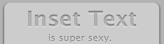
Yeah, that looks pretty good, right? I just don’t like how the inside of the text in now white. It looks kind of unnatural, and it really takes away from the outer glow that gives it the inset look. So let’s revise our shadow color by dropping it’s opacity or ‘a’ value to 0.5. Like so…

.insetText {
        font-family: Lucida Grande;
        background-color: #666666;
        -webkit-background-clip: text;
	-moz-background-clip: text;
	background-clip: text;
        color: transparent;
        text-shadow: rgba(255,255,255,0.5) 0px 3px 3px;
}

Perfect! Now we have a completely CSS based inset text effect! We can now add this class to any text element on our websites, without having to open Photoshop or Illustrator, create the document, design the effect, save the image, upload the image, and then place the image in our markup where it will slow down our load time. You would add this to your markup like so…

<h1>This is inset text</h1>

This solution is great for headings. The smaller you make your text the smaller you will need to make your text-shadow.

NOTE: This method is currently only supported by Webkit browser like Google Chrome and Apple Safari.

Thanks for reading, and I hope this helped!

view demo

Posted by: Dhiraj kumar

CSS3 3D effect, Shine text with css3 keyframe animation, Scrolling Page Background with jQuery – Happy New Year

On the occasion of New Year 2013, I thought to wish this festival by creating a nice webpage greeting. So, today I created this greeting card using 3D  and shining text effect with the help of CSS3, and scrolling background with JavaScript. I hope you all will enjoy this holiday as well as my web-card too :) .

Introduction

Greeting, today we are going to make a scrolling background effect. This script will move the background of any html tag, either vertically or horizontally. I used this script in one of my greeting card too which has a blue sky with clouds and it makes the whole website came alive. I think that’s pretty impressive. In this card you will find texts with different CSS effects like: 3D emboss, continuous spotlight shine effect, text shadow etc.

3d-shine-text-css3-scrolling-background-happy-new-year

The CSS

I have Used multiple text-shadows to create 3D text on any HTML element. No extra HTML, no extra headaches, just awesomesauce.
Works in the latest builds of Safari, Chrome, Firefox, and Opera.

h1 {
  margin:1.2em auto;
  font: bold 100px/1 "Helvetica Neue", Helvetica, Arial, sans-serif;
  color: #fff;
  text-shadow: 0 1px 0 #cccccc, 0 2px 0 #c9c9c9, 0 3px 0 #bbbbbb, 0 4px 0 #b9b9b9, 0 5px 0 #aaaaaa, 0 6px 1px rgba(0, 0, 0, 0.1), 0 0 5px rgba(0, 0, 0, 0.1), 0 1px 3px rgba(0, 0, 0, 0.3), 0 3px 5px rgba(0, 0, 0, 0.2), 0 5px 10px rgba(0, 0, 0, 0.25), 0 10px 10px rgba(0, 0, 0, 0.2), 0 20px 20px rgba(0, 0, 0, 0.15);
  -webkit-transition: .2s all linear;
}

Text shine Effect created with WebKit-specific CSS3 properties. You’ll need Safari or Chrome to enjoy key-frame animation.

p.shine{
    font-size: 3em;
    margin: 0 auto; padding:0;
    width: 95%;
}
.shine{
    background: #222 -webkit-gradient(linear, left top, right top, from(#ccc), to(#fff), color-stop(1, #f0f)) 0 0 no-repeat;
    background-size: 400px; -webkit-background-size: 400px; 
    -moz-background-size: 400px; -o-background-size: 400px;    
    color: rgba(255, 255, 255, 0.7);	
    background-clip: text; -webkit-background-clip: text; 
        -moz-background-clip: text; -o-background-clip: text;	
	-webkit-animation: shine 2s infinite;
	-moz-animation: shine 2s infinite;
	-o-animation: shine 2s infinite;
	-ms-animation: shine 2s infinite;
	animation: shine 2s infinite; 
}

@-webkit-keyframes shine{
    0%{background-position: top left;}
    100%{background-position: top right;}
}
@-moz-keyframes shine{
    0%{background-position: top left;}
    100%{background-position: top right;}
}
@-o-keyframes shine{
    0%{background-position: top left;}
    100%{background-position: top right;}
}
@keyframes shine{
    0%{background-position: top left;}
    100%{background-position: top right;}
}

For page background I used cloud in png format.

body{background:url(bg_clouds.png) 0 0}

The HTML

<h1>Happy New Year 2013</h1>
<p class="shine">The New Year is the time of unfolding horizons and the realization of dreams, may you rediscover new strength and garner faith with you, and be able to rejoice in the simple pleasures that life has to offer and put a brave front for all the challenges that may come your way.<br>
Wishing you a lovely New Year..</p>

The JavaScript – jQuery

We have to add jquery library in body first, after that we animate our page background with css background-position properties. I always prefer to use JavaScript files before close of body tag.

<script src="http://code.jquery.com/jquery-latest.js" type="text/javascript"></script>
<script type="text/javascript">var scrollSpeed = 70; 
    var current = 0;
    function bgscroll(){
        current -= 1;   
        // move the background with backgrond-position css properties
        $('body').css("backgroundPosition", 1 ? current+"px 0" : "0 " + current+"px");   
    }
     setInterval(bgscroll, scrollSpeed);   </script>

view demo

Happy New Year!

I hope you like the result and don’t hesitate to share your thoughts about it. Thanks for reading!

Posted by: Dhiraj kumar