Animated 3D Background Pattern using HTML5 < canvas >

Hi friends, today we are going to see a cool example of animated 3D Background using HTML5 <canvas> and javascript. The <canvas> element is part of HTML5 and allows for dynamic, script-able rendering of 2D shapes and bitmap images. It is a low level, procedural model that updates a bitmap and does not have a built-in scene graph. The <canvas> element is only a container for graphics… read more @ http://www.css-jquery-design.com/…

Animated 3D Perspective Background Patterns using HTML5 Canvas

What is canvas element in HTML?

Canvas was initially introduced by Apple for use inside their own Mac OS X WebKit component in 2004 read more @ http://www.css-jquery-design.com/…

read-more-button

3D Parallax effect with CSS, javascript or jQuery

Parallax effect is a long-known and widely used animation effect. Lately, the parallax effect has become a wide-spread and quite a trend element in web design, often referred to as “parallax scrolling”. Internet if full on many great examples of application of this effect in web design. As I planned to create a cool parallax animated background, my first goal was to write the shortest and simplest code to achieve maximum awesomeness! I’ll show you how I did it. In this tutorial, I’ll teach you the simplest parallax scrolling technique. Here, I am going to introduce you, a most flexible/responsive slider i.e. Parallaxfx_DG. It is so easy and useful. I have decided that I will post a page dedicated to this slider with it’s features and API later.
read more @ http://www.css-jquery-design.com/…

The idea of the parallax effect it in web design is built around giving a page depth by using several layers of images, all moving at different speeds in response to movement of the mouse or mouse scroller, so that a viewer get a full sense of 3D on the page. Parallax scrolling is an interesting technique, where, as you scroll, the background images translate slower than the content in the foreground, creating the illusion of 3D depth. read more @ http://www.css-jquery-design.com/ …

parallax-effect-with-javascript-css3-jquery-beautiful-place-background

Javascript

I have created a JavaScript plugin for this parallax effect. Plugin writes HTML,  its attributes with CSS animation effect in background read more @ http://www.css-jquery-design.com/….
read-more-button

Javascript or jQuery Fullscreen browser window – Html5 technology

The new html5 technology – fullscreen API gives us an easy way to present a web page content in full-screen mode. We are about to give you detailed information about the fullscreen mode. Just try to imagine about all possible advantages which you can get using this technology – full-screen photo albums, videos, and even games. But before we describe this new technology, I have to note that this technology is experimental, and not all the browsers support it.
read more @ http://www.css-jquery-design.com/…

javascript-jquery-fullscreen-browser-window-html5-technology

Starting the full-screen mode

Due to the fact that this mode is supported by different browsers differently, we have to foresee all the cases: read more @ http://www.css-jquery-design.com/…

read-more-button

Creating a Puzzle game using jQuery

Today we are making a simple puzzle game called “Doraemon Puzzle”. The purpose of the game is to slide 15 square blocks around to form an image. The goal of this tutorial is to look at this simple browser-based game and explain how it was made line by line. It’s a great way to learn jQuery. For this tutorial, We will use a 2D image of kid’s favorite cartoon “Doraemon” for square-sliding game.  I will go over each line of code to demonstrate the train of thought. I really do believe that breaking this game up into explanations on per-line basis will help you understand how to use jQuery in your own projects.

Concept about creating a Game as a jQuery Plugin

A jQuery plugin is a perfect way to create image slideshows, custom user interface controls and of course browser-based games. We won’t just write JavaScript code here, we will create a jQuery plugin.

A plugin is nothing more than our own custom jQuery method. You know how we have jQuery’s methods .css() and .animate()? Well, jQuery gives us the ability to extend its own functionality with custom methods that we create ourselves. Like the existing jQuery methods, we can apply the method we will create to a jQuery selector.

Well, the game is called “Doraemon Puzzle”, and we want to make our game “embeddable” inside an arbitrary HTML element like <div id=”game_area”>here</div> so we can move it around anywhere on the page.

creating-puzzle-game-with-jquery

The jQuery

We will actually create our own jQuery method and call it .puzzle_dg(). I have already created the plugin “puzzle_dg.min.js“.  Therefore, in order to launch the game inside an HTML element with id “#game_area” we will call this command:

$(window).load(function(){
    $('#game_area').puzzle_dg(140)
});

This will create and attach the game board to the div whose id is “game_area.” Also, each square will become 140 by 140 pixels in width and height based on the only passed parameter. You can re-size the game blocks and area easy by just changing this parameter.

In this tutorial I used the image of a Doraemon cartoon. You can replace it with any image you want.

Executing a custom method as shown in the code above will pass the selector string “#game_area” to our plugin function which grabs the DIV. Inside our custom method, we can refer to that selector/element using the this keyword. And we can also enable jQuery methods on it by passing it to the new jQuery object like so: $(this); — inside the extended function I have created.

The HTML

First, let’s prepare HTML markup for our game.  We have only call <div id="game_area"></div> for creating game area.

We have to include the awesome jQuery library. After including the jQuery library we have to include “puzzle_dg.min.js”  file as game plugin.

<!-- This is where the game will be injected -->
<div id="game_object"></div>

<script src="http://code.jquery.com/jquery-1.7.1.min.js"></script>
<script src="js/main.js"></script>
<script type="text/javascript">$(window).load(function(){
    $('#game_area').puzzle_dg(140)
});</script>

CSS

There are a few styles for our game:

#game_area {
	background-color: #ffffff;
	height: 550px;
	margin: 20px auto;
	position: relative;
	width: 550px;
}
#board div {
	background: url("images/doraemon.jpg") no-repeat scroll 0 0 #ffffff;
	cursor: pointer;
	height: 140px;
	line-height: 140px;
	position: absolute;
	text-align: center;
	width: 140px;
	/* css3 shadow */
    -moz-box-shadow: inset 0 0 20px #2caae7;
	-webkit-box-shadow: inset 0 0 20px #2caae7;
	-ms-box-shadow: inset 0 0 20px #2caae7;
	-o-box-shadow: inset 0 0 20px #2caae7;
	box-shadow: inset 0 0 20px #2caae7;
}

view demo

Conclusion

I tried to explain the code to the best of my ability here but some details were skipped because there is so much more to JavaScript. I hope you enjoyed this article. Thanks for reading!

You may like:

Posted by: Dhiraj kumar

Animate Full-Page Multiple Background images with fade-in & fade-out effect – jQuery

“How to change multiple background-image of body with effects?” – I think this is a major problem which all designers face. You can fade background colors but not background images. The way to work around this is to have your images as <img> tags and hide them by default display:none;. Give your images position:absolute and z-index:-1 so they act like backgrounds and are behind everything else.

Here’s a quick example of multiple images fading one after the other.

jquery-full-page-animated-background-images

The HTML

Html is very simple. Just add a div with multiple images which you want to animate / change in background with fade effects.

<div id="wrap">
<img class="bgfade" src="http://farm9.staticflickr.com/8526/8668341950_182b74faf2_z.jpg">
<img class="bgfade" src="http://farm9.staticflickr.com/8532/8667337535_6da0a9a261_z.jpg">
<img class="bgfade" src="http://farm9.staticflickr.com/8540/8667244539_d227f8c435_z.jpg">
</div>

The CSS

Now, We will use some CSS Technique which will create an illusion like background-image animation. The way to work around this is to have your images as <img> tags and hide them by default “display:none;”. Give your images “position:absolute” and “z-index:-1” so they act like backgrounds and are behind everything else. Now, set css property of div#wrap which includes these images to “position:fixed” and “top:0; left:0;” so that it will fix with page background.

#wrap{
	position:fixed;; 
	z-index:-1; 
	top:0; 
	left:0; 
	background-color:black
}
#wrap img.bgfade{
	position:absolute;
	top:0;
	display:none;
	width:100%;
	height:100%;
	z-index:-1
}

jQuery

Now, it is java-script’s turn. We will calculate browser window’s height & width. After that we will set width/height of div#wrap to browser so that background cover entire webpage. Now we have to animate our images. We will simple use function of fadeIn() and fadeOut() in images for this.

$(window).load(function(){
$('img.bgfade').hide();
var dg_H = $(window).height();
var dg_W = $(window).width();
$('#wrap').css({'height':dg_H,'width':dg_W});
function anim() {
    $("#wrap img.bgfade").first().appendTo('#wrap').fadeOut(1500);
    $("#wrap img").first().fadeIn(1500);
    setTimeout(anim, 3000);
}
anim();})
$(window).resize(function(){window.location.href=window.location.href})

Updated

I have updated the script. Actually, after re-sizing the browser we have to update the width/height of div#wrap. So, I am going to reload this window, when ever browser will re-size. It will help to re-calculate all these and refresh the animation. Div#wrap will re-size according to browser window and play animation smoothly.

view demo

You may like:

Posted by: Dhiraj kumar

Responsive jQuery Banner Slider with Pagination circles – Responsive_DG_Slider

After working on Responsive_DG_Slider,  which is a most flexible/responsive image slider with different random transition effects. After full-screen example, I am sharing another example with different transition effects. It is very easy to implement.

Here I am showing It’s Pagination circles with the height relative to the width functionality powered by the fantastic java-script library jQuery.

Configuring Your Slider

As we have done earlier, configuring the slider is very simple, you just need to place your images and call the initializer function and your slider is ready. Here’s how you can do this for liquid/responsive images slider with pagination.

responsive-slider-pagination-circle

The HTML

<div class="fluid_container">
        <div class="fluid_dg_wrap fluid_dg_charcoal_skin" id="fluid_dg_wrap_1">
            <div data-thumb="slides/thumbs/1.jpg" data-src="slides/1-1280x720.jpg">
                <div class="fluid_dg_caption fadeFromBottom">
                    Responsive_DG_Slider is a responsive/adaptive slideshow. <em>Try to resize the browser window</em>
                </div>
            </div>
            <div data-thumb="slides/thumbs/2.jpg" data-src="slides/2-1280x720.jpg">
                <div class="fluid_dg_caption fadeFromBottom">
                    It uses a light version of jQuery mobile, <em>navigate the slides by swiping with your fingers</em>
                </div>
            </div>
            <div data-thumb="slides/thumbs/3.jpg" data-src="slides/3-1280x720.jpg">
                <div class="fluid_dg_caption fadeFromBottom">
                    <em>It's <strong>completely free</strong>, with tons of effects, Prev / next, pager, Start / Stop / Auto control controls and lot of customizable options.</em>
                </div>
            </div>
            <div data-thumb="slides/thumbs/4.jpg" data-src="slides/4-1280x720.jpg">
                <div class="fluid_dg_caption fadeFromBottom">
                    Responsive_DG_Slider slideshow provides many options <em>to customize your project</em> as more as possible
                </div>
            </div>
            <div data-thumb="slides/thumbs/5.jpg" data-src="slides/5-1280x720.jpg">
                <div class="fluid_dg_caption fadeFromBottom">
                    It supports captions, HTML elements and videos and <em>it's validated in HTML5</em> (<a href="http://validator.w3.org/check?uri=http%3A%2F%2Fdemo.web3designs.com%2FResponsive_DG_Slider%2Fresponsive-slider-pagination-circle.htm" target="_blank">have a look</a>)
                </div>
            </div>
            <div data-thumb="slides/thumbs/6.jpg" data-src="slides/6-1280x720.jpg">
                <div class="fluid_dg_caption fadeFromBottom">
                    Different color skins and layouts available, <em><a href="http://demo.web3designs.com/Responsive_DG_Slider/fullscreen-responsive-image-slider.htm">fullscreen</a> ready too</em>
                </div>
            </div>
        </div>
    </div>

The CSS

First we have to link it’s default css file.

<link rel='stylesheet' id='fluid_dg-css'  href='css/fluid_dg.css' type='text/css' media='all'>

Now some customization:

.fluid_container {
			margin: 0 auto;
			width: 100%;
		}

The jQuery

First, We have to add some jQuery library.

 <script type='text/javascript' src='http://code.jquery.com/jquery-1.6.2.min.js'></script>
    <script type='text/javascript' src='Scripts/jquery.mobile.customized.min.js'></script>
    <script type='text/javascript' src='Scripts/jquery.easing.1.3.js'></script> 
    <script type='text/javascript' src='Scripts/fluid_dg.min.js'></script>

After adding all these library we have to initiate the Responsive_DG_Slider.

jQuery(document).ready(function(){
		jQuery(function(){			
			jQuery('#fluid_dg_wrap_1').fluid_dg({thumbnails: true,height:"25%"});
		}); })

You have done!!

Now enjoy your liquid slider. Please feel free to comment and share your thoughts/ideas about the result.
view demo

Updated

APIs and other options of this wonderful plugin, please click here.

You may like:

Posted by: Dhiraj kumar

Full-Screen Responsive jQuery Banner Slider – Responsive_DG_Slider

After working on responsive or flexy designs, I found some serious issues about fixed width in most of images/banner sliders which I have got online. So, I thought to develop a liquid/responsive images slider with different transition effects. Here, I am going to introduce you, a most flexible/responsive slider i.e. Responsive_DG_Slider. It is so easy and useful. I have decided that I will post a page dedicated to this slider with it’s features and API later.

Here I am showing It’s full screen responsive image slider functionality powered by the fantastic java-script library jQuery. With a nice and simple design it adjusted automatically to the width of your browser screen. Image sliders add life and interactivity to your web contents. But creating an image slider from scratch is not that easy. You need some good programming skills to create your own slider. If you are not the programmer or you just don’t want to re-invent the wheel, Responsive_DG_Slider is for you. Previously, I have already developed a very simple and useful slider i. e. jQuery – DG_Slider.
jquery-responsive-slider

Configuring Your Slider

Configuring the slider is very simple, you just need to place your images and call the initializer function and your slider is ready. Here’s how you can do this for full-screen.

The HTML

For develping a Full-Screen Background image slider you need to create the necessary HTML markups for your slider and then add references to necessary script files.

<div class="fluid_container">
        <div class="fluid_dg_wrap fluid_dg_emboss pattern_1 fluid_dg_white_skin" id="fluid_dg_wrap_4">
            <div data-thumb="slides/thumbs/1.jpg" data-src="slides/1-1280x720.jpg"></div>
            <div data-thumb="slides/thumbs/2.jpg" data-src="slides/2-1280x720.jpg"></div>
            <div data-thumb="slides/thumbs/3.jpg" data-src="slides/3-1280x720.jpg"></div>
            <div data-thumb="slides/thumbs/4.jpg" data-src="slides/4-1280x720.jpg"></div>
            <div data-thumb="slides/thumbs/5.jpg" data-src="slides/5-1280x720.jpg"></div>
            <div data-thumb="slides/thumbs/6.jpg" data-src="slides/6-1280x720.jpg"></div>
        </div>
</div>

The CSS

We have to link it’s default css file.

<link rel='stylesheet' id='fluid_dg-css'  href='css/fluid_dg.css' type='text/css' media='all'>

After attaching the default CSS, now we will customize it according to our requirement.

.fluid_container {
	bottom: 0; height: 100%; left: 0; position: fixed; right: 0; top: 0; z-index: 0;
}
#fluid_dg_wrap_4 {
	bottom: 0; height: 100%; left: 0;
	margin-bottom: 0 !important;
	position: fixed; right: 0; top: 0;
}
.fluid_dg_bar {
	z-index: 2;
}
.fluid_dg_prevThumbs, 
.fluid_dg_nextThumbs, 
.fluid_dg_prev, 
.fluid_dg_next, 
.fluid_dg_commands, 
.fluid_dg_thumbs_cont {
	background: #222;
	background: rgba(2, 2, 2, .7);
}
.fluid_dg_thumbs {
	margin-top: -100px; position: relative; z-index: 1;
}
.fluid_dg_thumbs_cont {
	border-radius: 0;
	-moz-border-radius: 0;
	-webkit-border-radius: 0;
}
.fluid_dg_overlayer {
	opacity: .1;
}

The jQuery

First, We have to add some jQuery library.

    <script type='text/javascript' src='http://code.jquery.com/jquery-1.6.2.min.js'></script>
    <script type='text/javascript' src='Scripts/jquery.mobile.customized.min.js'></script>
    <script type='text/javascript' src='Scripts/jquery.easing.1.3.js'></script> 
    <script type='text/javascript' src='Scripts/fluid_dg.min.js'></script>

After adding all these library we have to initiate the Responsive_DG_Slider. In this slider’s API we have several customization options. Here we are customizing some options according to this full-screen slider.

jQuery(document).ready(function(){
	jQuery(function(){			
		jQuery('#fluid_dg_wrap_4').fluid_dg({height: 'auto', loader: 'bar', pagination: false, thumbnails: true, hover: false, opacityOnGrid: false, imagePath: ''});
	}); 
})

Done!

That’s all, I hope you liked this article. Please feel free to comment and share your thoughts/ideas about the result.
view demo

Updated

APIs and other options of this wonderful plugin, please click here.

You may like:

Posted by: Dhiraj kumar

Responsive CSS design – Web Design Tips

For designers, the most difficult and interesting aspect of responsive web design has been the flexible nature of it. We’ve constantly in the process of trading in our tenacity for pixel perfection and embracing the web for what it really is; fluid. Today we’ll cover some steps to help you transition towards flexible web design, or as I like to call it, ‘Getting’ Flexy’.

Responsive CSS for a web site will increase a websites visitors by attracting the mobile and tablet visitors also along with the visitors who enjoy their post in desktop version.Now the number of people who are using the tablets and mobiles to browse the web are increasing. Hence a web page layout should be adaptable for all the view port of the device in which the visitor views the webpage.Some of the tips and tricks for the designers to keep in mind when they design a responsive webpages are given below. This will be a prefect resource for responsive web design tutorial in web.
responsive-css-design-tips

First, the basics

Responsive web design, as introduced has three core principles:

  • Flexible grids: percentage-based fluid columns of content.
  • Media queries: a magical tool to change your CSS based on the browser’s current state.
  • Flexible media: content such as images and video should scale with the browser’s dimensions.

You’ll notice that two of those ingredients have the phrase ‘flexible’. This is the key differentiation of responsive web design versus other web design approaches. Let’s look at how to become flexible.

Never use maximum-scale

Occasionally, in an attempt to override an orientation bug in iOS, web developers will add maximum-scale=1 to their meta name=”viewport” tag. Don’t do this. The unfortunate result is that users are unable zoom the page (using a pinch-zoom gesture). This is a bad practice and a huge accessibility concern. If you want your site to be ‘flexy’, it has to be zoom-able.

Do this: you win the internet!

<meta name="viewport" content="width=device-width, initial-scale=1">

This will inform the browser to set the window width to the device’s width without overriding any user needs. Then in your CSS, add this brand new at-rule:

/* You'll need prefixes. @-ms-viewport, @-o-viewport, etc... */
@viewport {
width: device-width;
}

This is an in-progress W3C spec written to move this viewport information over to CSS. IE10 and Opera browsers support this. Go ahead and start rolling this into production sites.

Responsive Images:

Making the height and the width of the images to auto is best for responsive webpages (should be used).

Also make sure always using a compressed image. Because images of 5mb or above are produced when captured from Digital cams. It will take time to load in mobile internet. Hence make sure you compress the image before you use it in the website.

Some of the sites found in the web

http://www.imageoptimizer.net

http://jpeg-optimizer.com/

Mobile Navigation Menu:

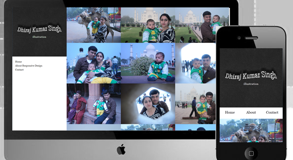
Navigation menu for mobile should be redesigned when the page is viewed in a smaller width.You could see how the menu is re aligned in this demo, when the width is reduced. Some responsive mobile navigation menus are available in internet.

http://webdesignerwall.com/demo/mobile-nav/

Relative Positioning Of Elements:

Every element in the html is relative to another.Thus it is much flexible when the browser width gets changed. In the this demo header and side menu positions are relative. That gives the flexibility for the menus to get aligned below the header when the width is reduced.

Relative Font Size & Usage Of Percentage:

Instead of using px for the font sizes em is used .Thus the font size reduces relatively when the font size of the header or some other html element reduces. Percentages should be used instead of px.

Example: instead of setting as 1000px , 100% or 90% should be set based on the requirement. Thus the website scales based on the width. The most common example is font-size, if you wanted to set a heading font-size (20px) based on your body font-size (10px) in em units.

Don’t use px units, use em units

The px vs em debate is a long one but em units have proven themselves useful in responsive web design. Using em units should be familiar to most web developers, but worth reviewing. An em unit is a relative unit of measurement based on the parent element.

Keep it relative: typography

Setting your type in em units enables you to use the power of CSS to build a scale-able typographic system that grows with the viewport.

body { font: 100%/1.5 serif; /* 16px */  }
h1 {  font-size: 2em; /* 32px */ }

@media (min-width: 600px) {
body { font: 112.5%; /* 18px */  }
h1 {    /* Do nothing! I'll automatically be 36px */ }
}

Based on personal experience, this will save you hours per project versus going through and updating pixel values. Also, it has an accessibility benefit when a user adjusts their font size.

Keep it relative: white-space

Additionally, using em units for padding and margin helps create a vertical base for your design. At larger screen dimensions you can insert more white-space into your design in a healthy, consistent manner without too much labour.

#hero { margin-bottom: 1em; }

@media (min-width: 600px) {
#hero { margin-bottom: 2em; }
}

Using em units will help you preserve a balanced system of relative proportions. For a more advanced approach on relative sizing,

Min-Width & Max-Width with CSS Media Queries:

Min-width and Max-width should be mentioned in the CSS along with the width.Thus imposing a constraint for the widths are better suited for scale-ability for its width.media queries should be added with the min-width or max-width as condition to display certain elements.

Media queries are so important for a responsive css design.

@media screen and (max-width:320px)
{
    .ad_bar{ display: none }
}

In the above code we are making the ads to disappear when the display device width is below 320px. By this we way we provide a better readability of the content in mobile devices.

max-width min-width
‘Desktop down’ ‘Mobile first’
Start large, dig down Start small, build up
Good for legacy sites Future friendly

Go forth and be flexy!

These are just the basics on the path towards fluid width nirvana. It’s important to remember that we’re all learning and it’s OK to make mistakes. I encourage you, if you haven’t already, to take the plunge and build out your own responsive design. The day when most websites sit on a flexible frame and are universally accessible by any device is hopefully fast approaching. Help the web become a better place.

If you have any more suggestions to be added , feel free to comment below.
view demo


Posted by: Dhiraj kumar

CSS3 3D effect, Shine text with css3 keyframe animation, Scrolling Page Background with jQuery – Happy New Year

On the occasion of New Year 2013, I thought to wish this festival by creating a nice webpage greeting. So, today I created this greeting card using 3D  and shining text effect with the help of CSS3, and scrolling background with JavaScript. I hope you all will enjoy this holiday as well as my web-card too :) .

Introduction

Greeting, today we are going to make a scrolling background effect. This script will move the background of any html tag, either vertically or horizontally. I used this script in one of my greeting card too which has a blue sky with clouds and it makes the whole website came alive. I think that’s pretty impressive. In this card you will find texts with different CSS effects like: 3D emboss, continuous spotlight shine effect, text shadow etc.

3d-shine-text-css3-scrolling-background-happy-new-year

The CSS

I have Used multiple text-shadows to create 3D text on any HTML element. No extra HTML, no extra headaches, just awesomesauce.
Works in the latest builds of Safari, Chrome, Firefox, and Opera.

h1 {
  margin:1.2em auto;
  font: bold 100px/1 "Helvetica Neue", Helvetica, Arial, sans-serif;
  color: #fff;
  text-shadow: 0 1px 0 #cccccc, 0 2px 0 #c9c9c9, 0 3px 0 #bbbbbb, 0 4px 0 #b9b9b9, 0 5px 0 #aaaaaa, 0 6px 1px rgba(0, 0, 0, 0.1), 0 0 5px rgba(0, 0, 0, 0.1), 0 1px 3px rgba(0, 0, 0, 0.3), 0 3px 5px rgba(0, 0, 0, 0.2), 0 5px 10px rgba(0, 0, 0, 0.25), 0 10px 10px rgba(0, 0, 0, 0.2), 0 20px 20px rgba(0, 0, 0, 0.15);
  -webkit-transition: .2s all linear;
}

Text shine Effect created with WebKit-specific CSS3 properties. You’ll need Safari or Chrome to enjoy key-frame animation.

p.shine{
    font-size: 3em;
    margin: 0 auto; padding:0;
    width: 95%;
}
.shine{
    background: #222 -webkit-gradient(linear, left top, right top, from(#ccc), to(#fff), color-stop(1, #f0f)) 0 0 no-repeat;
    background-size: 400px; -webkit-background-size: 400px; 
    -moz-background-size: 400px; -o-background-size: 400px;    
    color: rgba(255, 255, 255, 0.7);	
    background-clip: text; -webkit-background-clip: text; 
        -moz-background-clip: text; -o-background-clip: text;	
	-webkit-animation: shine 2s infinite;
	-moz-animation: shine 2s infinite;
	-o-animation: shine 2s infinite;
	-ms-animation: shine 2s infinite;
	animation: shine 2s infinite; 
}

@-webkit-keyframes shine{
    0%{background-position: top left;}
    100%{background-position: top right;}
}
@-moz-keyframes shine{
    0%{background-position: top left;}
    100%{background-position: top right;}
}
@-o-keyframes shine{
    0%{background-position: top left;}
    100%{background-position: top right;}
}
@keyframes shine{
    0%{background-position: top left;}
    100%{background-position: top right;}
}

For page background I used cloud in png format.

body{background:url(bg_clouds.png) 0 0}

The HTML

<h1>Happy New Year 2013</h1>
<p class="shine">The New Year is the time of unfolding horizons and the realization of dreams, may you rediscover new strength and garner faith with you, and be able to rejoice in the simple pleasures that life has to offer and put a brave front for all the challenges that may come your way.<br>
Wishing you a lovely New Year..</p>

The JavaScript – jQuery

We have to add jquery library in body first, after that we animate our page background with css background-position properties. I always prefer to use JavaScript files before close of body tag.

<script src="http://code.jquery.com/jquery-latest.js" type="text/javascript"></script>
<script type="text/javascript">var scrollSpeed = 70; 
    var current = 0;
    function bgscroll(){
        current -= 1;   
        // move the background with backgrond-position css properties
        $('body').css("backgroundPosition", 1 ? current+"px 0" : "0 " + current+"px");   
    }
     setInterval(bgscroll, scrollSpeed);   </script>

view demo

Happy New Year!

I hope you like the result and don’t hesitate to share your thoughts about it. Thanks for reading!

Posted by: Dhiraj kumar

Simple and Easy Tooltip Using jQuery & CSS3

I love jQuery and the way it makes web-designer’s/developer’s life easier.  Although it took all a while to accept it. I still prefer to write my own stuff, I can’t deny its advantages.   Today I will show you a “Tool-Tip” examples of using the same very, very simple script.

Features and Principle

Note: Tooltip Plugin is Less than 1Kb in size.
What this script does is adds an element to the body when you roll over a certain object. That element’s appearance is predefined with css (positioned absolute and styled) so all we need to do is fill the element with content, calculate mouse position and make it move accordingly. When cursor is moved over he object, element moves with it and when cursor roll out, the element is deleted.

Here is a  example where you can see this script in action.

The Simplest jQuery Tooltip Ever

The script takes a title attribute of an A tag and place it inside the popup element.

The Html

<a href="https://dhirajkumarsingh.wordpress.com" class="tooltip" title="Latest Techonology Updates in Web Technology">Roll over for tooltip</a>

The CSS

#tooltip{
	position:absolute; 
        color:#fff; 
        display:none;
	border:1px solid #333; 
        border-radius:4px;
	background-color:#222; background:rgba(2,2,2,.8);
	padding:2px 5px; 
        box-shadow:2px 2px 5px 0 rgba(2,2,2,.8);
}

jQuery – The javascript

First of all, we have to add jQuery library.
after adding jQuery library we have to add this tooltip plugin.
In this plugin you will got :

this.tooltip = function(){	
	/* CONFIG */		
		xOffset = 10;
		yOffset = 20;		
		// these 2 variable determine popup's distance from the cursor
		// you might want to adjust to get the right result		
	/* END CONFIG */		
	$("a.tooltip").hover(function(e){											  
		this.t = this.title;
		this.title = "";								  
		$("body").append("

“+ this.t +”

"); 
                $("#tooltip") .css("top",(e.pageY - xOffset) + "px") 
                              .css("left",(e.pageX + yOffset) + "px") 
                              .fadeIn("fast"); 
         }, function(){ this.title = this.t; 
                  $("#tooltip").remove(); 
         }); 
         $("a.tooltip").mousemove(function(e){ 
                $("#tooltip") .css("top",(e.pageY - xOffset) + "px") 
               .css("left",(e.pageX + yOffset) + "px"); 
}); 
}; 
// starting the script on page load 
$(document).ready(function(){ 
              tooltip()
});

view demo

Your turn

I hope you enjoyed this article and the techniques I used. Please share your comments and questions below!

Posted by: Dhiraj kumar