Animated aquarium with pure CSS

Here is a pure CSS experimental work to create a aquarium. Image / javascript hasn’t been used for aquarium or it’s animation. I have used jQuery only for random air-bubbles. All these animation is created by Pure CSS. Some times ago, I had written a article about “Animated bubbles upwards continuously with pure CSS“. You can also use this trick for air-bubbles.
read more @ http://www.css-jquery-design.com/…

Animated aquarium with pure CSS

For Creating Aquarium’s water, sand, rocks and plants few lines of HTML required.

The HTML

<div class="bubbles"></div>

<div class="ground"></div>
<div class="rock_1"></div>
<div class="rock_2"></div>
<div class="rock_3"></div>
<div class="rock_4"></div>
<div class="rock_5"></div>
<div class="rock_6"></div>
<div class="rock_7"></div>

<div class="plant_1_wrap">
    <div class="plant_1"></div>
    <div class="plant_2"></div>
    <div class="plant_3"></div>
</div>
<div class="plant_2_wrap">
    <div class="plant_4"></div>
    <div class="plant_5"></div>
</div>

Now, its CSS turn. I had written about 1040 lines only in CSS for creating these elements.
read more @ http://www.css-jquery-design.com/…read-more-button

Animated bubbles upwards continuously with pure CSS

Here is a pure CSS experimental work to create floating bubbles without using JavaScript. These animated bubbles are also with popping effect. All these animation is created by Pure CSS.

For our little demo, we use a simple image for the conical flask and then create the bubbles entirely with markup and CSS. read more @ http://www.css-jquery-design.com/…

Animated bubbles upwards continuously with pure CSS

The HTML

<div id="beaker">
  <span class="bubble">
    <span class="glow"> </span>
  </span>
</div>

With our bubbles all made, now we need them to act like bubbles. We could use JavaScript but that’s no fun. Just use CSS! read more @ http://www.css-jquery-design.com/…read-more-button

CSS Vendor Prefixes or CSS3 browser prefixes

CSS vendor prefixes or CSS browser prefixes are a way for browser makers to add support for new CSS features in a sort of testing and experimentation period. Browser prefixes are used to add new features that may not be part of a formal specification and to implement features in a specification that hasn’t been finalized. read more @ http://www.css-jquery-design.com/…

CSS-Vendor-Prefixes-or-CSS3-browser-prefixes

The CSS browser prefixes are:

  • Android: -webkit-
  • Chrome: -webkit-
  • Firefox: -moz-
  • Internet Explorer: -ms-
  • iOS: -webkit-
  • Opera: -o-
  • Safari: -webkit-

In most cases, to use a more advanced CSS style property, you take the standard CSS property and add the prefix above for each browser. read more @ http://www.css-jquery-design.com/…
read-more-button

Animated Color wheel spinning with CSS3 Keyframes animation, Transform and Transition

I have done some experimental work to create CSS3 Animation without using JavaScript. I end up creating some animations using CSS3 Keyframes and Transform and like to share. I have done this animation using border-color tricks and CSS Transform: i.e. CSS scale and CSS3 rotation.

Note: Before going I like to make something clear, Internet Explorer 10, Firefox, and Opera supports the @keyframes rule and animation property. Chrome and Safari requires the prefix -webkit- in css.

Important: Internet Explorer 9, and earlier versions, does not support the @keyframe rule or animation property.

css3-keyframes-color-wheel-animation

The HTML

<div id="colorWheel">
    <span class="color01"></span>
    <span class="color02"></span>
    <span class="color03"></span>
    <span class="color04"></span>
    <span class="color05"></span>
    <span class="color06"></span>
    <span class="color07"></span>
    <span class="color08"></span>
    <span class="color09"></span>
    <span class="color10"></span>
</div>

The CSS

Now, We will use some CSS Technique using border-color tricks and CSS3 rotation. I have created this color cycle without using any image.  I have done a cool rotating wheel animation  using @keyframes animation.

#colorWheel {
    height: 100px;
    width: 100px;
    margin: 40px auto ;
    position: absolute; left:10%;
    -webkit-transform-origin: 50px 150px;
    -moz-transform-origin: 50px 150px;
    -ms-transform-origin: 50px 150px;
    -o-transform-origin: 50px 150px;
    transform-origin: 50px 150px;
    -webkit-transition: all 0.5s linear;
    -moz-transition: all 0.5s linear;
    -ms-transition: all 0.5s linear;
    -o-transition: all 0.5s linear;
    transition: all 0.5s linear;
    animation: wheel 10s ease-in-out infinite alternate;
    -moz-animation: wheel 10s ease-in-out infinite alternate;
    -webkit-animation: wheel 10s ease-in-out infinite alternate;
    -ms-animation: wheel 10s ease-in-out infinite alternate;
}

@keyframes wheel{
    0%{
    opacity:1;
    left:-10%;
    transform:scale(.6) rotate(0deg);
}
50%{
    opacity:.7}
100%{
    left: 90%;
    opacity:1;
    transform:scale(1) rotate(2160deg);
}
}
@-webkit-keyframes wheel{
    0%{
    opacity:1;
    left:-10%;
    -webkit-transform:scale(.6) rotate(0deg);
}
50%{
    opacity:.7;}
100%{
    left: 90%;
    opacity:1;
    -webkit-transform:scale(1) rotate(2160deg);
}
}
@-moz-keyframes wheel{
0%{
    opacity:1;
    left:-10%;
    -moz-transform:scale(.6) rotate(0deg);
}
50%{
    opacity:.7;}
100%{
    left: 90%;
    opacity:1;
    -moz-transform:scale(1) rotate(2160deg);
}
}
@-ms-keyframes wheel{
0%{
    opacity:1;
    left:-10%;
    -ms-transform:scale(.6) rotate(0deg);
}
50%{
    opacity:.7;}
100%{
    left: 90%;
    opacity:1;
    -ms-transform:scale(1) rotate(2160deg);
}
}

#colorWheel:hover {}
#colorWheel span {
    position: absolute;
    -webkit-transform-origin: 50% 50%;
    border-style: solid;
    border-width: 150px 50px;
    box-sizing: border-box;
}
#colorWheel span.color01 {
    -webkit-transform: rotate(0deg);
    -moz-transform: rotate(0deg);
    -ms-transform: rotate(0deg);
    -o-transform: rotate(0deg);
    transform: rotate(0deg);
    border-color: #43a1cd transparent transparent transparent;
}
#colorWheel span.color02 {
    -webkit-transform: rotate(36deg);
    -moz-transform: rotate(36deg);
    -ms-transform: rotate(36deg);
    -o-transform: rotate(36deg);
    transform: rotate(36deg);
    border-color: #639b47 transparent transparent transparent;
}
#colorWheel span.color03 {
    -webkit-transform: rotate(72deg);
    -moz-transform: rotate(72deg);
    -ms-transform: rotate(72deg);
    -o-transform: rotate(72deg);
    transform: rotate(72deg);
    border-color: #9ac147 transparent transparent transparent;
}
#colorWheel span.color04 {
    -webkit-transform: rotate(108deg);
    -moz-transform: rotate(108deg);
    -ms-transform: rotate(108deg);
    -o-transform: rotate(108deg);
    transform: rotate(108deg);
    border-color: #e1e23b transparent transparent transparent;
}
#colorWheel span.color05 {
    -webkit-transform: rotate(144deg);
    -moz-transform: rotate(144deg);
    -ms-transform: rotate(144deg);
    -o-transform: rotate(144deg);
    transform: rotate(144deg);
    border-color: #f7941e transparent transparent transparent;
}
#colorWheel span.color06 {
    -webkit-transform: rotate(180deg);
    -moz-transform: rotate(180deg);
    -ms-transform: rotate(180deg);
    -o-transform: rotate(180deg);
    transform: rotate(180deg);
    border-color: #ba3e2e transparent transparent transparent;
}
#colorWheel span.color07 {
    -webkit-transform: rotate(216deg);
    -moz-transform: rotate(216deg);
    -ms-transform: rotate(216deg);
    -o-transform: rotate(216deg);
    transform: rotate(216deg);
    border-color: #9a1d34 transparent transparent transparent;
}
#colorWheel span.color08 {
    -webkit-transform: rotate(252deg);
    -moz-transform: rotate(252deg);
    -ms-transform: rotate(252deg);
    -o-transform: rotate(252deg);
    transform: rotate(252deg);
    border-color: #662a6c transparent transparent transparent;
}
#colorWheel span.color09 {
    -webkit-transform: rotate(288deg);
    -moz-transform: rotate(288deg);
    -ms-transform: rotate(288deg);
    -o-transform: rotate(288deg);
    transform: rotate(288deg);
    border-color: #272b66 transparent transparent transparent;
}
#colorWheel span.color10 {
    -webkit-transform: rotate(324deg);
    -moz-transform: rotate(324deg);
    -ms-transform: rotate(324deg);
    -o-transform: rotate(324deg);
    transform: rotate(324deg);
    border-color: #2d559f transparent transparent transparent;
}
#colorWheel:before {
    content: "";
    width: 300px;
    height: 300px;
    overflow: hidden;
    position: absolute;
    top: -30px;
    left: -130px;
    border-radius: 100%;
    border: 30px solid #ffffff;
    z-index: 100;
    box-shadow:0px 0px 2px 12px rgba(180,180,180,.5)
}
#colorWheel:after {
    content: "";
    width: 100px;
    height: 100px;
    overflow: hidden;
    position: absolute;
    top: 100px;
    left: 0px;
    border-radius: 100%;
    box-shadow:0px 0px 2px 12px rgba(250,250,250,.5);
    background: #444 url(Dhiraj.png); background-size:contain
}

view demo

Your turn

I had already posted some articles of css3 @keyframes animation examples.  Please check some of these beautiful animation with demo below:

I hope you enjoyed this article and the techniques I used. Please share your comments and questions below!

Posted by: Dhiraj kumar

CSS3 3D effect, Shine text with css3 keyframe animation, Scrolling Page Background with jQuery – Happy New Year

On the occasion of New Year 2013, I thought to wish this festival by creating a nice webpage greeting. So, today I created this greeting card using 3D  and shining text effect with the help of CSS3, and scrolling background with JavaScript. I hope you all will enjoy this holiday as well as my web-card too :) .

Introduction

Greeting, today we are going to make a scrolling background effect. This script will move the background of any html tag, either vertically or horizontally. I used this script in one of my greeting card too which has a blue sky with clouds and it makes the whole website came alive. I think that’s pretty impressive. In this card you will find texts with different CSS effects like: 3D emboss, continuous spotlight shine effect, text shadow etc.

3d-shine-text-css3-scrolling-background-happy-new-year

The CSS

I have Used multiple text-shadows to create 3D text on any HTML element. No extra HTML, no extra headaches, just awesomesauce.
Works in the latest builds of Safari, Chrome, Firefox, and Opera.

h1 {
  margin:1.2em auto;
  font: bold 100px/1 "Helvetica Neue", Helvetica, Arial, sans-serif;
  color: #fff;
  text-shadow: 0 1px 0 #cccccc, 0 2px 0 #c9c9c9, 0 3px 0 #bbbbbb, 0 4px 0 #b9b9b9, 0 5px 0 #aaaaaa, 0 6px 1px rgba(0, 0, 0, 0.1), 0 0 5px rgba(0, 0, 0, 0.1), 0 1px 3px rgba(0, 0, 0, 0.3), 0 3px 5px rgba(0, 0, 0, 0.2), 0 5px 10px rgba(0, 0, 0, 0.25), 0 10px 10px rgba(0, 0, 0, 0.2), 0 20px 20px rgba(0, 0, 0, 0.15);
  -webkit-transition: .2s all linear;
}

Text shine Effect created with WebKit-specific CSS3 properties. You’ll need Safari or Chrome to enjoy key-frame animation.

p.shine{
    font-size: 3em;
    margin: 0 auto; padding:0;
    width: 95%;
}
.shine{
    background: #222 -webkit-gradient(linear, left top, right top, from(#ccc), to(#fff), color-stop(1, #f0f)) 0 0 no-repeat;
    background-size: 400px; -webkit-background-size: 400px; 
    -moz-background-size: 400px; -o-background-size: 400px;    
    color: rgba(255, 255, 255, 0.7);	
    background-clip: text; -webkit-background-clip: text; 
        -moz-background-clip: text; -o-background-clip: text;	
	-webkit-animation: shine 2s infinite;
	-moz-animation: shine 2s infinite;
	-o-animation: shine 2s infinite;
	-ms-animation: shine 2s infinite;
	animation: shine 2s infinite; 
}

@-webkit-keyframes shine{
    0%{background-position: top left;}
    100%{background-position: top right;}
}
@-moz-keyframes shine{
    0%{background-position: top left;}
    100%{background-position: top right;}
}
@-o-keyframes shine{
    0%{background-position: top left;}
    100%{background-position: top right;}
}
@keyframes shine{
    0%{background-position: top left;}
    100%{background-position: top right;}
}

For page background I used cloud in png format.

body{background:url(bg_clouds.png) 0 0}

The HTML

<h1>Happy New Year 2013</h1>
<p class="shine">The New Year is the time of unfolding horizons and the realization of dreams, may you rediscover new strength and garner faith with you, and be able to rejoice in the simple pleasures that life has to offer and put a brave front for all the challenges that may come your way.<br>
Wishing you a lovely New Year..</p>

The JavaScript – jQuery

We have to add jquery library in body first, after that we animate our page background with css background-position properties. I always prefer to use JavaScript files before close of body tag.

<script src="http://code.jquery.com/jquery-latest.js" type="text/javascript"></script>
<script type="text/javascript">var scrollSpeed = 70; 
    var current = 0;
    function bgscroll(){
        current -= 1;   
        // move the background with backgrond-position css properties
        $('body').css("backgroundPosition", 1 ? current+"px 0" : "0 " + current+"px");   
    }
     setInterval(bgscroll, scrollSpeed);   </script>

view demo

Happy New Year!

I hope you like the result and don’t hesitate to share your thoughts about it. Thanks for reading!

Posted by: Dhiraj kumar

CSS3 Buttons with Cool Effects – Pure CSS

Nowadays, using subtle patterns is kinda cool so I thought why not using them also on buttons? The idea was to create some nice CSS3 patterned buttons and in this article you’ll see what I’ve been working on lately.

css3-patterned-buttons

view demo

I wrote before about CSS3 buttons, so you may want to check also these articles:

CSS3 patterned buttons features

  • Easy-to-use.
  • Contain the transitions on gradients hack.
  • As you may have expected, no images used here. Instead, an base64 string is used to create the patterned effect.
  • Stilish pressed behavior when grouped.

Buttons

Basically, to create a button, the only thing you have to do is this:

<a href="" class="button">Button</a>

or

<button class="button">Button</button>

You could also use something like <input type="submit"> but for best cross-browser rendering, just stick to the above.

THE CSS

.button{
  display: inline-block;
  *display: inline;
  zoom: 1;
  padding: 6px 20px;
  margin: 0;
  cursor: pointer;
  border: 1px solid #bbb;
  overflow: visible;
  font: bold 13px arial, helvetica, sans-serif;
  text-decoration: none;
  white-space: nowrap;
  color: #555;
  background-color: #ddd;
  background-image: linear-gradient(top, rgba(255,255,255,1),
                                         rgba(255,255,255,0)),
                    url(data:image/png;base64,iVBORw0KGg[...]QmCC); 
  transition: background-color .2s ease-out;
  background-clip: padding-box; /* Fix bleeding */
  border-radius: 3px;
  box-shadow: 0 1px 0 rgba(0, 0, 0, .3),
              0 2px 2px -1px rgba(0, 0, 0, .5),
              0 1px 0 rgba(255, 255, 255, .3) inset;
  text-shadow: 0 1px 0 rgba(255,255,255, .9);  
}

.button:hover{
  background-color: #eee;
  color: #555;
}

.button:active{
  background: #e9e9e9;
  position: relative;
  top: 1px;
  text-shadow: none;
  box-shadow: 0 1px 1px rgba(0, 0, 0, .3) inset;
}

Different buttons sizes

If you want to make a more prominent or a less prominent call-to-action button, you have options:

css3-patterned-buttons

<button class="small button">Button</button>

or

<button class="large button">Button</button>

THE CSS

/* Smaller buttons styles */

.button.small{
  padding: 4px 12px;
}

/* Larger buttons styles */

.button.large{
  padding: 12px 30px;
  text-transform: uppercase;
}

.button.large:active{
  top: 2px;
}

Various buttons colors

You’ll need custom colors for successful actions or negative ones as delete:

css3-patterned-buttons

<button class="button">Button</button>
<button class="color red button">Button</button>
<button class="color green button">Button</button>
<button class="color blue button">Button</button>

THE CSS

.button.color{
  color: #fff;
  text-shadow: 0 1px 0 rgba(0,0,0,.2);
  background-image: linear-gradient(top, rgba(255,255,255,.3), 
  					 rgba(255,255,255,0)),
                    url(data:image/png;base64,iVBORw0KGg[...]QmCC);
}

/* */

.button.green{
  background-color: #57a957;
  border-color: #57a957;
}

.button.green:hover{
  background-color: #62c462;
}

.button.green:active{
  background: #57a957;
}

/* */

.button.red{
  background-color: #c43c35;
  border-color: #c43c35;
}

.button.red:hover{
  background-color: #ee5f5b;
}

.button.red:active{
  background: #c43c35;
}

/* */

.button.blue{
  background-color: #269CE9;
  border-color: #269CE9;
}

.button.blue:hover{
  background-color: #70B9E8;
}

.button.blue:active{
  background: #269CE9;
}

Disabled states

In case you’re using buttons or inputs, in some cases you’ll need them to be disabled until a certain task is triggered:

css3-patterned-buttons

<button class="button" disabled>Button</button>
<button class="color red button" disabled>Button</button>
<button class="color green button" disabled>Button</button>
<button class="color blue button" disabled>Button</button>

THE CSS

.button[disabled], .button[disabled]:hover, .button[disabled]:active{
  border-color: #eaeaea;
  background: #fafafa;
  cursor: default;
  position: static;
  color: #999;
  /* Usually, !important should be avoided but here it's really needed :) */
  box-shadow: none !important;
  text-shadow: none !important;
}

.green[disabled], .green[disabled]:hover, .green[disabled]:active{
  border-color: #57A957;
  background: #57A957;
  color: #D2FFD2;
}

.red[disabled], .red[disabled]:hover, .red[disabled]:active{
  border-color: #C43C35;
  background: #C43C35;
  color: #FFD3D3;
}

.blue[disabled], .blue[disabled]:hover, .blue[disabled]:active{
  border-color: #269CE9;
  background: #269CE9;
  color: #93D5FF;
}

Grouped buttons

There will be cases when you’ll need to group similar call-to-action buttons:

css3-patterned-buttons

<ul class="button-group">
	<li><button class="button">Button</button></li>
	<li><button class="button">Button</button></li>
	<li><button class="button">Button</button></li>
	<li><button class="button">Button</button></li>
</ul>

THE CSS

.button-group,
.button-group li{
  display: inline-block;
  *display: inline;
  zoom: 1;
}

.button-group{
  font-size: 0; /* Inline block elements gap - fix */
  margin: 0;
  padding: 0;
  background: rgba(0, 0, 0, .04);
  border-bottom: 1px solid rgba(0, 0, 0, .07);
  padding: 7px;
  border-radius: 7px; 
}

.button-group li{
  margin-right: -1px; /* Overlap each right button border */
}

.button-group .button{
  font-size: 13px; /* Set the font size, different from inherited 0 */
  border-radius: 0; 
}

.button-group .button:active{
  box-shadow: 0 0 1px rgba(0, 0, 0, .2) inset,
              5px 0 5px -3px rgba(0, 0, 0, .2) inset,
              -5px 0 5px -3px rgba(0, 0, 0, .2) inset;   
}

.button-group li:first-child .button{
  border-radius: 3px 0 0 3px;
}

.button-group li:first-child .button:active{
  box-shadow: 0 0 1px rgba(0, 0, 0, .2) inset,
              -5px 0 5px -3px rgba(0, 0, 0, .2) inset;
}

.button-group li:last-child .button{
  border-radius: 0 3px 3px 0;
}

.button-group li:last-child .button:active{
  box-shadow: 0 0 1px rgba(0, 0, 0, .2) inset,
              5px 0 5px -3px rgba(0, 0, 0, .2) inset;
}

Browser compatibility

CSS3 patterned buttons works in all major browsers. But of course CSS3 features used here do not work in oder browsers like IE8 and below.

view demo

This is it!

There are so many CSS3 buttons in the wild and I know it. Yet I’m confident that my CSS3 patterned buttons might inspire you and I hope you’ll find it useful for your future projects.

Posted by: Dhiraj kumar

Rotating Words With CSS Animations – CSS3 Keyframes Animation Example

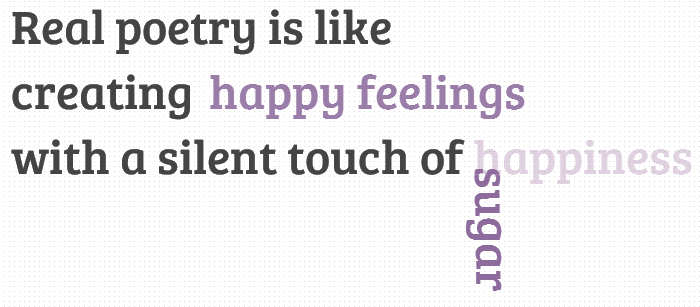
In today’s tutorial we’ll create another typography effect. The idea is to have some kind of sentence and to rotate a part of it. We’ll be “exchanging” certain words of that sentence using CSS animations.
Please note: the result of this tutorial will only work as intended in browsers that support CSS animations.
So let’s start!

In the following, we’ll be going through demo.

rotating-words-css-animations

THE HTML

We’ll have a main wrapper with a h2 heading that contains first-level spans and two divisions for the rotating words:

<section class="rw-wrapper">
	<h2 class="rw-sentence">
		<span>Real poetry is like</span>
		<br />
		<span>creating beautiful butterflies</span>
		<br />
		<span>with a silent touch of</span>
		<div class="rw-words rw-words-1">
			<span>spice</span>
			<span>colors</span>
			<span>happiness</span>
			<span>wonder</span>
			<span>sugar</span>
			<span>happiness</span>
		</div>
	</h2>
</section>

Now, ignoring the garbage placeholder text, we want each span of the rw-word to appear at a time. For that we’ll be using CSS animations. We’ll create one animation for each division and each span will run it, just with different delays.
So, let’s look at the CSS.

THE CSS3

First, we will style the main wrapper and center it on the page:

.rw-wrapper{
	width: 80%;
	position: relative;
	margin: 110px auto 0 auto;
	font-family: 'Bree Serif';
	padding: 10px;
	height: 400px;
	overflow: hidden;
}

We’ll add some text shadow to all the elements in the heading:

.rw-sentence{
	margin: 0;
	text-align: left;
	text-shadow: 1px 1px 1px rgba(255,255,255,0.8);
}

And add some specific text styling to the spans:

.rw-sentence span{
	color: #444;
	white-space: nowrap;
	font-size: 200%;
	font-weight: normal;
}

The divisions will be displayed as inline elements, that will allow us to “insert” them into the sentence without breaking the flow:

.rw-words{
	display: inline;
	text-indent: 10px;
}

Each span inside of a rw-words div will be positioned absolutely and we’ll hide any overflow:

.rw-words span{
	position: absolute;
	opacity: 0;
	overflow: hidden;
	color: #888;
	-webkit-transform-origin: 10% 75%;
	-moz-transform-origin: 10% 75%;
	-ms-transform-origin: 10% 75%;
	-o-transform-origin: 10% 75%;
	transform-origin: 10% 75%;
}

Now, we’ll run two animations. As mentioned previously, we’ll run the same animation for all the spans in one div, just with different delays:

.rw-words-1 span{
	animation: rotateWord 16s linear infinite 0s;
}
.rw-words-2 span{
    animation: rotateWordsSecond 18s linear infinite 0s;
}
.rw-words span:nth-child(2) {
	animation-delay: 3s; 
	color: #6b889d;
}
.rw-words span:nth-child(3) {
	animation-delay: 6s; 
	color: #6b739d;	
}
.rw-words span:nth-child(4) {
	animation-delay: 9s; 
	color: #7a6b9d;
}
.rw-words span:nth-child(5) {
	animation-delay: 12s; 
	color: #8d6b9d;
}
.rw-words span:nth-child(6) {
	animation-delay: 15s; 
	color: #9b6b9d;
}

Our animations will run one cycle, meaning that each span will be shown once for three seconds, hence the delay value. The whole animation will run 6 (number of images) * 3 (appearance time) = 18 seconds.
We will need to set the right percentage for the opacity value (or whatever makes the span appear). Dividing 6 by 18 gives us 0.333… which would be 33% for our keyframe step. Everything that we want to happen to the span needs to happen before that. So, after tweaking and seeing what fits best, we come up with the following animation (Fade in and “fall”) for the first words:

@keyframes rotateWord {
    0% { opacity: 0; }
    5% { opacity: 1; }
    17% { opacity: 1; transform: rotate(0deg); }
	19% { opacity: 1; transform: rotate(98deg); }
	21% { opacity: 1; transform: rotate(86deg); }
	23% { opacity: 1; transform: translateY(85px) rotate(83deg); }
	25% { opacity: 0; transform: translateY(170px) rotate(80deg); }
	80% { opacity: 0; }
    100% { opacity: 0; }
}

We’ll fade in the span and we’ll also animate its height.
The animation for the words in the second div will fade in and animate their width. We added a bit to the keyframe step percentages here, because we want these words to appear just a tiny bit later than the ones of the first word:

@keyframes rotateWordsSecond {
    0% { opacity: 1; animation-timing-function: ease-in; width: 0px; }
    10% { opacity: 0.3; width: 0px; }
    20% { opacity: 1; width: 100%; }
    27% { opacity: 0; width: 100%; }
    100% { opacity: 0; }
}

css3-animations-rotating-words

And that’s it folks! There are many possibilities for the animations, you can check out the demo and see what can be applied!
I hope you enjoyed this tutorial and find it inspiring!
view demo


Posted by: Dhiraj kumar

Animated 3D Bouncing Ball with CSS3, Html5

Hi guys! Today we are going to see another great example of how to use the power of CSS3. We will start by creating a very cool and realistic 3D ball with pure CSS3 properties, and add a little CSS3 animations for giving the ball a “bouncing” effect.

Please note: the result of this tutorial will only work as intended in browsers that support the respective CSS properties (gradient, shadow, border-radius, keyframe animation).css-3d-bouncing-ball

THE HTML

Let’s start with some very basic HTML:

<div id="ballWrapper">
     <div id="ball"></div>
     <div id="ballShadow"></div>
</div>

What we have here are 3 simple DIV elements. “#ballWrapper” is the main DIV which wraps the ball. This DIV will determine the ball’s position and height on the screen. Next, we have the “#ball” element which is the ball markup, and finally there is the “#ballShadow” which holds the ball’s shadow separately from the ball itself.

THE CSS

First, we’ll want to set a basic width and height to our ‘#ballWrapper’ DIV. It will help us position it to the center of the screen:

#ballWrapper {
    width: 140px;
    height: 300px;
    position: fixed;
    left: 50%;
    top: 50%;
    margin: -150px 0 0 -70px;
}

Note that I gave the DIV both top and left position properties of  ‘50%’, and a negative top and left margin which is calculated to be exactly half of the original height and width of the DIV. That way we can center the ball on the screen.

Next in line, let’s give our ball some styles (grow up, it’s not that funny… :])

#ball {
    width: 140px;
    height: 140px;
    border-radius: 70px;
    background: linear-gradient(top,  rgba(187,187,187,1) 0%,rgba(119,119,119,1) 99%);
    box-shadow: inset 0 -5px 15px rgba(255,255,255,0.4), 
                inset -2px -1px 40px rgba(0,0,0,0.4), 
                0 0 1px #000;   
}

We are giving the ball equal width and height and a ‘border-radius‘ property with a value of  ’70px’ (which is half of the original width and height we’ve set) so it will be a ball and not an oval shape.

Another thing you’ll notice is the background. I gave the ball’s element a linear background and 3 different box shadow levels so it would get the 3D effect. The first box shadow level is for the dark shadowing at the bottom of the ball (see image). Then, we have the second level that is responsible for the blurry glow – again, at the bottom of the ball. Finally the third level is a hardly noticeable blurry shadow behind the contours of the ball.

If you take a look at the ball you’ll notice that there is another small oval shape on top of the ball that gives it a reflection effect. Here is how I created it:

#ball::after {
    content: "";
    width: 80px; 
    height: 40px; 
    position: absolute;
    left: 30px;
    top: 10px;  
    background: linear-gradient(top,  rgba(232,232,232,1) 0%,rgba(232,232,232,1) 1%,rgba(255,255,255,0) 100%);
    border-radius: 40px / 20px; 
}

I used the CSS pseudo element ::after and gave it a linear gradient with an opacity. In addition, I’ve set the border radius to  ’40px / 20px’ so it has an oval shape.
Next, let’s handle the ball’s shadow:

#ballShadow {
    width: 60px;
    height: 75px;
    position: absolute;
    z-index: 0;
    bottom: 0;
    left: 50%;
    margin-left: -30px;
    background: rgba(20, 20, 20, .1);
    box-shadow: 0px 0 20px 35px rgba(20,20,20,.1);
    border-radius: 30px / 40px; 
}

view demo

Again, I used the same properties for centering the shadow, but this time I pinned it to the bottom of ‘#ballWrapper’. I also added a semi-transparent background to it, a fitting box shadow and a border radius.

THE BOUNCING ANIMATION

Now let’s take a look at the fun stuff…

I’ll start by adding the animation property to our ball:

#ball {
    animation: jump 1s infinite;
}

All I did was to define the animation’s name (jump), the animation’s duration (1 second) and how many times the animation will happen – in our case we use ‘infinite’ which means that it will run forever.
The animation itself:

@keyframes jump {
    0% {
        top: 0;
    }
    50% {
        top: 140px;
        height: 140px;
    }
    55% {
        top: 160px; 
        height: 120px; 
        border-radius: 70px / 60px;
    }
    65% {
        top: 120px; 
        height: 140px; 
        border-radius: 70px;
    }
    95% {
        top: 0;
    }
    100% {
        top: 0;
    }
}

So, basically what I’m doing here is to play with the ‘top’ position property of the ball.  Starting from 0, through 160 and back to 0. You’ll notice that in the middle of the animation I’m also playing with the ‘border-radius’ property – that way I handle the “impact” of the ball on the ground.

And now the ball’s shadow; first let’s add the shadow’s relevant animation property:

#ballShadow {
    animation: shrink 1s infinite;
}

I used the same values that I used with the ball, only with a different keyframes animation called shrink which looks as follows:

@-keyframes shrink {
    0% {
        bottom: 0;
        margin-left: -30px;
        width: 60px;
        height: 75px;
        background: rgba(20, 20, 20, .1);
        box-shadow: 0px 0 20px 35px rgba(20,20,20,.1);
        border-radius: 30px / 40px;
    }
    50% {
        bottom: 30px;
        margin-left: -10px;
        width: 20px;
        height: 5px;
        background: rgba(20, 20, 20, .3);
        box-shadow: 0px 0 20px 35px rgba(20,20,20,.3);
        border-radius: 20px / 20px;
    }
    100% {
        bottom: 0;
        margin-left: -30px;
        width: 60px;
        height: 75px;
        background: rgba(20, 20, 20, .1);
        box-shadow: 0px 0 20px 35px rgba(20,20,20,.1);
        border-radius: 30px / 40px;
    }
}

In the shadow’s animation I played with different properties then in the ball’s animation. In order to give it all a realistic effect when it comes to the ball’s distance from the floor, I needed to animate the shadow width, height and opacity. While the ball is close to the floor, the shadow needs to be darker and smaller. When the ball jumps up, the shadow should be lighter and bigger.

Last, but not least, let’s add the “click effect” to the ball which makes it appear as if it moves away from us when we click and hold. To achieve this effect, all we have to use is the ‘:active’ pseudo-class, add a transition and play with the CSS3 transform ‘scale’ property like this:

#ballWrapper {
    transform: scale(1);
    transition: all 5s linear 0s;
}

#ballWrapper:active {
    transform: scale(0);
}

The transition from a transform value of scale(1) to scale(0) will make it look as if the element is moving away from you.

view demo

That’s it!

I hope you enjoyed this article and if you have questions, comments, or suggestions, let me know! Thanks for reading.

Posted by: Dhiraj kumar

Creating CSS Starbursts Design with CSS3 Transform

Working with the new CSS3 rotation property I got that I could create image free starbursts. All I needed was a series of nested block-level elements each rotated by a slightly different amount. The rotation would distribute the box corners around the circumference of the star.

About these CSS3 Starbursts:

A good thing is if you create your starbursts with CSS3 you can do so much more than with images. You can experiment with different numbers of points/corners, rounded borders, resize, text-shadows and animations also.

To see the animations you will need to use latest browsers like IE 9+, Firefox 4.0+, Safari 4.1+ and Chrome 3.0+.

css-starburst-design

No CSS Hacks

There are no CSS hacks required for these CSS3 starbursts. CSS is designed to be backwards compatible so any browser that cannot understand CSS3 will simply ignore these new rules without any error.

iPhone, iPod Touch, & iPad Compatible

The Safari browser is one of the most advanced when it comes to CSS3 because it uses the powerful Webkit rendering engine. This means all these animated starbursts will work fine on the iPhone, iPod Touch and the iPad.

SEO Friendly

Because the text in each starburst is actually real text it will be crawled and indexed by Google like everything else. It also means that people who are vision impaired can more easily read and understand your web page if they are using a screen reader.

No Images Required

All of the shapes, colours and shadows in the starbursts above are created using CSS3 rules. No images are used at all.

No JavaScript Required

The animations in these demos are made possible with the CSS3 transition rules. No JavaScript is used to create any effects.

Resizable Text Compatible

All the dimensions of the starbursts are set in em measurements. This means that you can increase the text size in your browser and the starburst will grow in size along with all other text. This is great news for web accessibility.

view demo

The HTML

<div class="price-container">
  <div class="price">
    <span class="label">Buy</span>
    <span class="number">$99.95</span>
    <span class="label">Now</span>
  </div>
</div>

I have <div> that, you guessed it, contains the price starburst. I’ll use this for the background of the starburst. The <div> is the container for the text inside (the price info.) That’s it for the markup. From here, I’ll be styling pseudo classes to create the multiple points. Also, I mentioned earlier that there were a few less points in the CSS version of this starburst. This markup doesn’t really have anything unnecessary in it.

The CSS

Now on to the fun part. Let me overview what I’m going to do, then I’ll show you the styles needed to achieve it. I’m going to style .price-container.price, and the :before and:after pseudo elements for each. Essentially, I’ve got six elements to work with. I created this background image to apply to each of the elements and I will rotate 15 degrees each:

image used for starburst

The CSS is a little bit longer. I’ve used the rotation rules in the CSS, one is for Firefox (prefixed with -moz-), one is for webkit i.e. Safari and Chrome (prefixed with -webkit-), one is for Internet Explorer (prefixed with -ms-), one is for Opera (prefixed with -o-), and the other is the standard rotation rule as it will be used once this rotation property becomes standard:

.price-container,
.price-container:before,
.price-container:after,
.price-container .price,
.price-container .price:before,
.price-container .price:after {
	height: 8.5em;
	width: 8.5em;
	background: #760B1F url(price-bg.png) top left no-repeat;
	background-size: 8.5em;
}

.price-container:before,
.price-container:after,
.price-container .price:before,
.price-container .price:after {
	content: "";
	position: absolute;
}

.price-container {
	margin: 100px auto; /* Centering for demo */
	position: relative; /* Context */
	top: 2.5em;
	left: 2.5em;
	-webkit-transform: rotate(-45deg);
	  -moz-transform: rotate(-45deg);
	   -ms-transform: rotate(-45deg);
	    -o-transform: rotate(-45deg);
	       transform: rotate(-45deg);
}

.price-container:before {
	top: 0;
	left: 0;
	-webkit-transform: rotate(-30deg);
	  -moz-transform: rotate(-30deg);
	   -ms-transform: rotate(-30deg);
	    -o-transform: rotate(-30deg);
	       transform: rotate(-30deg);
}

.price-container:after {
	top: 0;
	left: 0;
	-webkit-transform: rotate(-15deg);
	  -moz-transform: rotate(-15deg);
	   -ms-transform: rotate(-15deg);
	    -o-transform: rotate(-15deg);
	       transform: rotate(-15deg);
}

.price-container .price {
	padding: .5em 0em;
	height: 7.5em; /* height minus padding */
	position: absolute;
	bottom: 0;
	right: 0;
	-webkit-transform: rotate(45deg);
	  -moz-transform: rotate(45deg);
	   -ms-transform: rotate(45deg);
	    -o-transform: rotate(45deg);
	       transform: rotate(45deg);
	z-index: 1; /* important so the text shows up */
}

.price-container .price:before {
	top: 0;
	left: 0;
	-webkit-transform: rotate(60deg);
	  -moz-transform: rotate(60deg);
	   -ms-transform: rotate(60deg);
	    -o-transform: rotate(60deg);
	       transform: rotate(60deg);
}

.price-container .price:after {
	top: 0;
	left: 0;
	-webkit-transform: rotate(75deg);
	  -moz-transform: rotate(75deg);
	   -ms-transform: rotate(75deg);
	    -o-transform: rotate(75deg);
	       transform: rotate(75deg);
}

A few things I’ll point out about the styles:

  • Notice the order of the rotation angles: This order is important because there is going to be text inside the inner-most element. Therefore, the last element (the one the text going in, in this case .price) has to be straight. Notice that .price-container is rotated -45 degrees and .price is rotated 45 degrees – back to 0.
  • The height and width: The height and width has to be set since we are dealing with background images here. I’ve set it in ems to adjust appropriately when the text size increases.
  • There’s a padding top and bottom on .price-container .price. That’s why the height is a little different than all the others.
  • Everything is positioned absolutely inside the first container. .price-container hasleft: 2.5em and top: 2.5em just to move the whole thing a little. When everything is rotated, the corners go of the page and out of the container a little.
  • z-index: There’s a z-index defined for .price-container .price. This is so the price information inside this div is visible.

Now all that’s left is styling the text.

.price-container .price span {
        position: relative;
	z-index: 100;
	display: block;
	text-align: center;
	color: #FE0;
	font: 1.8em/1.4em 'georgia',Sans-Serif;
	text-transform: uppercase;
}

.price-container .price span.number {
  font-weight: bold;
  font-size: 2.5em;
  line-height: .9em;
  color: #fff;
}

Some more CSS used in hover effect:

.price-container.one:hover {
	-webkit-transform: rotate(-20deg);
	-moz-transform: rotate(-20deg);
	-ms-transform: rotate(-20deg);
	-o-transform: rotate(-20deg);
	transform: rotate(-20deg);
}

Doing It Image-Free

Now, I have some extra stuff in here because the design called for this very subtle inner border. If you don’t like or need the inner border, just remove the bit about background image and background size and design will hold up fine.

Browser Support

This works as-is in IE 9+, Firefox 4.0+, Safari 4.1+ and Chrome 3.0+. IE 8 and below do not support background-size, and Chrome 1.0, Firefox 3.6 and Safari 3.0 will require some vendor prefixes. IE8 does support pseudo elements, however doesn’t support transform.

The fallback would be a colored square. Very likely not a huge problem.

auto-adjustable-dynamic-starburst-design-css3-html5

There You Have It

It’s a price star thing. Flexible enough to grow when you increase your font size. Made with some CSS. You can use this for highlighting prices, discounts etc.

That’s it!

I hope you enjoyed this article and if you have questions, comments, or suggestions, let me know! Thanks for reading.

Posted by: Dhiraj kumar

Animated Notification bubble icon with CSS3 keyframe animation

The other day, while working on a web project, I had to emphasize somehow a dynamic notification bubble. Basically, every time the notification value changes, a visual effect was needed in order to get user’s attention. So I made that using CSS3 keyframe animation.

notification-bubble-animation

The HTML

For this example, we’ll borrow the markup structure and look from my CSS3 dropdown menu.

<ul>
    <li><a href="">Dashboard</a></li>
    <li><a href="">Friends</a></li>
    <li>
    	<a href="">Message
    		<span>9</span>
    	</a>
    </li>
    <li><a href="">Games</a></li>
    <li><a href="">Settings</a></li>
</ul>

The focus will be on the <span>, which is the notification bubble that will be animated.

The CSS

The .animating class represents an CSS3 animation that uses a bezier curve.

.animating{
	animation: animate 1s cubic-bezier(0,1,1,0);			
}

@keyframes animate{
	from {
	   transform: scale(1);
	}
	to {
	   transform: scale(1.7);
	}
}

The jQuery

It’s not as easy as you might think to restart an animation and Chris Coyier wrote a good article about it.

The method I chose for this example involves using JavaScript’s setTimeout() method. So, every time the notification value changes, the .animating class is removed after a second (exactly how long the proper animation lasts).

In production, you will not need the counterValue variable. This is used just for our working example in order to be able to increment and decrement the notification value.

var counterValue = parseInt($('.bubble').html()); // Get the current bubble value

function removeAnimation(){
	setTimeout(function() {
		$('.bubble').removeClass('animating')
	}, 1000);			
}

$('#decrease').on('click',function(){
	counterValue--; // decrement
	$('.bubble').html(counterValue).addClass('animating'); // animate it
	removeAnimation(); // remove CSS animating class
})

$('#increase').on('click',function(){
	counterValue++; // increment
	$('.bubble').html(counterValue).addClass('animating'); // animate it
        removeAnimation(); // remove CSS animating class

view demo

Simple, but effective

I think this is a simple and practical example on how to use a CSS3 animation to enhance user experience. Further, you can experiment with the bezier curve values and come up with some other cool effects.

Thanks for reading and looking forward to read your thoughts!

Posted by: Dhiraj kumar